Email newsletters stand as a beacon between your brand and your audience. In one cohesive and on-brand email, you can share everything from news to announcements to updates and inspire action, building stronger connections with your subscribers.The artistry behind crafting a newsletter that not only informs but captivates is a journey of balancing aesthetic appeal with potent content, ensuring each word and image is a step towards enriching subscriber engagement. As connoisseurs of well-crafted email newsletters, within the confines of this blog, we'll share 16 email newsletter examples, each uniquely highlighting the impact of successful communication in its own special way.
Behind the Best Email Newsletter Examples
Understanding the mechanics of email design means recognizing and appreciating the subtle nuances that elevate a newsletter from good to exceptional. Below, you'll find a collection of designs that brilliantly mix visuals and content, each one shining a light on the exciting opportunities that your own newsletters can explore.
E-Commerce Newsletter Examples
Serumize
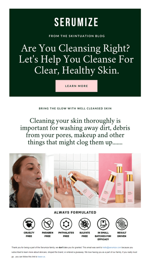
The presented newsletter comes from "Serumize," a brand dedicated to skincare. This specific edition from their "Skintuation" blog emphasizes the importance of correct skin cleansing to achieve clear, healthy skin.
Stand-out elements:
- Engaging Content and Visuals:
- One of the standout features of this newsletter is its use of engaging content complemented by visually appealing imagery. The headline "Are You Cleansing Right?" is not only attention-grabbing but also prompts the reader to delve deeper into the content. When accompanied by high-quality images of the products and a model showcasing the cleansing process, it gives the viewer a comprehensive idea of what the brand offers.
- Clear Call to Action:
- The "LEARN MORE" button is prominently placed and effectively serves as a call to action. Its distinct color and positioning ensure it catches the reader's attention, leading them towards more detailed information or potentially to a purchase.
- Transparency and Trustworthiness:
- Serumize has incorporated icons at the bottom of the newsletter, highlighting the qualities of their products, such as "Cruelty-Free" and "Paraben Free." This not only informs the consumer about the product's attributes but also builds trust by showcasing their dedication to safe and ethical formulations. Additionally, the personal touch in their thank you note at the end adds a feeling of community and appreciation, making the reader feel valued and connected to the brand.
Business Newsletter Examples
Moz
This newsletter is from Moz, a reputable name in the domain of search engine optimization (SEO) and digital marketing. Through its "Moz Top 10," the brand aims to provide its subscribers with valuable insights, updates, and resources in the ever-evolving realm of SEO and online marketing.

Stand-out elements:
- Curated Quality Content:
- Moz's strategy of listing the top 10 articles or resources is an excellent way to keep readers informed about the latest and most pertinent topics in the industry. Each entry is concise yet descriptive, allowing subscribers to gauge the relevance and importance of the content quickly. This curation reflects Moz's expertise, providing readers with confidence that they're getting a distilled version of the most significant industry happenings.
- Variety and Interactivity:
- Including diverse resources, from video sessions like "TechSEO Boost 2019" to interactive games like "The Search," showcases Moz's commitment to catering to various learning styles and preferences. By mixing traditional resources with more engaging, interactive content, they ensure that readers remain engaged and are more likely to explore the provided content further.
- Clear Value Proposition and Incentives:
- The newsletter not only updates readers but also offers tools and resources that can be directly implemented, like the "Google Search Console – Quick Insights (Google Sheet)." Additionally, the promotional segment at the bottom about an "Early Bird" discount serves as an incentive for readers to act and get involved with Moz's offerings, effectively driving potential conversions
The Hustle
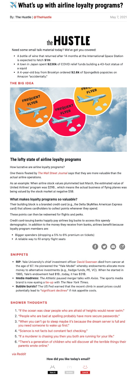
The newsletter presented is from "The Hustle," a daily business and technology news platform that condenses vital information into bite-sized, digestible pieces. This edition, dated May 7, 2021, delves into the intricacies and value proposition of airline loyalty programs while also offering readers a mix of interesting tidbits and thought-provoking snippets.
Stand-out elements:
- Engaging Big Idea Segment:
- The newsletter opens with a "Big Idea" section, focusing on airline loyalty programs. By leading with a captivating visual and a headline that poses a question, the Hustle immediately piques the reader's curiosity. The section provides key insights, like the surprising financial value of loyalty programs compared to actual airline operations. Such an approach not only educates but also offers a fresh perspective on a topic many might assume they're familiar with.
- Diverse Range of Content:
- One of the strengths of this newsletter is the diversity in content. Beyond the main story, there are "Snippets," which cover various topics from finance to sports and media, catering to a broad audience spectrum. This strategy ensures that even if a reader isn't particularly interested in the main topic, other sections might catch their attention, increasing overall engagement.
- Shower Thoughts for Engagement:
- Adding a touch of whimsy, the "Shower Thoughts" section offers quirky and contemplative statements likely to resonate with many readers, potentially becoming a talking point or even being shared on social platforms. This inclusion, while seemingly light-hearted, enhances user engagement and offers a delightful conclusion to the reading experience.
Product Newsletter Examples
Fridababy
The showcased newsletter is from "Fridababy," a company specializing in innovative baby and toddler products designed to simplify parental challenges. This edition is dedicated to introducing their new product, the "DermFrida Bath Mitt," aiming to transform bath times into a fuss-free experience for parents and their little ones.

Stand-out Elements:
- Eye-Catching Visuals and Cohesive Design:
- Fridababy has effectively used vibrant, playful visuals that immediately draw attention to the new product. Using a child's illustrated hand juxtaposed with the actual product not only adds a fun element but also emphasizes the product's utility. The cohesive color palette, centered around the product's color, further accentuates the product and creates a visually appealing design that's consistent throughout.
- Clear Information and Benefits:
- The newsletter does a commendable job of highlighting the product's features, from being a "quick-dry" mitt to its "bacteria-resistant" nature. The segment "A Tub Without Tantrums" cleverly emphasizes the primary benefit for parents—making bath time a breeze. The succinct points give a quick overview, allowing potential customers to grasp the product's advantages at a glance.
- Comprehensive Product Range Showcase:
- Towards the end, the newsletter smartly showcases a range of their other products, reminding subscribers of their holistic approach to baby care. This not only reinforces brand recall but also encourages cross-selling. The invitation to "Join the Fridababy Babble" further promotes community engagement and brand loyalty.
The Body Shop
The featured newsletter comes from "The Body Shop," a globally recognized brand known for its ethically produced beauty and skincare products. This edition emphasizes their new avocado-themed body care range, showcasing the benefits of this natural ingredient while highlighting promotions and the essence of the brand's ethos.

Stand-out Elements:
- Cohesive Thematic Presentation:
- "The Body Shop" has brilliantly leaned into the avocado theme, creating a visual treat for the eyes. From the prominent avocados to the green-hued product packaging, everything in the newsletter ties together seamlessly. This cohesive presentation not only emphasizes the natural ingredients of their products but also creates a memorable and distinct visual identity for this specific range.
- Clear Call-to-Action and Offers:
- Throughout the newsletter, there are clear and enticing CTAs. Whether it's the playful "Smash that buy button" for the avocado range or the "Buy now" for the 20% off promotion, each segment clearly guides the reader on what to do next. Coupled with attractive offers and promotions, it nudges potential customers towards purchasing.
- Emphasis on Brand Values:
- The "Spread Love" section at the bottom, featuring diverse models, is a subtle yet powerful nod to the brand's commitment to inclusivity and positive body image. By incorporating this imagery and message, "The Body Shop" reinforces its brand values, creating a deeper connection with its audience beyond just the products it sells.
Professional Newsletter Examples
Your City
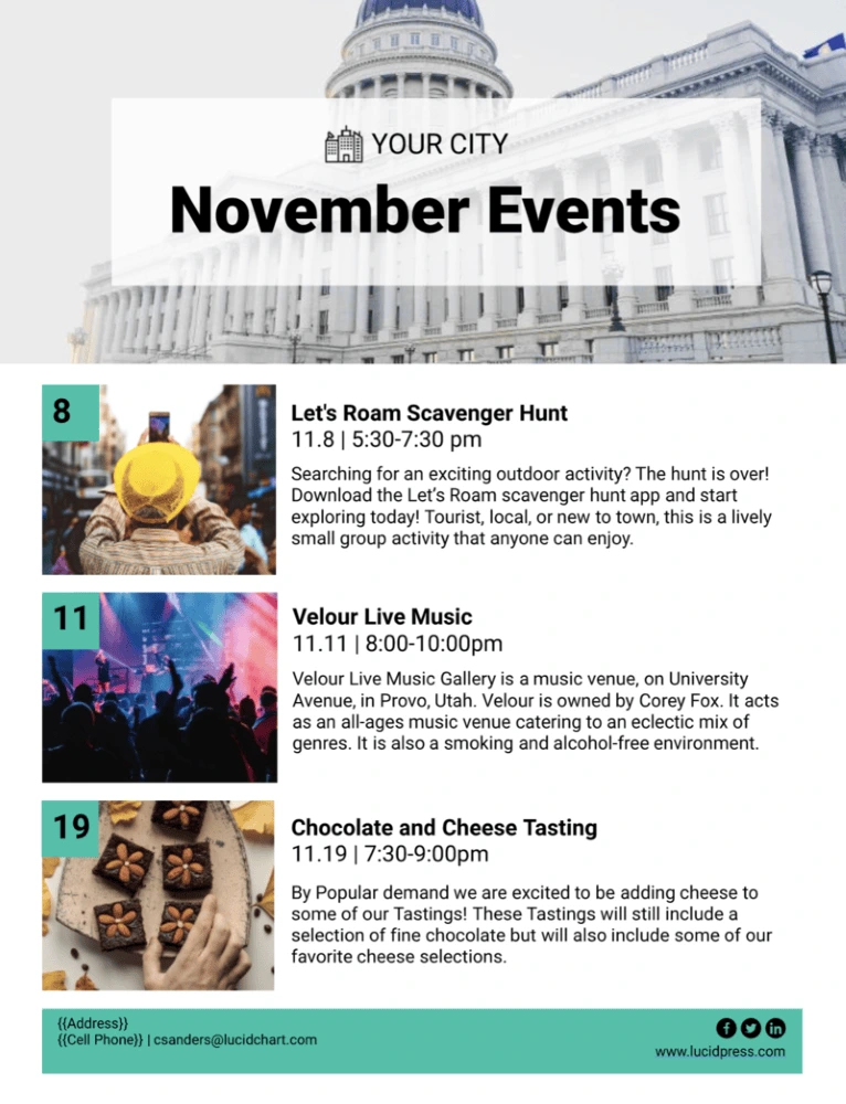
From interactive scavenger hunts to melodious live music sessions and delightful tasting events, the city is bustling with activities for locals and tourists to indulge in and enjoy.
Stand-out Elements:
- Clear Visual Cues and Structured Layout:
- The newsletter employs a clear and straightforward layout, a boon for easy readability. The dominant imagery of the city's iconic building sets the geographical context instantly. Dates are boldly highlighted, ensuring readers can swiftly pick out the timings for each event. The accompanying images for each event serve as visual cues, giving readers an instant feel of what to expect.
- Concise and Informative Descriptions:
- Each event's description is concise yet comprehensive enough to give readers a clear idea of the activity. The "Let's Roam Scavenger Hunt," for example, is not just presented as a fun outdoor activity but is specifically pitched towards tourists, locals, and newcomers alike, broadening its appeal. The "Velour Live Music" description mentions the owner's name and the venue's unique selling points, such as a smoke and alcohol-free environment.
- Call to Action and Accessibility:
- Strategically placed at the bottom, the contact information ensures that interested parties have a direct line to the organizers. An email address allows for easy communication, while the placeholders for address and phone number suggest that the newsletter would provide multiple ways for readers to reach out, enhancing user accessibility and interaction.
Webinar Newsletter Examples
Fluent
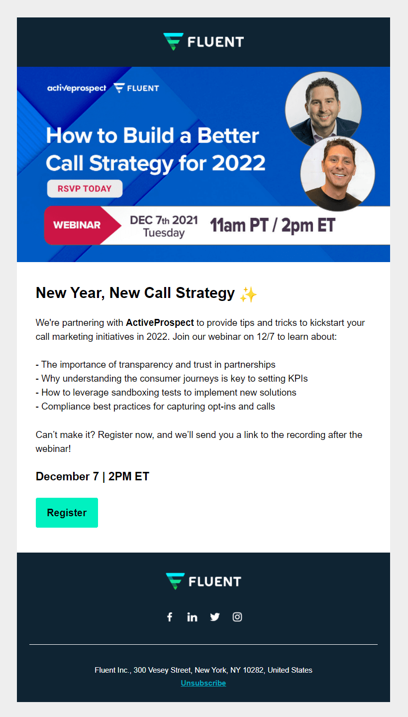
This newsletter is from Fluent, a marketing company, announcing a collaborative webinar with ActiveProspect. This webinar aims to provide insights and strategies for building a superior call marketing plan for 2022, appealing to businesses and marketers looking to enhance their communication strategies for the upcoming year.
Stand-out Elements:
- Visual Clarity and Conciseness:
- One of the standout features of this newsletter is its clear, concise, and visually appealing design. The bold, catchy header "How to Build a Better Call Strategy for 2022" immediately captures the reader's attention. Including headshots of the speakers adds a personal touch, giving a face to the experts who will be presenting. The highlighted date and time ensure readers can quickly jot down the event in their calendars.
- Detailed Content with a Direct CTA:
- The newsletter does an exceptional job of detailing the webinar's objectives in a bullet-point format, which allows potential attendees to gauge the content at a glance. By touching on crucial points like transparency, consumer journeys, and compliance best practices, Fluent emphasizes the comprehensive nature of the webinar. The clear "Register" button is a straightforward call-to-action (CTA), prompting immediate registration. Additionally, the assurance that a recording link will be sent even if someone cannot attend the live session helps capture a broader audience.
- Transparent Communication:
- The footer section, which includes Fluent's address and an unsubscribe option, ensures transparency and adheres to best email marketing practices. It establishes trust with the recipients, showing that Fluent respects their privacy and their right to opt out of such communications.
2C2P
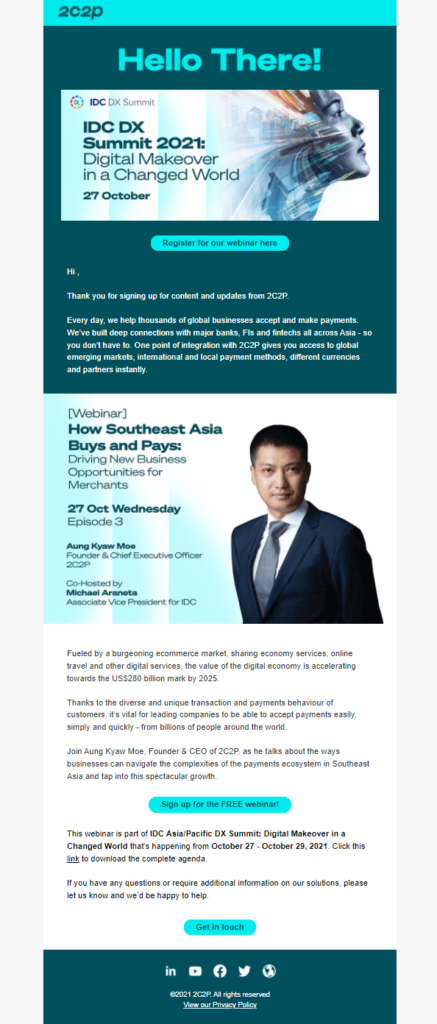
By providing solutions that facilitate payments across diverse markets, 2C2P positions itself as a critical bridge in the digital payments ecosystem. This specific newsletter emphasizes their upcoming participation in the IDC DX Summit and a webinar centered around the buying and payment trends in Southeast Asia.
Stand-out Elements:
- Clarity and Segmentation:
- One of the standout aspects of this newsletter is the clarity it offers. Each section is distinctly separated, allowing for easy navigation. Whether it's the invitation to the IDC DX Summit or the details about the webinar, readers can quickly glean the primary focus points, enhancing user experience.
- Engaging Content and Value Proposition:
- The description of the digital economy's growth and the potential it holds for businesses is compelling. By highlighting numbers like the "US$280 billion mark by 2025," the newsletter taps into a sense of urgency and opportunity. Moreover, by showcasing their CEO, Aung Kyaw Moe, as the speaker for the webinar, 2C2P is subtly underscoring their expertise in the domain. The emphasis on the complexities of the payments ecosystem in Southeast Asia positions the webinar as a must-attend for businesses keen on tapping into the region's potential.
- Direct Calls to Action (CTA) and Accessibility:
- The newsletter doesn't merely provide information; it guides the reader towards specific actions. The "Register for our webinar here," "Sign up for the FREE webinar!" and "Get in touch" buttons are direct CTAs that foster engagement. Additionally, providing a direct link to download the complete agenda for the IDC DX Summit ensures readers have immediate access to detailed information.
Blog Newsletter Examples
Julie Blanner
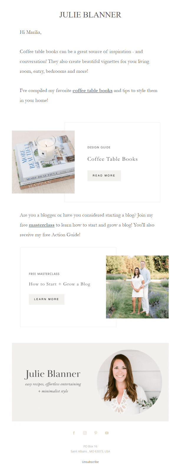
The newsletter in focus is from Julie Blanner, a lifestyle influencer known for her approach to easy recipes, effortless entertaining, and minimalist style. Through this newsletter, she introduces her readers to her favorite coffee table books and extends an invitation to her free masterclass on starting and growing a blog.
Stand-out Elements:
- Personal Touch and Relevance:
- One of the standout elements of this newsletter is its personal touch. Addressing the recipient by name ("Hi Marilia") creates an instant connection, making the reader feel individually acknowledged. Furthermore, by offering content on coffee table books, Julie provides value that aligns with her brand's aesthetic and resonates with her target audience's interests. This tailored content is crucial in capturing and maintaining the reader's attention.
- Visual Consistency and CTA:
- Julie's newsletter excels in visual consistency. The soft, muted color palette and the curated images reflect her brand's essence and the promise of "minimalist style." The images not only provide visual appeal but also offer a sneak peek into what readers can expect by clicking on the "Read More" or "Learn More" CTAs. Clear and concise CTAs encourage user interaction and lead the reader down a predetermined path, increasing the chances of conversion.
- Offering Value and Engagement:
- Julie's invitation to her free masterclass on blogging is a strategic move to engage with her readership further. By offering something of value, like a masterclass, she not only establishes her expertise but also fosters a deeper relationship with her community. Additionally, including her profile at the bottom, complete with social media links, ensures that readers have multiple avenues to connect with her and explore her content further.
Restaurant Newsletter Examples
Allset
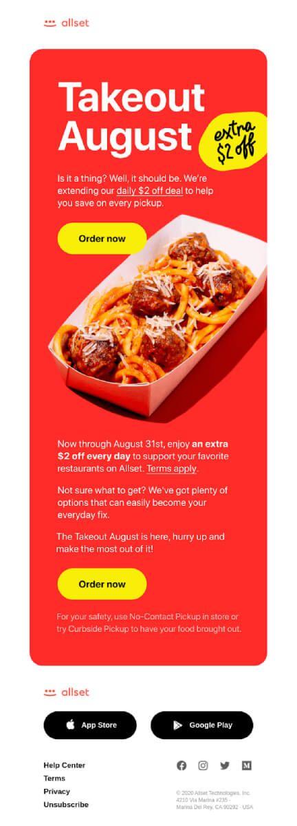
This newsletter is from "Allset," a platform facilitating a seamless dining experience by allowing users to order meals ahead for dine-in or pickup. This particular communication promotes their "Takeout August" campaign, aiming to incentivize users with a daily $2 off on their pickups.
Stand-out Elements:
- Eye-catching Design and Clear Messaging:
- One of the primary strengths of this newsletter lies in its visually appealing design. The bright red background immediately captures attention, and the contrasting yellow emphasizes the promotional offer. The headline "Takeout August" followed by "extra $2 off" succinctly conveys the essence of the promotion. Furthermore, the image of a delicious meal not only tantalizes the taste buds but also gives a visual cue about the brand's service – offering delightful meals at a discount.
- Direct Call to Action and User Convenience:
- The newsletter uses multiple "Order now" buttons, strategically placed after introducing the offer and towards the end. This ensures that at any point if the user is convinced, they have an immediate way to act. Additionally, the mention of "No-Contact Pickup" and "Curbside Pickup" addresses current health and safety concerns, showcasing the brand's commitment to user safety. Such features can significantly enhance user trust and increase the likelihood of conversions.
- Integration of Mobile and Encouragement for Recurring Use:
- By displaying App Store and Google Play buttons, the newsletter encourages users to download the allset app, pushing for a more extended engagement. Coupled with the statement, "Not sure what to get? We’ve got plenty of options that can easily become your everyday fix," the brand subtly promotes recurring use, aiming to make their service a part of the user's daily routine.
Sweetgreen
The displayed newsletter is from "Sweetgreen," a brand known for its dedication to fresh, wholesome food offerings. Catering to the health-conscious and those who appreciate vibrant flavors, this particular communication emphasizes their summer-themed salads, reminding customers that summer is far from over.

Stand-out Elements:
- Vibrant Visuals and Seasonal Relevance:
- The use of fresh, bright imagery in this newsletter not only emphasizes the freshness of the ingredients but also evokes a sense of the summer season. By stating, "Summer is going strong," Sweetgreen captures what many love about the season – the warmth, vibrancy, and extended daylight. This strategic play on the sentiment resonates with the audience, making them more inclined to indulge in the salads and extend their summer feelings.
- Detailed Descriptions and CTA:
- Each salad is accompanied by a brief, flavorful description that tantalizes the reader's palate. Phrases like "watermelon + spicy cashew" or "peach + goat cheese" are not just ingredients; they narrate a flavor story, hinting at the delightful contrasts one can expect. The repeated call to action – "Taste the summer" – is a compelling nudge, inviting readers to experience these flavor combinations for themselves.
- Brand Mission and Accessibility:
- Closing off with "connecting people to real food" not only reinforces Sweetgreen's brand mission but also subtly communicates their dedication to quality and authenticity. The inclusion of social media icons and their physical address enhances accessibility, giving readers multiple avenues to engage with the brand, whether it's for feedback, queries, or simply to follow their journey.
Company Newsletter Examples
Star Capital Bank
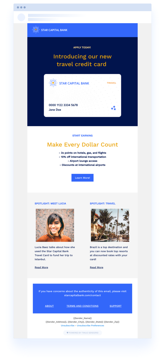
A renowned financial institution, Star Capital Bank, seems to be expanding its portfolio with a product that aims to benefit the globetrotters by offering them rewards, discounts, and perks for their travels.
Stand-out Elements:
- Clear Highlight of the New Product:
- At the outset, the newsletter grabs attention with a vibrant visual of the travel credit card. Accompanied by the phrase "Introducing our new travel credit card," the positioning makes it instantly clear what the main focus of the communication is. This direct approach ensures that readers immediately understand the core message without distractions.
- Emphasis on Benefits:
- Rather than just listing features, the newsletter smartly emphasizes the benefits of using the travel credit card. The section "Make Every Dollar Count" details the rewards and perks cardholders can avail of, like 3x points on various categories and significant discounts. By outlining these tangible benefits, the bank effectively communicates the card's value proposition, making it more enticing for potential customers.
- Personal Stories and Destination Highlight:
- The spotlight sections, featuring Lucia's story and highlighting Brazil as a top destination, add a personal touch to the newsletter. Lucia's story offers a testimonial of sorts, detailing how the card benefited a real customer, which can resonate with readers and build trust. The Brazil feature, conversely, not only taps into wanderlust but also showcases how the card can be used for diverse travel experiences.
Create Email Newsletters That Stand Out With Beefree
In today's digital age, capturing your audience's attention is more challenging than ever. It is paramount to craft email newsletters that truly resonate and stand apart from the myriad of messages flooding inboxes daily. It is just as important to have the right tool to create email designs effortlessly.
That's where Beefree comes in.
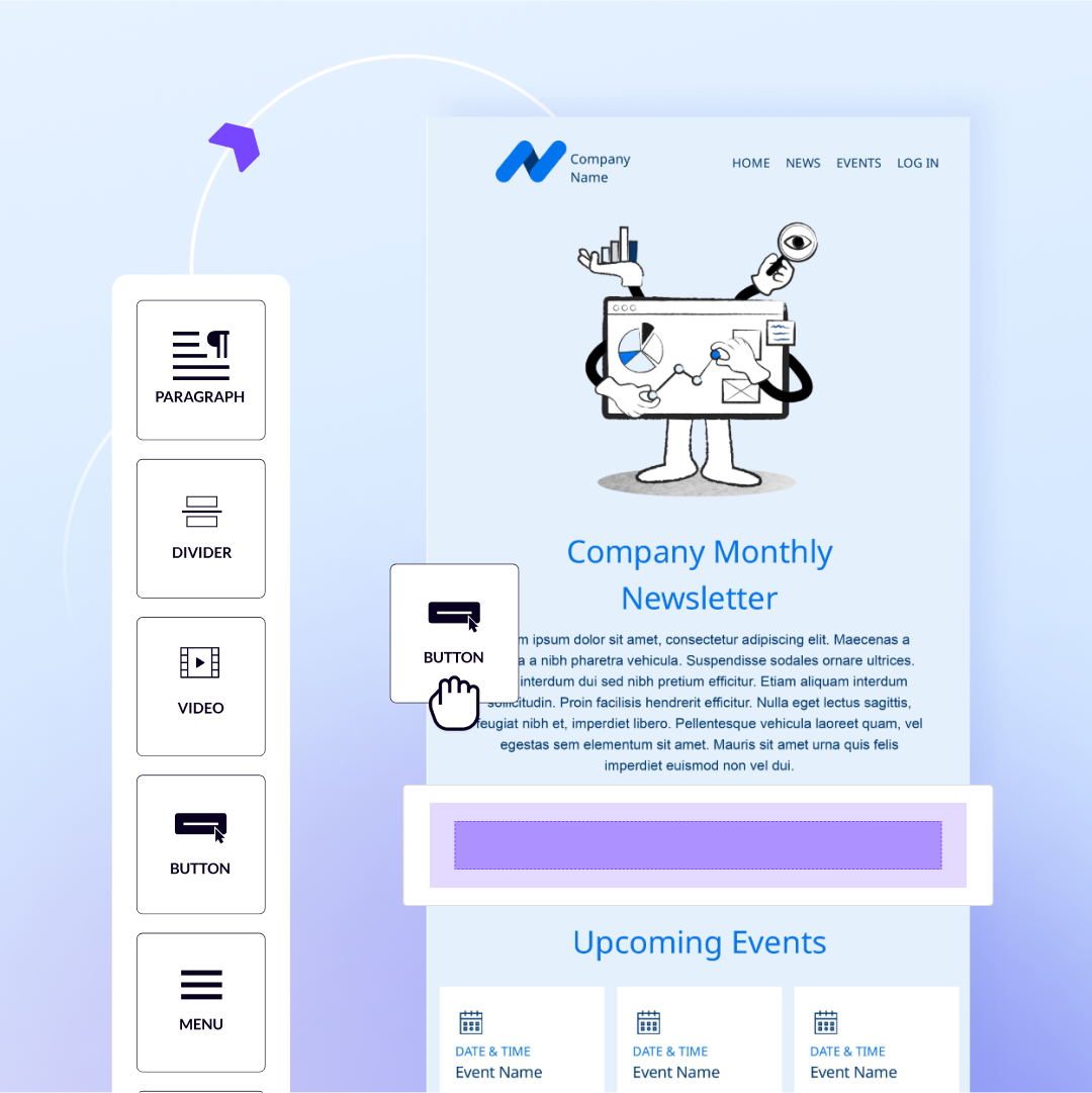
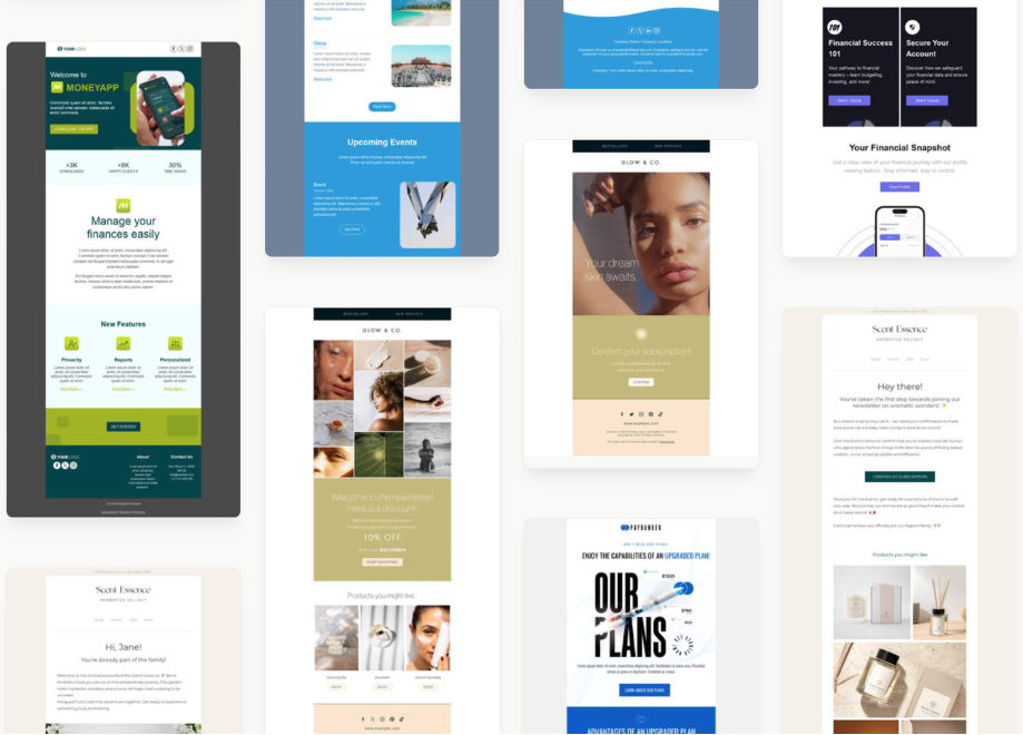
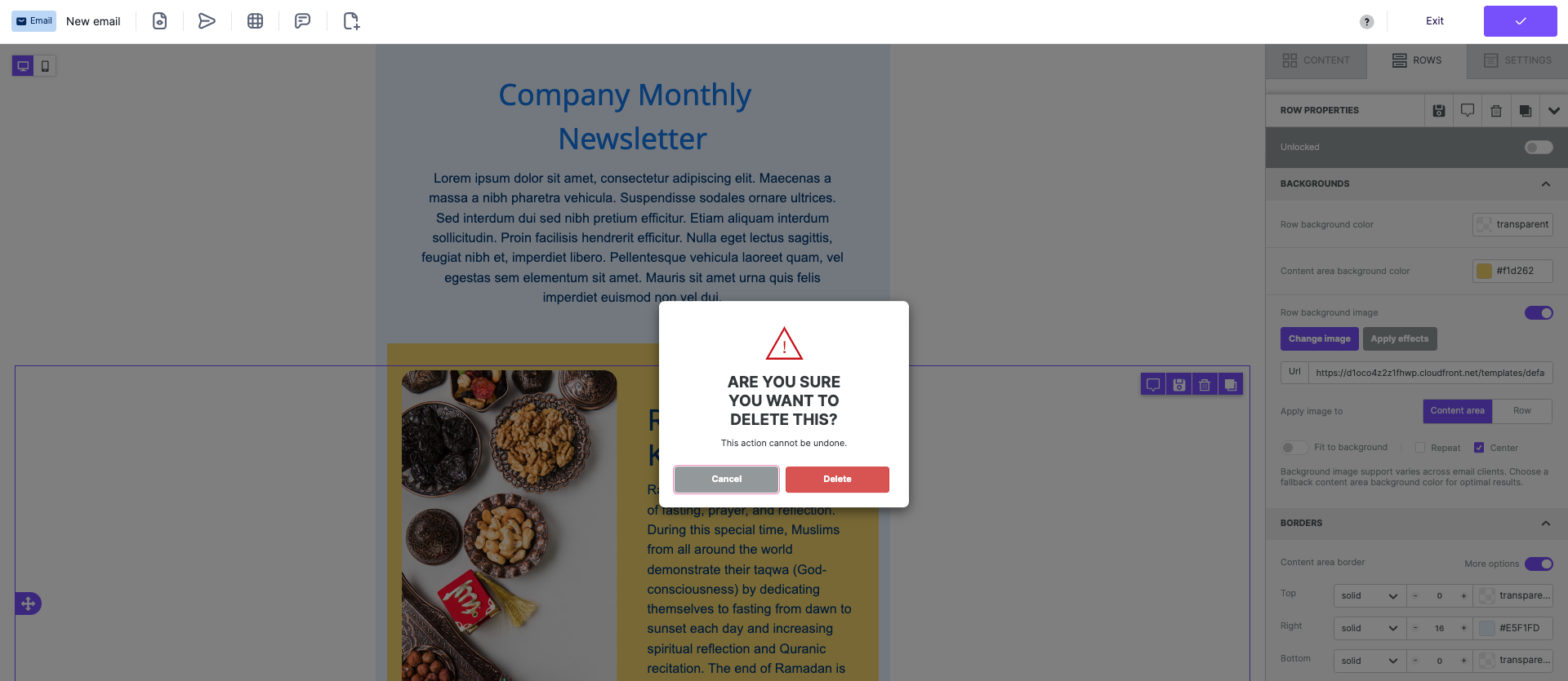
Beefree offers 1,500+ customizable newsletter templates to fit your individual company needs. Our drag-and-drop editor makes it easy for anyone on your team to simply swap out content, add your branding, and export using your favorite sending platform. The best part? It's free. Happy designing!


