
Design
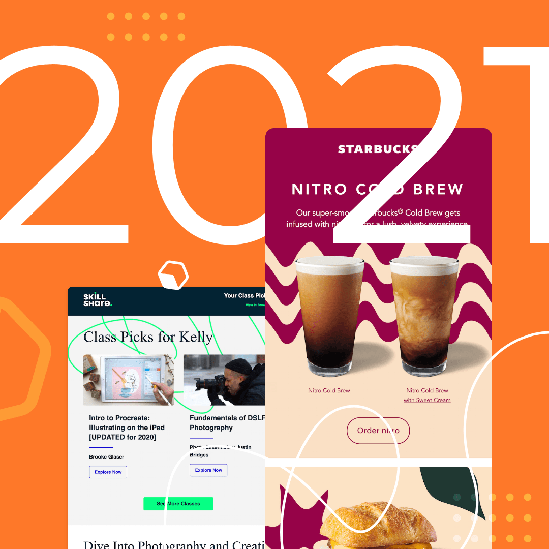
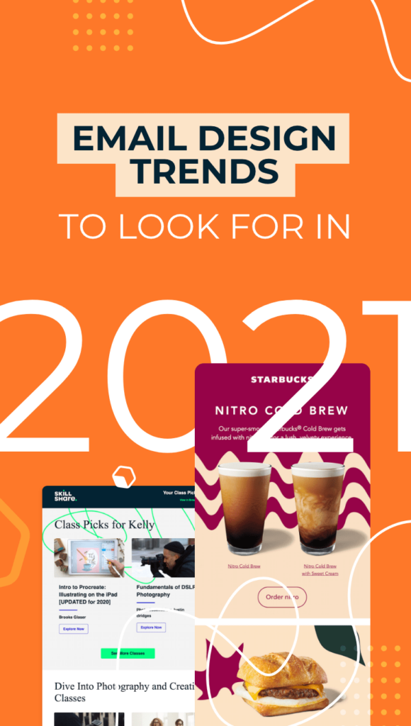
Email Design Trends to Look For in 2021
New year, new email design tactics? That’s a yes from us! Many businesses leaned heavily on email marketing throughout 2020. And email design will only continue to be essential into 2021. With the COVID-19 pandemic, more and more brands are relying on digital channels such as email to communicate with their customers.But the face of email marketing has changed. Email design trends are constantly evolving, and the pandemic has altered customer communications forever. By getting ahead of the biggest email design trends in 2021, you can effectively market your business via email. Email marketing is here to stay--but it's your job to stay on top of the latest trends. Here are the email marketing trends for 2021 that can help increase your engagement. (Looking for more email marketing trends? Check out this post from Jordie at Email Monday: The Future of Email Marketing & Marketing Automation. We're proud to be included!)
Email design trends are constantly evolving, and the pandemic has altered customer communications forever.
Minimalist design
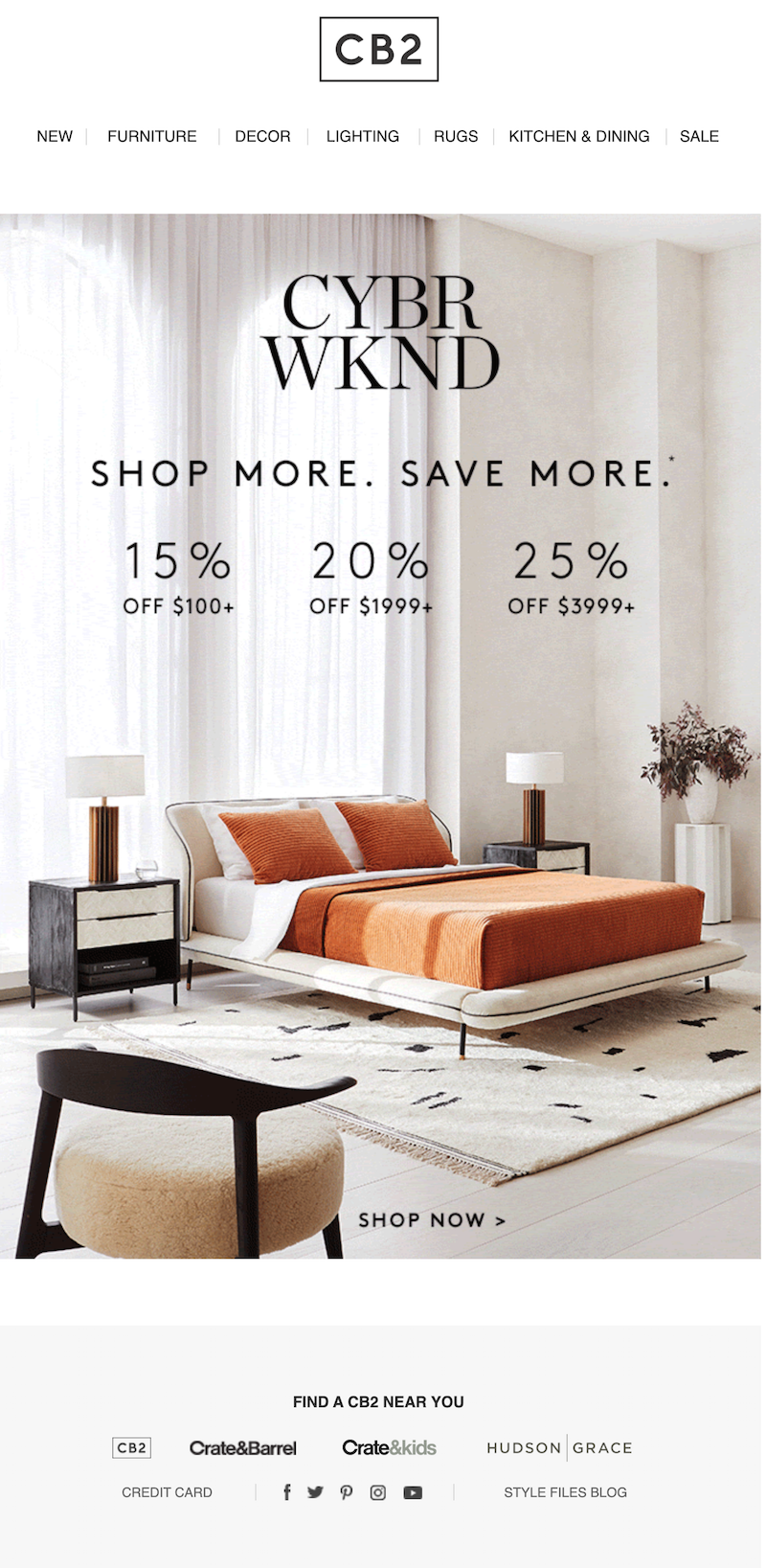
Keep things simple by designing minimalistic emails that are uncluttered, visually stunning and get the point across. Minimalistic emails have fewer design elements; they’re less distracting so your reader immediately knows what you want them to do.White space, easily readable typography and muted colors are all components that can go into designing minimalistic emails. This message from Crate & Barrel is essentially just a header and one image. The color scheme is light and airy and it takes the reader just a few seconds to take in the email and CTA — Shop Now.Subject line: it’s on: CYBER WKND SALE
Customer experience
With the onset of the COVID-19 pandemic, many customers transitioned to purchasing online instead of in-store. For many shoppers, these online buys may be their first digital shopping experience with your brand. So it’s your job to help them through the process as much as possible. You can incorporate customer experience into your emails by:
- Providing a direct link to open a support chat
- Answering FAQ’s about buying your products online
- Offering tips for navigating your website
That's what VideoAsk does here by providing a link to its Help Center in the email footer. The link takes readers to a landing page where they can search tutorials and articles to find the answer to their question. When your customers have a good digital experience, they’ll return to buy from your site again and again.Subject line: Camera shy? We've got the cure

Broken grid layout
Your email doesn’t have to use a traditional layout where all of your design elements are assembled in neat columns. One of the major email design trends for 2021 is a broken grid layout. Essentially, this type of layout makes it feel as if the email doesn’t have columns at all, switching up the structure for a different look. This BEE template is an example of an email with a broken grid.

Video in email
Video in email was a major email marketing trend we saw going into 2020, and videos will only increase in popularity in 2021. Videos can increase click rates by 65% and reduce unsubscribe rates by 26%! When you add videos to your emails, keep in mind that many big-name email platforms don’t allow video playback within an email (such as Outlook, Yahoo and Gmail). It’s best to embed a link to the video in your message (like GoPro does here) so your reader can open the video on your website, YouTube channel or a landing page.Subject line: Best of 2019 video

Dark mode compatibility
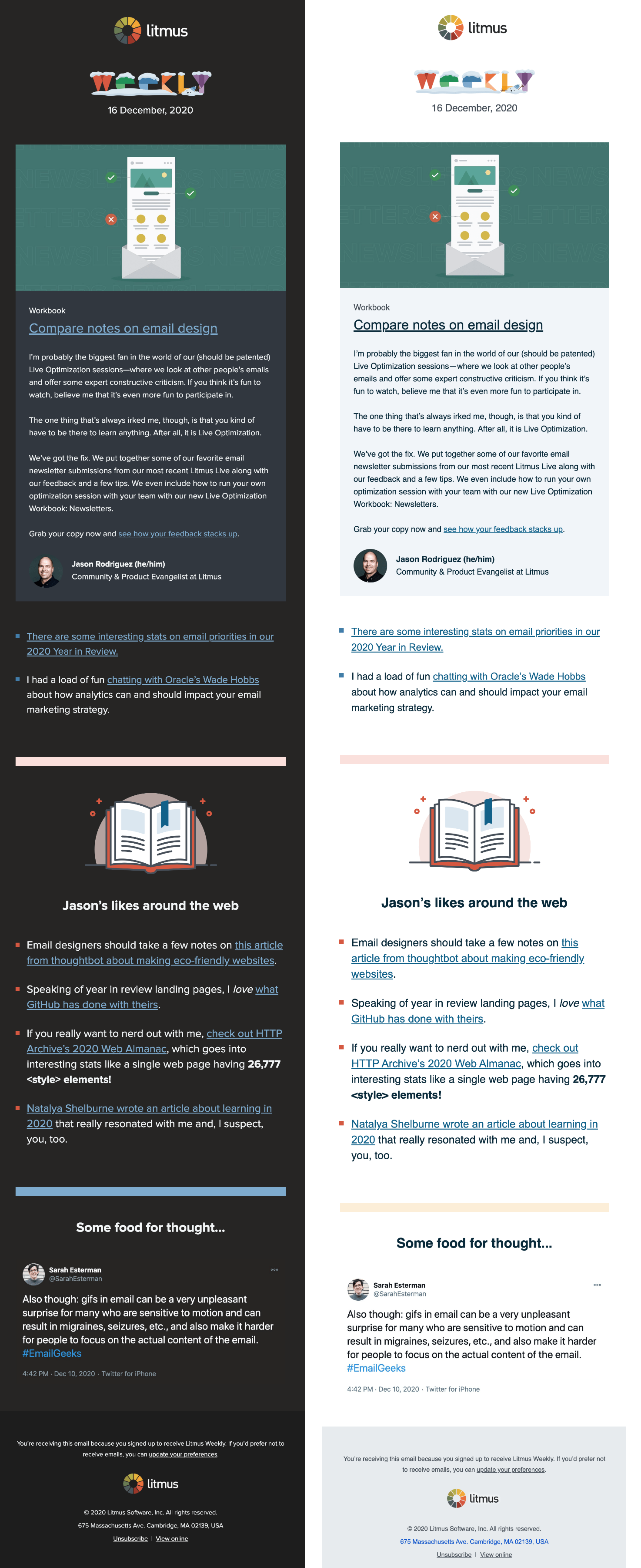
It’s absolutely essential to add provisions for dark mode into your email marketing strategy for 2021. Every day, more people start using dark mode to view email, so optimizing your emails to be read with dark mode turned on ensures everyone will be able to read your messages. Using transparent images, outlining black text in white and testing your dark mode emails are a few ways to make sure your emails are dark mode compatible. This winter-themed message from Litmus showcases dark mode and light mode done right.Subject line: Live Optimization comes to you, more stats than you can shake a stick at, and more
Connection and empathy
2020 has changed many things forever. The way companies communicate with their customers is one of them. This year, brands have learned to connect with their customers on a new level, keeping them informed about everything that’s going on and reminding them we’re all in this together. And that email marketing trend should carry over into 2021 and beyond.This empathetic message from Tuft & Needle’s CEO was sent in mid-March as the COVID-19 pandemic rapidly accelerated in the U.S. It kept customers in the loop and encouraged them to take care of themselves. But you don’t have to wait for a global crisis to show empathy to your customers. Focus on putting your customers’ needs first at every time of year.Subject line: An update from our CEO

Bold colors and text
One of the final email design trends in 2021 that we’re expecting to see is bold colors and text. Many brands are putting text across their hero image, like this stunning example from The North Face. This tactic is a good way to grab your reader’s attention and start the email off strong.Subject line: Get 30% off gear (and gifts) before they’re gone

Wrap-up: BEE editor
Start off the New Year on the right foot by using the BEE email editor to design your marketing emails and email newsletters. With BEE’s simple drag-and-drop editor, it’s easy to stay on top of the email design trends for 2021 and create emails that will get more engagement. Start designing for free today!
Share this post with your friends! Pin it on Pinterest ?

How 6 Brands Build Hype in Their Teaser Email Campaigns
We stand by a lot of email design best practices, and one of them is to make sure an email never feels like a waste of time. That's why you'll hear us say this a lot: Emails should be clear, simple and direct, always keeping the reader in mind. And when it comes to teaser email campaigns, this principle is more important than ever!Teaser emails (see the Nike example below) are where marketers give readers a short, sometimes mysterious preview about an upcoming promotion or event.Subject line: Coming 10.13 — member exclusive sale
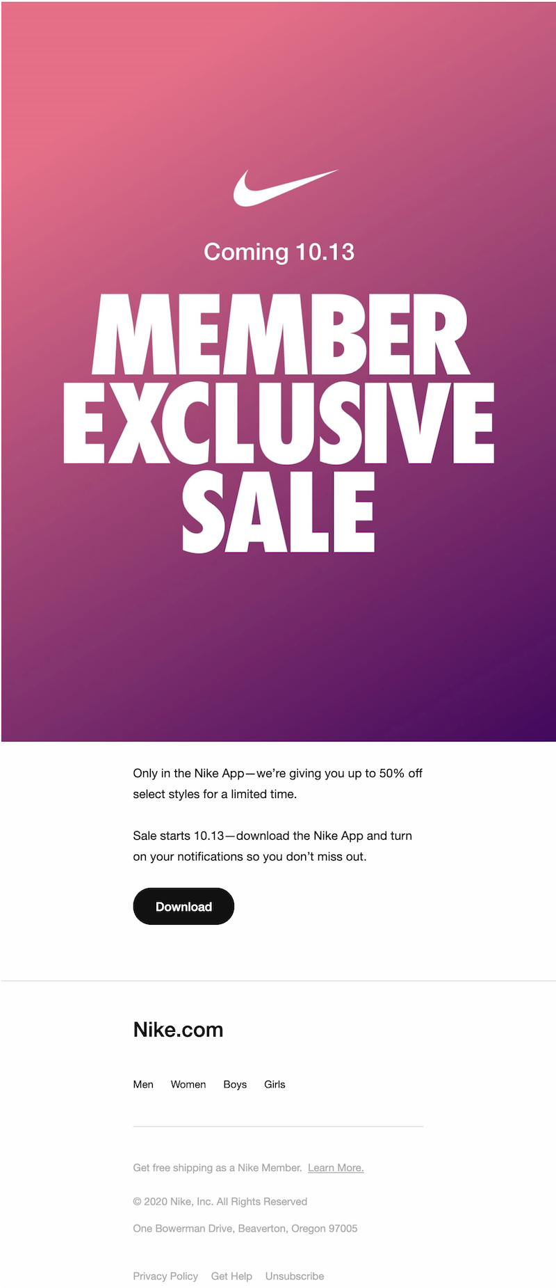
Teaser emails are a great way to build intrigue and prep readers for the email(s) to follow. Today, we'll look at how six different brands designed teaser email campaigns for maximum impact. Let’s get into the examples!
Teaser emails are a great way to build intrigue and prep readers for the email(s) to follow.
Best practices for teaser emails
The purpose of teaser emails is to tip readers off that something new and big is coming. When done well, these emails build intrigue and make subscribers feel like they're in on a secret.When building a teaser email, here's what you should keep in mind.
- Set a goal. What action do you want readers to take when they open your teaser email? Often, teaser emails ask readers to stay tuned, mark their calendars or preview a product that isn't yet available to purchase. If your message falls into the "stay tuned" category, your email might not have a call to action. In that case, you should think seriously about the email's purpose and value. You might want to set up an A/B test where some recipients receive a teaser email before an announcement, while others receive the announcement without the teaser. Then, you can test if the non-CTA teaser email increased conversion rates. It's important to be intentional about this because you don't want to lose readers' faith that you'll deliver timely, relevant content (that doesn't clog up their inbox).
- Align the call to action with your goal. Want readers to mark their calendars? Then give them an easy, actionable way to do that, like with an add-to-calendar CTA. If you want them to check out a new product before it launches, consider allowing readers to pre-order or join a waitlist.
- Have a vision for the whole campaign. In the spirit of not over-inundating readers with emails, consider how your teaser email plays a role within the larger campaign. Is it one of many emails, or one of three? A basic flow might be: teaser email, announcement email, follow-up email. A word of advice, though — don't send more than one teaser email. One heads-up is enough!
- Establish suspense in the subject line. It’s essential to get your reader curious from the very start. Otherwise, they might not even open the message.
- Get readers curious! The idea, after all, is to create a little intrigue. Use your design expertise to get creative! Set a countdown timer, partially reveal a product or make a now-you-see-it, now-you-don't GIF.
Let's look at how six brands did it.
Teaser email campaigns from our inbox
#1. Wrap Life
Subject line: The best sale of the year is coming
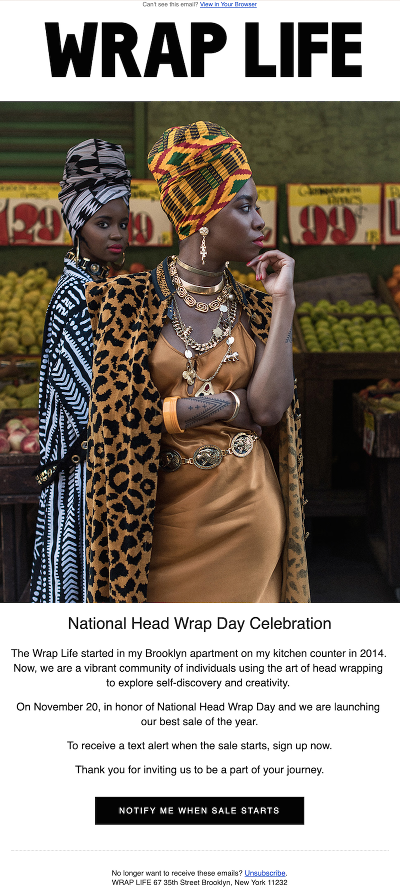
In honor of National Head Wrap Day, Wrap Life launched a major sale — and its email subscribers got the first scoop in this simple yet effective plain text message. Readers could tap the CTA to sign up and be notified when the sale went live.
#2. Carter’s
Subject line: Psst… something big is coming

From this teaser email, the reader can't be 100% sure what's coming — only that it’s definitely going to be good. Sent in mid-November, the email is appropriately decked out for the season and gets readers excited to hurry up and wait.
#3. REI
Subject line: Coming soon: Gear up get out sale

REI sent out a teaser email with an irresistible offer — be the first to preview the company’s sale catalog! Sending an email like this can help build customer excitement and make them feel like they're getting a sneak peek or exclusive deal. After all, there's major appeal in knowing you're the first to get to see or do something.
#4. The Lip Bar
Subject line: Something BIG is coming…
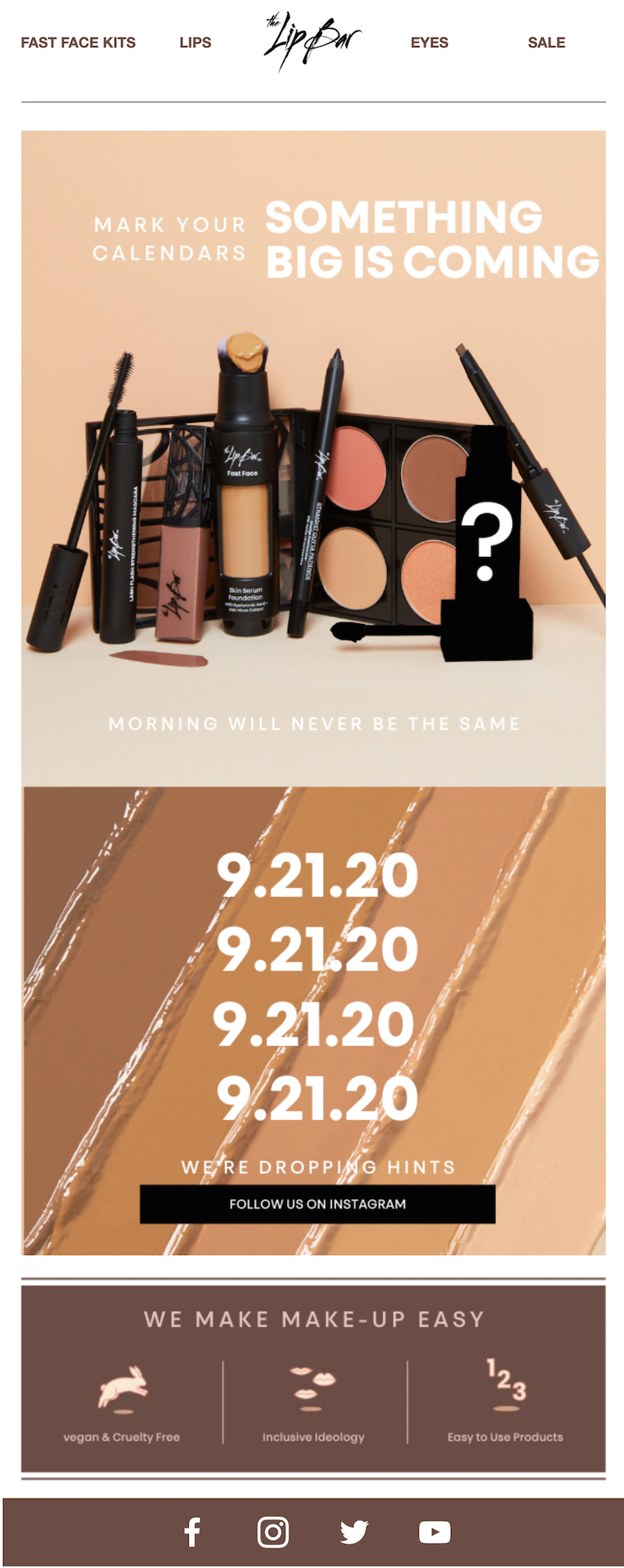
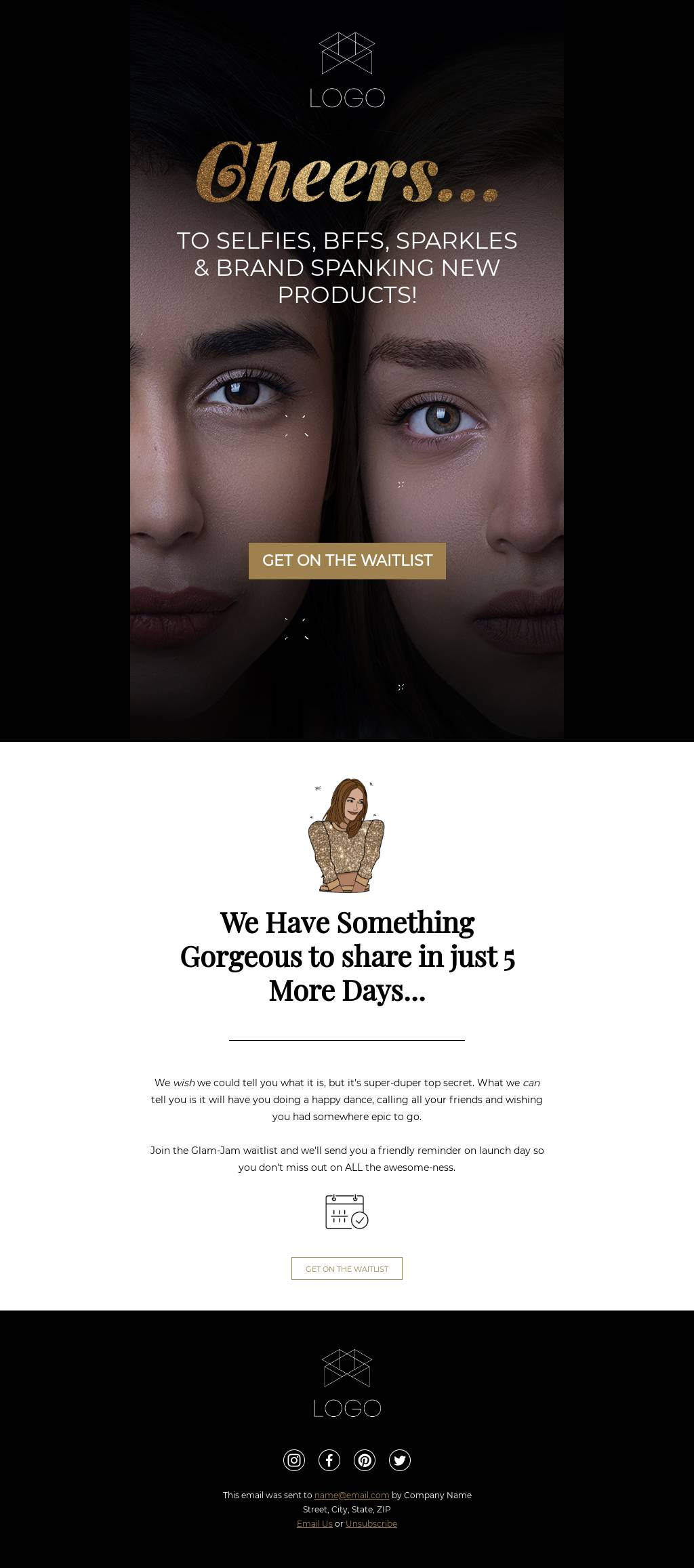
In this teaser email, The Lip Bar drops a subtle hint for a new product that’s coming up. A clever product photo shows one makeup product blacked out with a big question mark — a major hint for what’s to come. Then the email utilizes cross-promotion, telling readers they can learn more exclusive info by following the company on Instagram.
#5. Gilt
Subject line: Cosabella is returning. Get ready.

Gilt does a great job of creating curiosity in the subject line. Once the email is opened, it's clear that something big is on the horizon. The company even includes a specific date and time so customers can be sure they won’t miss out.
#6. Bose
Subject line: Get ready: We’re working on something big
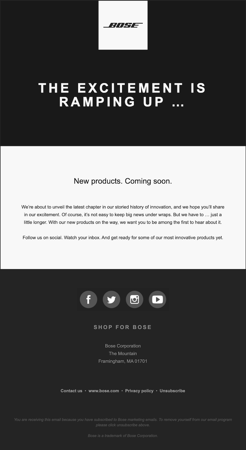
This teaser email from Bose advertises new products coming soon. With just a simple, on-brand black-and-white color scheme and a few lines of copy, the message makes you feel like something epic is coming soon. We’re on board!
Wrap-up: Build your own teaser email campaign
If you’re not already using BEE, sign up for a free trial of BEE Pro and get access to hundreds of templates and design features to create your own mysterious teaser email campaigns!
Share this post with your friends! Pin it on Pinterest ?
How to Choose the Best Font for Email
Selecting a font for your emails can greatly affect how easily your message is read, the overall mood it conveys, and how it appears across different email clients and devices. It's a small but crucial decision that can make or break the effectiveness of your communication. In this article, we’ll break down how you can choose the best fonts for your goals.
Why Fonts Matter
In your marketing emails, font choice is a bigger deal than you think. It serves several purposes:
- Readability: A font can make your messaging easier (or more difficult) to read. You want it to be comfortable and inviting for readers, including people with visual impairments.
- Branding: Some fonts have a modern aesthetic, some look traditional, some look more feminine or more masculine, and so on. The aesthetic theme of your font contributes to the overall brand your email cultivates.
- Emotion: Fonts can contribute to the feel or tone of your email. Whether you’re trying to create a fun or corporate vibe your font will impact this. How strange would it be to see a marketing email that was addressing a serious, somber topic using a comic sans font?
- Attention: Using fonts strategically can, along with your overall email design, guide readers’ eyes to where you want them to go. This can improve your conversions as you’re guiding readers toward making a purchase, booking a call, or whatever your call-to-action may be.
- Technical Rendering: One of the challenges with email marketing is that people in your mailing list are receiving your emails on a wide variety of platforms and apps: Gmail, the iOS Mail app, Outlook, and more. Not all fonts will render properly on all these platforms, so if you choose the wrong font, it could look completely different for some readers.
Each of these things on its own might seem minor. But together, they mean that your font is an important factor in how successful your email marketing is, and every conversion matters.
Best Fonts for Email
Thinking about all the ways your font can affect your email, it’s easy to get bogged down trying to analyze every font you can find online, searching for the perfect one or the perfect combination. Don’t worry; we’ve done the overthinking for you already.While your font choice for each email will ultimately depend on your brand and your message, there are certain fonts that work particularly well for emails. Our favorites are:
- Courier
- Georgia
- Lucida Sans
- Tahoma
- Times New Roman
- Trebuchet MS
- Verdana
- Arial
- Helvetica
Why are these so special? Let’s get into it.
Breaking Down Our Favorite Web Safe Email Fonts
As we noted above, one important factor in your font choice for emails is the ability of different email apps to render the font properly. The nine favorite fonts we listed are all known as “web-safe fonts.” This means that they’re common enough that nearly all email platforms are able to render them properly. If you want to make sure your emails are readable on all apps, these web-safe fonts are the way to go.But each of those fonts also has its own characteristics that make it excellent for email marketing. Let’s break them down.
Courier
Courier is a font people often associate with typewriters. It has a somewhat whimsical, old-timey look that can be perfect if you’re going for a vintage feel.

Georgia
Georgia is a font you’ve probably seen often in books and literature. It’s a popular choice for publishing houses and conveys a professional yet creative look in email marketing.

Lucida Sans
Lucida Sans is a font that is common in marketing emails and sometimes websites, but you don’t see it in many other places. Still, it’s a simple and easily readable font that could be perfect for your next campaign.

Tahoma
You’ve probably seen Tahoma font more often than you realize. It has a very simple but slightly modern look to it, which makes it ideal for some contemporary brands.

Times New Roman
Times New Roman is about as classic as it gets. It spent many years as Microsoft Word’s default font so chances are that you think of it as the font you used for all your school papers in your youth. It’s a font we all easily read and recognize which is perfect for email marketing.

Trebuchet MS
Trebuchet MS font might look familiar because it’s similar to Calibri, a default font in many word processors. It’s standard and clear, without making a strong impression toward any particular style, but it’s straightforward and easy to read.

Verdana
If you’re on the hunt for a font that is clear and readable but has a bit of a fun flair to it, check out Verdana. This popular email marketing font has a youthful but still professional look.

Arial
Arial font is about as simple and standard as it gets. It’s abundantly easy to read and uses fairly minimalistic characters, making it appropriate for a wide range of styles and brands.

Helvetica
As far as web-safe fonts go, Helvetica is the peak of modern chic. This font’s rounded characters and thin line give it a 21st-century look that’s ideal for brands who want the latest in style.

Drawbacks of Helvetica and Arial
While all of the fonts above are excellent for email marketing, there’s a specific issue that Helvetica and Arial face: excessive uniformity. In these fonts, some letters like p, b, q, and d, or i and l, are actually too similar to each other. That can make them tough for readers’ minds to quickly distinguish, leading to misinterpretations.Does that mean you should avoid these fonts? No. It just means you should be mindful of how and when you use them. For example, they might be the wrong choice if your messaging contains words that might contain several of these uniform characters, like abode, abide, illicit, or dabble.This is actually an issue that affects many serif fonts. What are serif fonts? We’ll get into that while explaining the different types of fonts below.
Types of Fonts
In the world of typography, there are four basic types of fonts: serif, sans serif, decorative, and script. These each have different properties that affect how readable they are and how and when they should be used.
Serif Fonts
Take a look at some text in Times New Roman for a moment. Consider the capital T. You’ll see that it has little lines that come off the bottom of the T, and off the right and left sides of the top line in the T. These little lines are called serifs. You’ll find them on nearly all letters in Times New Roman.Fonts that contain those serifs are known as serif fonts. Not only do these serifs add a bit of an elegant flair but they can make fonts more readable because you don’t have the problem of excessive uniformity. Of the ideal email marketing fonts we listed above, the serif fonts are Courier, Georgia, and Times New Roman.
Sans Serif
While serif fonts are those that contain serifs, sans serif fonts are those without serifs. As far as email marketing fonts go, Lucida Sans, Tahoma, Trebuchet MS, Verdana, Arial, and Helvetica are all sans serif fonts.
Decorative
Decorative fonts are fonts that are, well, decorative. They’re highly unique and are usually designed with a niche look that portrays a specific theme. These fonts are designed not necessarily for readability but to catch someone’s eye. For example, you’ll often see these in titles on posters or other design projects, as well as social media graphics and so on.
Script
A script font is a font that looks like cursive handwriting, generally. These fonts, like decorative fonts, are best reserved for titles and other areas in which you want your text to catch a reader’s eye but where there isn’t much text to read, because they aren’t easy to skim at a glance. Script fonts typically have a decidedly elegant, classy look.
Best Fonts for Email Body Text
Your email’s body text and header text have different goals and needs. When it comes to body text, the key is for the text to be easy to read smoothly and quickly. You want readers to be able to read it comfortably rather than struggling to interpret each word. That comes from fonts that don’t just use simple and straightforward lines but that have an appropriate amount of space between each letter and word.In general, choose a serif font for body text in emails with longer blocks of text - these fonts are perfect for quick reading. Georgia, Verdana, or Times New Roman are typically best. We tend to scan through emails, and fonts like these have wide enough spacing that we can catch everything even as we skim.
Best Fonts for Email Header Text
In your marketing emails, headers are all about snatching a reader’s attention and pulling them in. The fonts need to be readable, sure, but because your headers are brief, they don’t need to be as easy to skim as body text does. You also want to make sure there’s some contrast between your header font and your body font. This allows your headers to stand out and pull in the reader’s eye.As we noted, serif fonts are ideal for body text. An excellent way to contrast them, then, is to use a sans serif font for your headers. You don’t want two fonts that have so much personality that they clash with each other - you want them to have a natural flow. Any of the sans serif fonts we named above, like Helvetica, Tahoma, or Verdana, can be excellent for headers.Note that you also want to distinguish between your header text and body text in other ways. Make your headers a larger font size than your body text, for example, and make them bold. This makes it clear to readers that these headers are telling them what they’ll learn from each section of your email.
How to Integrate Custom Fonts in Emails
There are cases when you might want to use custom fonts rather than standardized web-safe fonts in marketing emails. For example, you could use them to call out a very clear and simple message, like “Flash sale today!” or “Tickets now on sale!” in a very brand-specific font. What’s the best way to do this?Because custom fonts often won’t render properly on many email platforms, it’s best to use an image instead. Use design software to create an image that contains your message in the custom font and place this in your email body. Then, you can use a web-safe font below the image to go into more detail now that the image has grabbed the reader’s attention.There are a few caveats to keep in mind here. First, some of your readers might have images disabled in their email platforms, and in that case, they won’t be able to see that snazzy image with your custom font. Usually, this isn’t a large percentage of your readers, though, so it’s a risk that could be worth taking. Second, remember that some of your readers may have visual impairments, so they might be using text-to-speech features. Those features won’t be able to read the text in your images, so it’s vital to include alt text for the image that tells these readers what the image says and shows.
Typography Best Practices
Choosing a font is just one aspect of designing the typography for your marketing emails. There are other factors and best practices you can use to make your emails more impactful and to drive conversions. Like choosing a font, your other typography choices will affect whether your email catches readers’ attention, how well your emails embody your brand, where readers’ eyes move throughout the screen and more.
Size
When it comes to email text, size matters. If your text is too big, you’ll have big blocks of text that turn off readers. If it’s too small, it’s hard for readers to read it comfortably. So what’s the middle ground? For body text, a 14-point font is considered the gold standard, though anything from 10-16 can work depending on the font. For headers, the rule of thumb is to go no larger than 36-point font. Even adding just 3-4 points to your body text can create large enough headers that stand out, assuming it’s a different font and bold.
Color
The colors you choose for your marketing emails are just as important as the colors you use in any other piece of branded marketing. Ideally, use your custom brand colors and, within your assortment of brand colors, choose colors that embody the feel you want for your email.What are the best practices for colored text in your emails? Remember that body text is all about easy readability, and headers are all about grabbing attention. In general, it’s best to use color in your headers but not in your body text. The color you use should depend, though, on your email’s background color. There are certain rules for readable color combinations, like using black text on a high-contrast color background or using white text on rich, dark colors.
Bold
Bold font can be an excellent tool in directing the reader’s eye in a marketing email. It’s great for headers, helping these high points stand out. Within the body of your email, though, you can also use brief bold text to call attention to certain phrases. This can be a smart choice for particularly impactful phrases, like this:“Our latest webinar is your go-to guide for doubling your sales in the next three months.”Remember, though, that the more text you bold, the less impact it has because it no longer stands out. Less is more.
Link Formatting
Adding links to your email text can be an excellent way to further engage readers and prompt conversions. You don’t need to stick with the standard blue, underlined text for links. You can get creative by bolding links and/or putting them in one of your brand colors. This makes them better flow with the design of your email while calling attention to them. But make sure they’re just as readable (both before and after they’re clicked) as the rest of your body text.
Text Alignment
For US-based audiences, their eyes immediately start on the left side of their screen because they read from left to right. It might sound like a small detail, but aligning your text to the left makes it easier to read because it coordinates better with your audience’s natural flow.
Getting Started with an Email Editor
If all of this sounds like a lot to keep straight in designing your emails, you’re not alone. It is a lot of heavy detail! The easiest way to put all these best practices to use without getting overwhelmed is to use email templates that do it for you.Beefree’s email templates narrow your font choices to the best fonts for email marketing and give you the option of pre-selected color schemes and other design choices that are specifically curated for email marketing. At the same time, unlike many email design platforms, Beefree also gives you the option to add custom fonts, like your own brand’s font, for your convenient use. To see how easy it can be to reap the benefits of impactful, brand-building, conversion-driving emails, check out Beefree’s email templates and sign up for a free account today.Editor’s Note: This post was updated on May 2023 to ensure accuracy and comprehensiveness.Save
How to Send A Happy New Year Email to Your Business Clients
The New Year is coming up and we’ve never been more ready for a fresh start. We’re guessing many of you feel the same way — and your customers and clients probably do, too. Start the New Year off right by sending a Happy New Year business email to thank the people who’ve made your year a success. Here are a few ideas to help you get started with your New Year’s email design.
Start the New Year off right by sending a Happy New Year business email to thank the people who’ve made your year a success.
Why send a Happy New Year email for business?
The new year is a good time to reflect on everything you’ve accomplished over the last 12 months. And chances are, you didn’t achieve your successes on your own. In one survey, 91% of people said they were more likely to do business with a company that appreciated its customers and clients. That’s why it’s essential to show some love to yours! Use these tips for a Happy New Year business email to set your company up for success in the coming year.
Decide who should receive the email
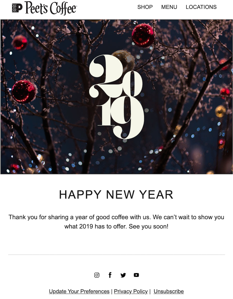
Consider creating a few different Happy New Year emails to go out to different audiences. Send one to your customers and email list, encompassing anyone who has purchased from or interacted with your brand in the past year. Create another message to go out internally, thanking each of your team members for their contributions during the past year. And you may want to send an email to your suppliers or companies you’ve partnered with as well. This Peet’s Coffee email is directed to customers of the company — a fact that’s clear from the email’s copy and tone.Subject line: Happy New Year from Peet’s
Consider your tone
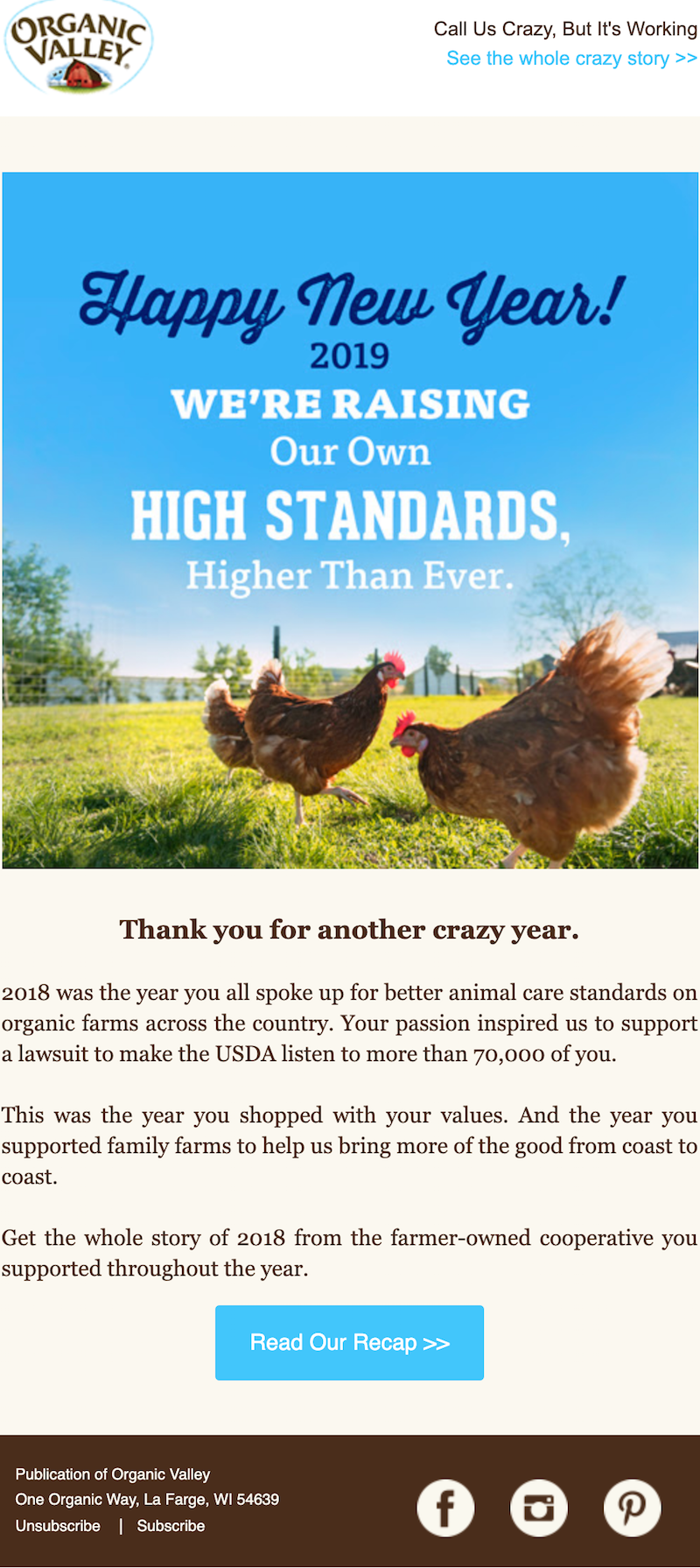
The tone of your Happy New Year business email will vary based on the audience who will be reading that email. Are you writing to your customers, suppliers or employees? Each group will require a different tone. In this example, Organic Valley is speaking to its customers. The company’s tone is straightforward and direct, recapping the year and saying a genuine thank you to readers.Subject line: Happy New Year! ?
Focus on your readers
It’s nice to recap your company’s year and share the successes you’ve achieved over the past twelve months. But it can also be a good idea to turn the focus away from yourself and onto your clients or customers. Tell your customers that you’ll be there for them to help them achieve their goals and dreams in the new year. You could even invite them to hit reply and share their New Year’s resolutions, creating an opportunity to interact and start off the year on the right foot (then use their replies to create user-generated content later!).

Set the scene
Even though a New Year’s email comes on the tail end of the holiday season, your readers are probably still in holiday mode. Use your email design to give a nod to the festivities. Try using gold accents or scripted fonts to give your Happy New Year business email a little pizzazz. MealPal added a confetti-filled background in this New Year’s email to set the tone for January 1st.Subject line: Here’s a little New Year treat ?

Personalize your messages
No matter who you’re sending your New Year’s email to — whether your customers, employees or a different segment altogether — make sure to customize the email to that group of recipients. Adding first names and direct, personal copy helps your readers feel valued as you speak right to them.
Wrap-up: Happy New Year email template
The end of the year is busy enough as it is. Don’t create extra work for yourself! Work off of the same base Happy New Year email template, simply tweaking the copy to make it appropriate for each separate email you send. Our New Year’s email templates are easy to customize using the BEE email editor. Just pick your favorite email and add your images and text (plus any brand visuals you desire). Then send your best wishes for the New Year business email off — reinforcing your relationship with your customers and employees as they ring in 2021!
Share this post with your friends! Pin it on Pinterest ?
4 Ways to Send a Happy New Year Email to Clients
As 2022 comes to a close, we're preparing to send our last emails of the year. Among them is a Happy New Year email to clients: sending a Happy New Year message to our customers makes perfect sense: they're the ones that keep us all in business, and they deserve a heartfelt "Thank You!!".To get inspired, we're looking back at some of our favorite New Year's email greetings from the past couple of years. Most of these messages fall into one of these four categories:
- Personal notes
- Promotions
- Short and sweet messages
- Year In Review emails
Whether you're sending a Happy New Year email to clients, customers, colleagues or friends, there's plenty of inspiration here to make your message beautiful and bright. Scroll on to get inspired and then head over to our template catalog to browse over 30 free new year email templatesand quickly design the perfect message for your New Year campaign.
#1. New Year emails with a personal tone
It’s the perfect time of year to reflect on months past and express your thanks to everyone who supported, followed along and invested in you. To show gratitude, many Happy New Year emails have a personal touch, whether it's a note from a CEO or photos of staff.
Function of Beauty
Subject line: New year, but we’re still doing us
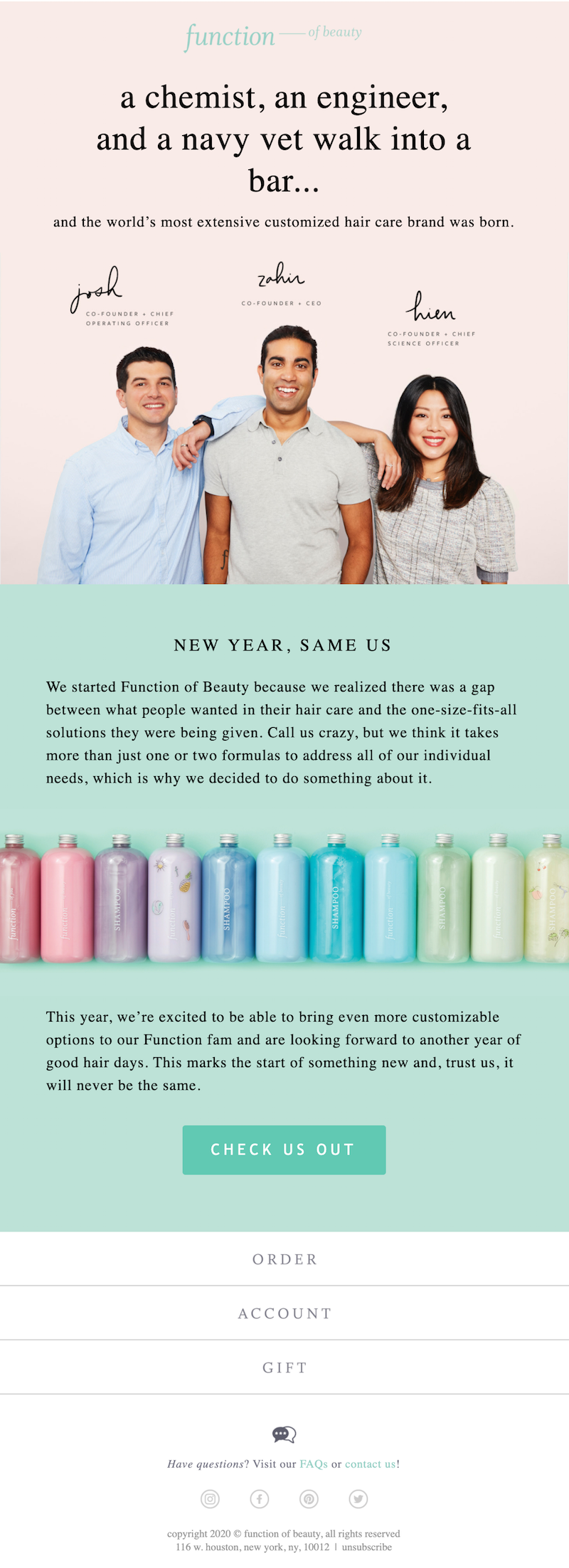
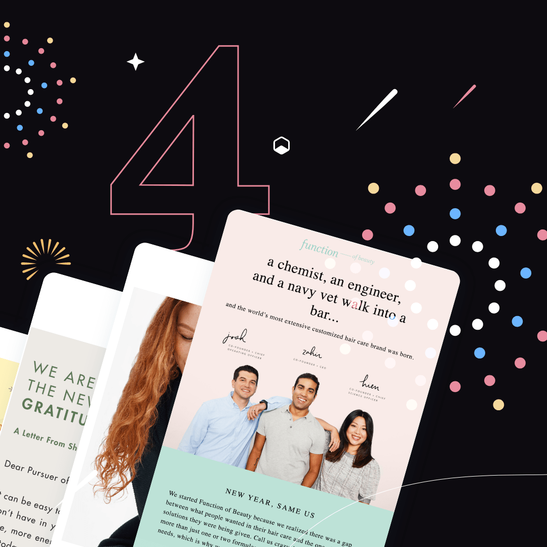
This Happy New Year email from Function of Beauty does a great job of reinforcing brand awareness and putting a face to the brand.
Pursoma
Subject line: A Well New Year ✨

In this personal letter, Pursoma CEO Shannon Vaughn expresses gratitude to her company’s customers and shares what she’s thankful for. This heartfelt message is succinct but impactful, creating genuine engagement that resonates.
Still House
Subject: HAPPY NEW YEAR!
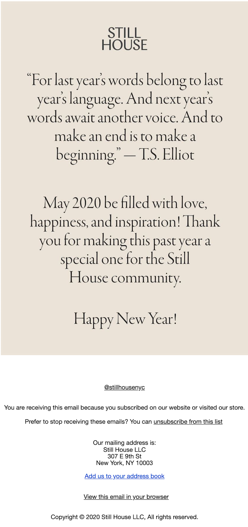
Here's an example of a Happy New Year email that keeps it simple with a thought-provoking quote and a brief Happy New Year message. The pale background color and basic font create a look that’s elegant, yet easy to read (and create).
#2. Promotional New Year emails with a nudge to buy
While some New Year emails take a break from offering deals and promotions, others add an incentive to click.Customers have a ton of momentum to purchase during the New Year and an email is a great way to direct this traction to your website or landing page.These promotional emails have a good balance of messaging that says Happy New Year while also giving readers a reason to purchase.
Indie Lee
Subject line: Don’t *stress* - new year, NEW products

Who doesn’t want to start off the New Year with a healthy dose of zen? Here, Indie Lee highlights a few products that can help readers start off the year in the zone.
J. Crew
Subject line: New year, new sweaters

While the copy in this J. Crew Happy New Year email may not have aged well, this is still a great example of a fun New Year’s promotion. We love the “Wear it with” section, helping customers envision how J. Crew’s sweaters can be paired with other products to create a full outfit.
Eileen Fisher
Subject line: New year, new blueThis New Year email from Eileen Fisher is a play on the “New Year, new you” concept, showcasing several blue sweaters that are on sale.

#3. Reflective New Year emails featuring a year in review
There's a big window for sending a year-in-review email. We typically see them land in our inbox anywhere from the last week of December all the way through mid-January. Year-in-review emails generally round up or summarize a brand's highlights, achievements or big moments of the year. Here are a couple of examples.
OptiMonk
Subject line: Thank you for being with us in 2019! Here are our favorite moments…
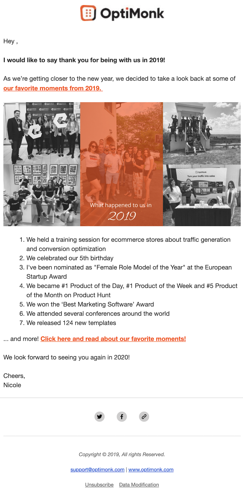
This email from OptiMonk is nicely structured and easy to read with 2019’s high points shared in a bulleted list. The images also add a personal touch.
Linjer
Subject line: Thank you for a wonderful 2018
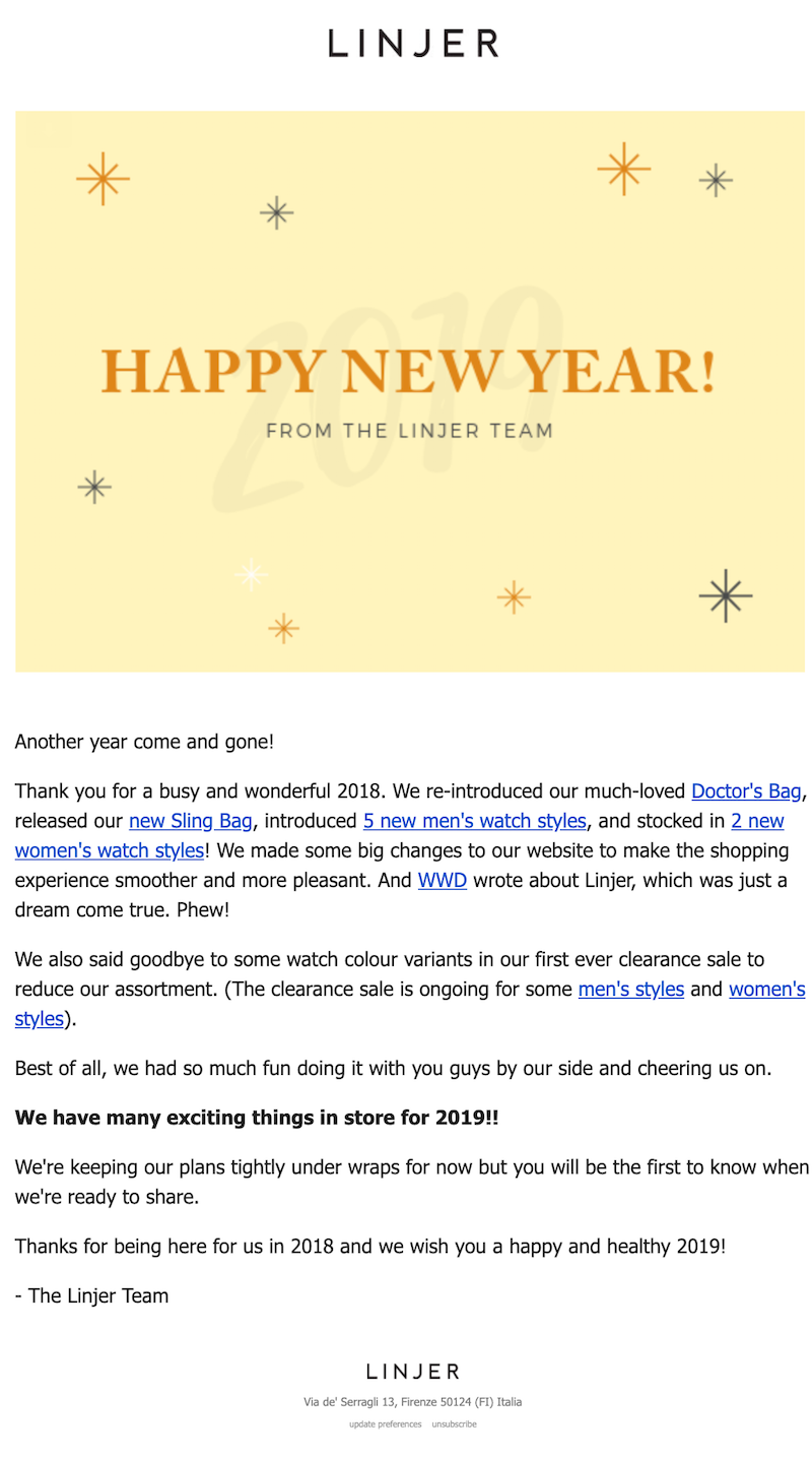
Linjer recapped its year with a few brief lines of copy primarily focusing on new product launches and products that had been removed.
#4. Short and sweet
Not feeling sentimental, reflective or promotional? That's okay — plenty of brands send short and sweet Happy New Year emails that do the trick. These emails still accomplish the goal of getting your brand name in front of readers over the holidays. Plus, they’re a lot of fun to send!
The North Face
Subject line: Happy New Year, explorers

This email from The North Face is absolutely perfect for the company’s audience and brand. It’s fresh, fun and imbued with a sense of adventure for readers to carry into the New Year.
Michael Kors
Subject line: Happy New Year!
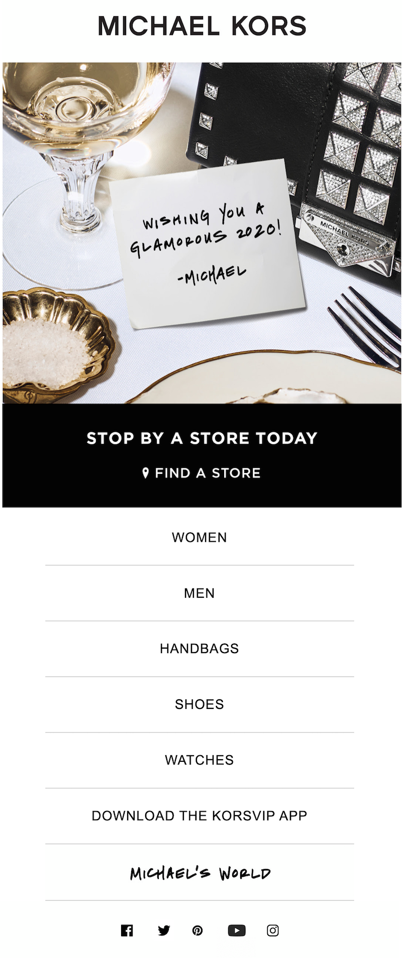
Like The North Face’s email, this message from Michael Kors is perfectly on-brand — it’s elegant, sparkly and refined. We love the handwritten touch.
Wrap-up: Happy New Year email templates
Need to quickly send your New Year's email greeting? Check out BEE's many free Happy New Year email templates. There are over 30 of them in our template catalog and some great Happy New Year landing pages too. You can immediately customize the text, replace images, move or remove content blocks — you name it. It's simple and fast, and all templates are created by professional designers. Happy New Year, and happy email designing!
Share this post with your friends! Pin it on Pinterest ?
Updated December 20, 2022.
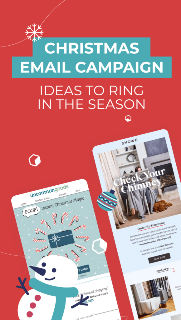
Christmas Email Campaign Ideas to Ring in the Season
It’s beginning to look a lot like Christmas — and after the kind of year 2020 has been, we’re ready for a little holiday cheer! This year, holiday e-commerce spending is projected to be bigger than ever. Prepare for the most wonderful time of the year by creating a Christmas email campaign that will connect with your customers and boost sales! Check out these Christmas email campaign ideas for some inspiration as you design your own Christmas messages this year.
Prepare for the most wonderful time of the year by creating a Christmas email campaign that will connect with your customers and boost sales.
Write festive Christmas email subject lines
Your Christmas email marketing subject lines are among the most important parts of your holiday emails. Emojis are popular, with small Christmas trees, gift boxes and Santa heads peppering our inboxes. We're also seeing the keywords "gift," "holiday" and "Christmas" pop up over and over. Experiment with different combinations of Christmassy words and emojis, testing different Christmas email subject lines to see which ones work best.

Consider your timing
Timing is everything when it comes to Christmas emails. Don’t be afraid to start early; consumers are prepared to see Christmas marketing messages as early as the first weeks of November to promote those early December sales. As we get closer to the holiday, you’ll want to tweak the content of your messages, ditching the early-bird sales in favor of promoting things like fast shipping. Here, Pai Skincare does a great job of plugging its e-gift cards on Christmas Eve.Subject line: ? We can get to you today

Explain your COVID precautions
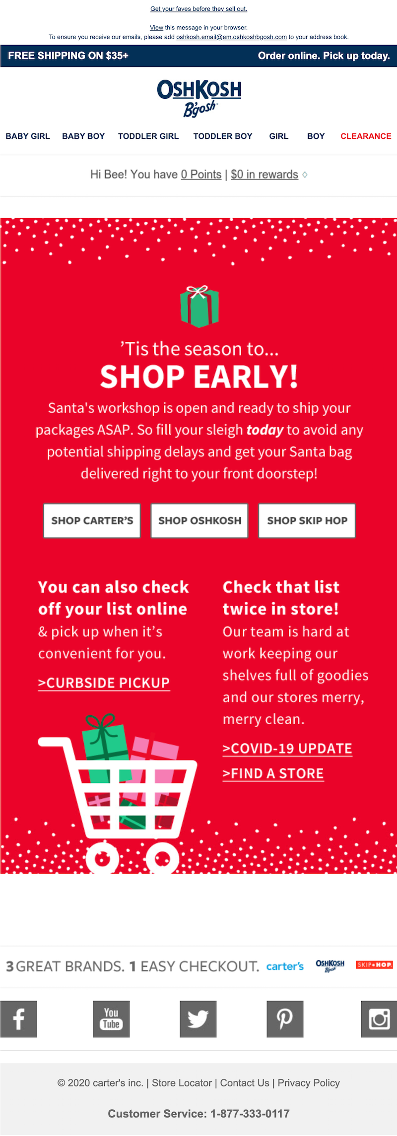
We don’t have to tell you that this year looks different for retailers and shoppers. Many consumers are planning to shop entirely online to help stop the spread of COVID-19, and the shoppers who are venturing into stores want to be reassured that they’ll have a safe shopping experience. Use your Christmas email campaigns to explain what you’re doing to keep your customers safe. In this festive email, Oshkosh shares three COVID-related messages:
- Encourages customers to shop early to avoid potential shipping delays
- Tells customers they can shop online and pick up their purchases curbside
- Shares how employees are keeping stores clean
Oshkosh makes it easy for customers to shop, even during a global pandemic.Subject line: 8 weeks till Christmas!!!
Choose a different color combo
The pale blue hues in this Christmas email from Snowe provide a refreshing change from the reds and greens our eyes are bombarded with during the holidays. We also love the body copy, encouraging customers to order now so they don’t have to wrap a printout of the gift. And the section of bestselling products at the bottom is easy to customize for each customer based on their browsing history.Subject line: Order by tomorrow, get it by Christmas

Get creative with your sales
When it comes to holiday sales, you might be tempted to slap a 20% off sticker on your entire store and call it a day. But by getting a little more creative with your promotions, you can be more memorable and increase your sales. Draper James hosted a 12 Days of Gifts event where different products were on sale each day. In the email below, the company announced that all plaid items were 30% off with the code MADABOUTPLAID. This is a fun way to add a little pizzazz to a holiday sale and push your customers toward products that they may not have considered purchasing on their own.Subject line: The most Christmas-y dresses ever ?

Offer 12 days of deals
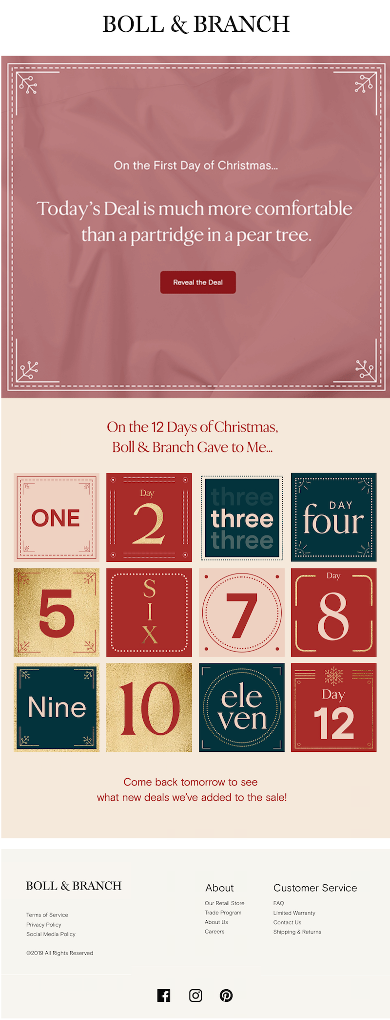
Draper James isn’t the only company offering 12 days of deals — this fun marketing scheme is fairly popular among the brands in our inbox. Here, Boll & Branch shares a secret, special promotion that turns out to be a discount on the company’s sheets. A handy vintage-looking calendar lets customers keep track of where they are in the 12 days of deals.Subject line: It’s Day 1 of our 12 deals of Christmas!
Here’s another example from Lucky Brand Jeans. This brand uses a festive gold color scheme to share its “12 Days of Giftmas” deals.Subject line: LAST DAY: Order and get it now for Christmas!

When it comes to Christmas email campaign ideas, this one is both fun and effective: The more chances for your customers to save, the better.
Be clear about your offer
Don’t fall prey to the temptation of taking up lots of space with flowery Christmas decorations or unnecessary design elements. Keep things simple and clear so your readers immediately understand what’s being offered. In this Christmas email, Yankee Candle’s promotion is immediately stated: All large candles are 5 for $55 for a limited time. Then the email goes into other product photos and less important CTA’s. The important stuff is at the beginning of the message, where it can’t be missed.Subject line: NOW: 5 for $55 large candles — 5 days ‘til Christmas!

Send a holiday gift guide
Here’s another one of the Christmas email campaign ideas that frequents our inbox in December: personalized gift guides to help shoppers find presents for friends and family. Toy brand Melissa and Doug shared an entire blog post on this topic and sent the post to its readers via email:Subject line: Best gifts for toddlers & kids (and why!)

You can categorize your gift guides as broadly or as specifically as you’d like. Lucky Brand Jeans (above) simply shared two sections of products — one for men and one for women. Depending on your industry, the nature of your product and how many products you have available, you might choose to separate out your gift guide into a larger number of sections. KEEN Footwear sent out a holiday gift guide with ideas for hikers, sledders and paddlers (how cute is this illustration?).Subject line: Gift ideas inside

You can also group products by price so budget-conscious consumers can find what they need. Sharing a gift guide via email is a smart way to help your customers make a purchase from you this Christmas.
Use GIFs
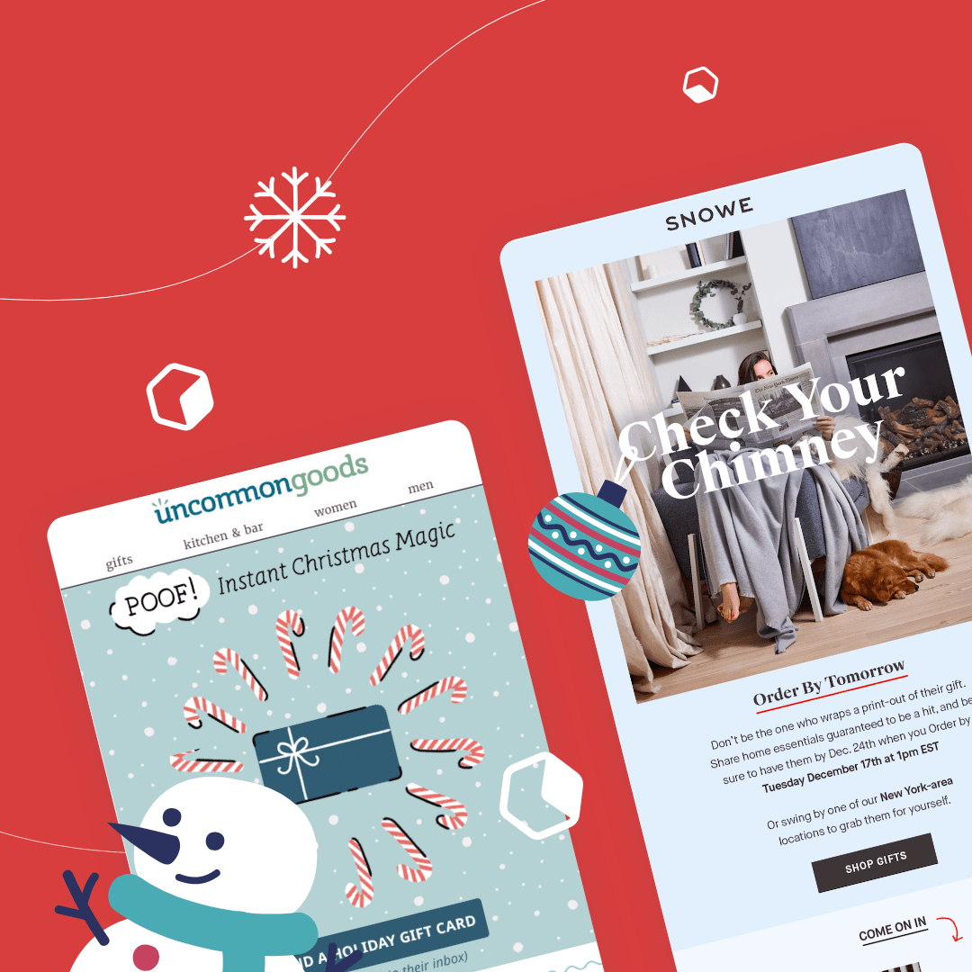
There’s no better way to get into the Christmas spirit than a festive GIF or animated illustration! In this cute email from Uncommon Goods advertising holiday e-gift cards, a circle of candy canes surrounds a gift card. As you watch, the candy canes all flip the other way and then back again while snow falls in the background of the GIF.
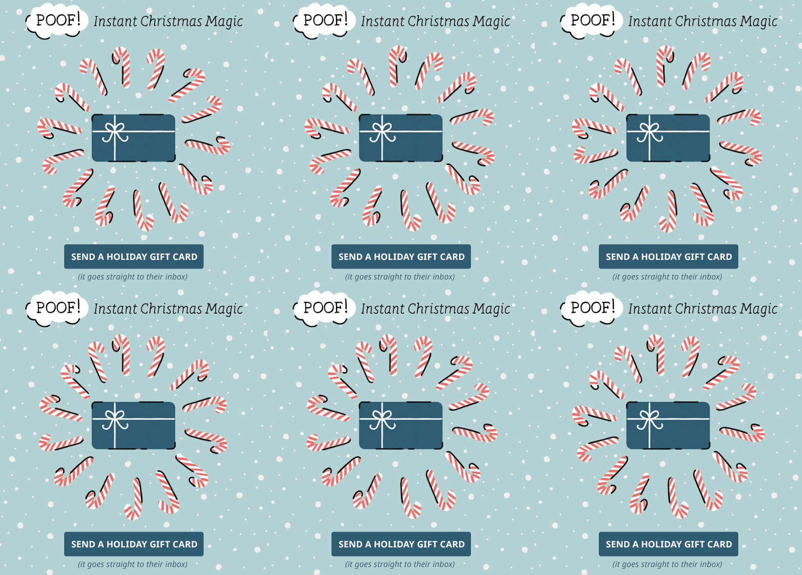
Here's the full email:Subject line: There’s still time to save Christmas
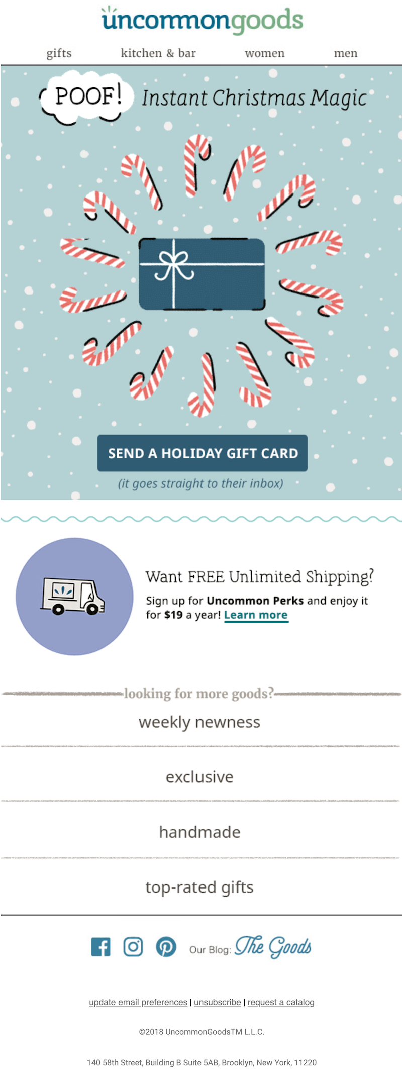
This Christmas email marketing idea is an eye-catching, fun way to help the message stand out.
Wrap-up: Christmas email templates
Now that your head is spinning with Christmas email campaign ideas, it’s time to create your own! Check out our Christmas email templates to get started. You might like this Your Wish List Is Here message designed by Navid Nosrati:
Or this adorable Christmas Restaurant Food Delivery email created by Oksana Melis Barsukova.
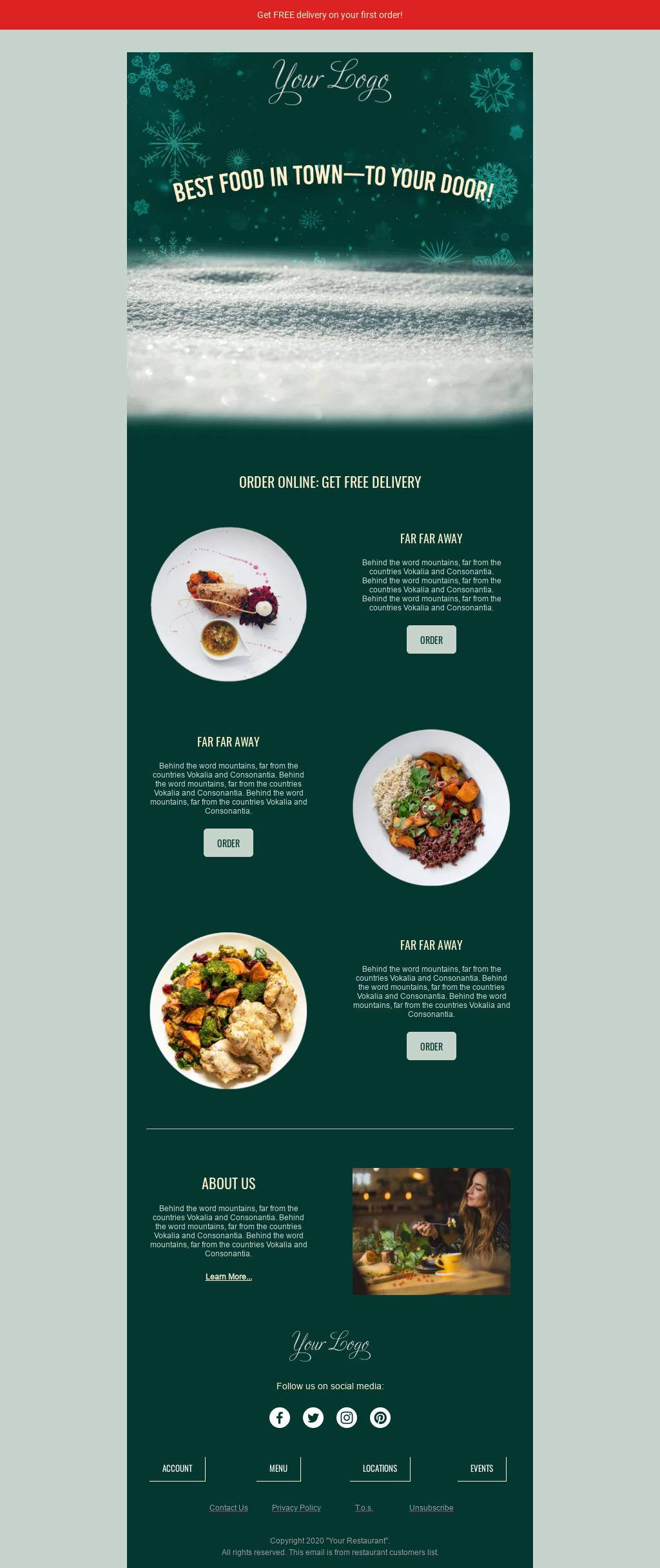
Happy designing — and happy holidays from all of us at BEE!
Share this post with your friends! Pin it on Pinterest ?

Design Tips for Using Background Colors in Email
How do you add visual interest to your emails? If you’re like most brands, you probably rely heavily on product images and graphics. There’s nothing wrong with that. But you might be overlooking an easy way to create more engaging marketing emails: Email background colors!Background colors can organize content and establish hierarchy. When they’re used behind images, they can even reinforce your design when image-viewing is turned off. In fact, color can improve audience comprehension by 73% and, according to the same study, marketing with color is read 42% more often than marketing in black and white. Plus, HTML background colors render across all inboxes and are easy to create.
Email background colors can organize content and reinforce your design. Plus, they're easy to create!
Many emails will maintain a white background and reserve color blocking for headers and footers. This visually separates intro and outro content from the body of the email. Here’s an example from Crate & Barrel that uses a white and gray background in the body of the message, but includes a pop of red in the header.

Using a simple color palette and incorporating plenty of white space are best practices in email design. But there are also emails that pull off background colors in a fresh and inspiring way — and not just in headers or footers.
Tips for selecting email background colors
Here are a few key tips for using email background colors creatively in email, with inspiration from brands that aren’t afraid to go bold with color.
#1 Select a color scheme
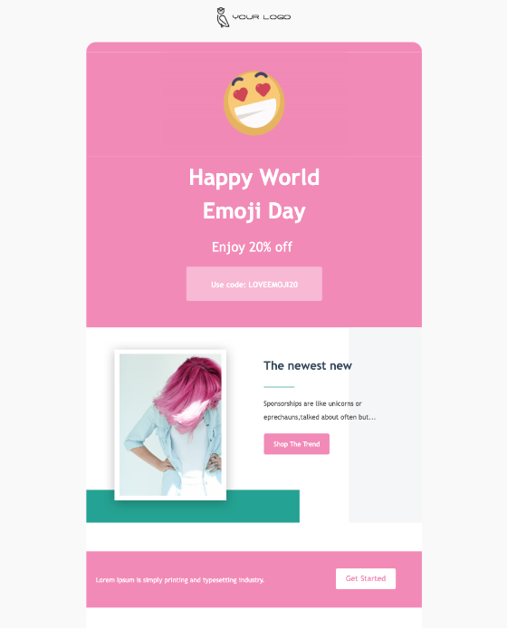
You want your email to look visually appealing and professional, so instead of simply choosing one background color, you want to choose a full color scheme of 3-5 coordinating and contrasting colors. There are a few things to keep in mind for your color scheme:
- Keeping your email’s image inline with your branding
- Creating the feel you want for your email (e.g., an exciting feel vs. a formal, corporate feel)
- Matching colors to your content (e.g., bright colors for a summer sale or colors that align with the holiday or event your email is highlighting)
Consider how put-together this email looks because of its color scheme:
#1. Combine images and background colors
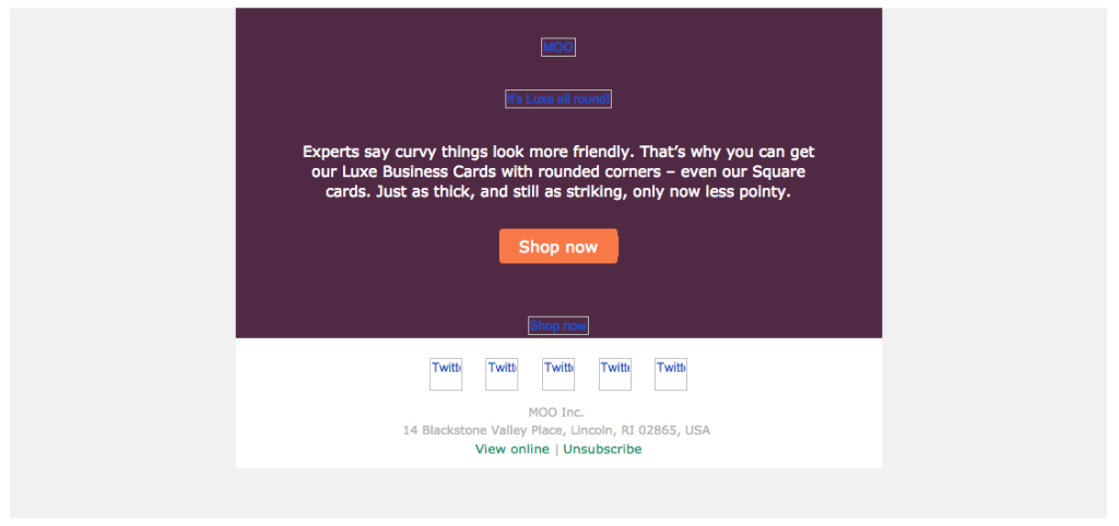
Emails that are made up entirely of images (with little to no plain text) are problematic. Some people won’t be able to see an image-only email at all because of their email client settings. Image-only emails often end up in spam folders or don’t get fully downloaded. And they aren’t mobile-optimized, either. That’s why we always insist that effective emails have a balance of images and plain text (at least 500 characters of text).Check out this email from Moo, a website that helps you design and print business cards, first with image-viewing turned off:
And then with images turned on:
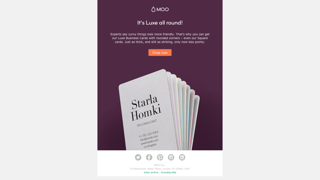
Once the images are viewable, we can see that most of the top portion of the email is plain text, while the second half is an image of a stack of business cards. But put together, it looks like the email is a single, solid image. The two modules of the email seamlessly flow into each other through the use of the deep purple email CSS background color.
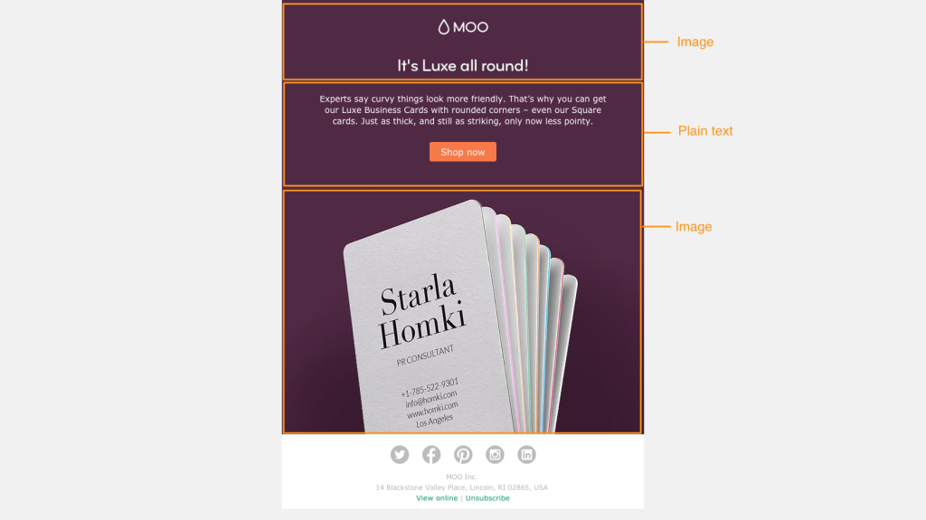
This design tactic is clever. It allows Moo to use color in a simple, striking way to build an email that has a single visual focus (and looks like one cohesive image or module). But it simultaneously allows Moo to avoid sending an image-only email.To pull off this kind of message, three elements of the email need to match:
- The background color of the photos
- The HTML background color of the plain text section
- The background color of the ALT text when images don’t appear.
If you don’t know the HTML color code of an image or graphic, a web tool like HTML color codes will let you upload a photo to determine the colors used.Moo’s email is also optimized with email-safe text and bulletproof buttons that will always render. And the styled ALT text background upholds the structure of the design, even when images aren’t viewable. It’s a great way to make background colors work with your product photos to create a bright, bold email that’s eye-catching and a change of pace from a sterile white background.
#2. Use a single background color for the entire email
It can be tough to break away from the typical white background, and using a background color throughout your email can significantly change the impact it has on readers. So when you’re using color in a way that can potentially be pretty overpowering, like top-to-bottom in an email, it’s wise to think about the feeling you want to evoke first. Brands that do this well often choose a branded color that’s a light shade.Here’s an email from Chobani that uses its pale tan brand color as the background:

A uniform non-white background color works well here (and looks great) because contrasting font and link colors are used so all text is easy to read. Plus, the pale shades act similarly to a white background: They help the email feel light and airy.
#3. Separate content sections with background colors
One of our favorite ways to use vibrant email CSS background colors in email is section by section. It’s one of the most effective organizational uses of color, making clear where one section ends and another begins. We recently received an email from Draper James that’s a great example of this. The blue, white and pale peach sections clearly stand out. The colors are on-brand and complement each other, and it’s easy to navigate the message to find what you need.Similarly, Otherwild uses bold background colors to separate different modules of its email. The blue, green and orange match the products shown in the photos, helping the merchandise stand out. Incorporating email CSS background colors in sections is a great way to visually break up long emails and keep the reader scrolling.

The blue, white and pale peach sections clearly stand out. The colors are on-brand and complement each other. And it’s easy to navigate the message to find what you need.Similarly, Otherwild uses bold background colors to separate different modules of this email:

#5. Design an inclusive and accessible-friendly color scheme
Your color scheme can make or break the accessibility of your email in ways you may not realize. For example, people with visual impairments will have a hard time reading your email if there isn’t enough contrast between the background color and the text color. Another important consideration is how your color scheme will look to people who are colorblind. While there are different types of colorblindness that will impact readers in different ways, some general rules to follow include:
- Avoid a color scheme of reds and greens - especially placing green text on red backgrounds and vice versa.
- Blue and red hues contrast well for most people with colorblindness, so this is an excellent starting point for your color palette. The same is true for yellow and orange.
- Include a combination of light and dark colors - while people with colorblindness may not see the same hue, they will see the same darkness as others, so this can help them understand your email.
Remember that chances are that you have people on your email list who have either color blindness or visual impairment - color blindness affects an estimated 300 million people worldwide and 2.2 billion people globally have visual impairment. Always design your colors with inclusivity in mind.
#6. Use an email editor to add HTML background colors without coding
Using HTML to create background colors in your email is an industry-wide best practice. Each email program your recipients may be using (Gmail, Outlook, etc.) interprets email data differently, but HTML background colors will translate properly in all mainstream email providers so more readers see what you want them to see. Don’t know how to code HTML? No problem! An email editor gives you a user-friendly design interface and translates your design into HTML so you get the benefit of HTML background colors without the coding work.
FAQ: Email background colors
Have some questions about how to implement background colors into your emails and inboxes? We’ve got answers! Check out these commonly asked questions.
How do you change the email background color in Outlook?
Outlook is designed for sending individual emails rather than mass emails such as email marketing. Still, you can customize your Outlook emails by changing the background color. With the draft message open, click on “Options” at the top of the window and click “Page Color.” This will let you customize the background color.
How do I change my Gmail email background color?
Gmail doesn’t allow you to set a background color in an email you are sending. You can, however, change the background color of your Gmail interface. Click on the gear icon in the top right corner and click “See All Settings.” In this menu, click “Theme” and choose a background image or background color.PRO tip: Beefree is compatible with both Gmail and outlook. That means you can easily design email assets in Beefree and effortlessly export them to Gmail or Outlook.
Get started with free HTML email templates
Using strategic background colors is one of many best practices you can use to make your emails more effective. You can implement this and other email design practices with ease using Beefree’s HTML email templates. Explore our variety of templates designed for different purposes and audiences and start building more buzz for your business today.
Share this post with your friends! Pin it on Pinterest ?
Editor’s Note: This post was updated on July 2023 to ensure accuracy and comprehensiveness.
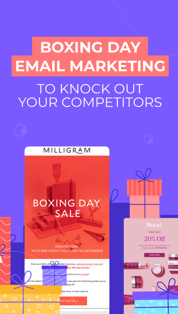
Boxing Day Email Marketing to Knock Out Your Competitors
Described as the Black Friday of UK sales, Boxing Day occurs on the day after Christmas each year. It’s a valuable chance for companies to offer one final holiday discount — whether you’re based in the UK or not. Many businesses treat Boxing Day as a way to clear out any extra stock to make space for other products in the new year. Think of your Boxing Day email marketing as the final follow-up to your Black Friday sales, Cyber Monday discounts and other holiday promotions.When it comes to Boxing Day sales, having a strong marketing strategy is key. Let your customers know about your deals through one of the channels where they’re most active: email! Check out these helpful Boxing Day email marketing tips to create emails that will convert this December.
Think of Boxing Day as the final follow-up to your Black Friday sales, Cyber Monday discounts and other holiday promotions.
Create catchy Boxing Day email subject lines
Customers expect good deals, so share your discount in the subject line of your Boxing Day sale email. Give your customers details about where they can shop (online? In-store?) and consider using an emoji to grab the eye.

Use product GIFs
If you’ve read our past blog posts, you know that we’re big fans of product GIFs. Emails with GIFs are more likely to be opened; they have a higher conversion rate, too. And creating your own original product GIFs is a unique and snazzy way to show off your goods.These cute GIFs show Murad’s skincare products sliding in and out of their boxes. The images look like a stop-motion film:Subject line: Today only! 20% off for ? Boxing Day! ?
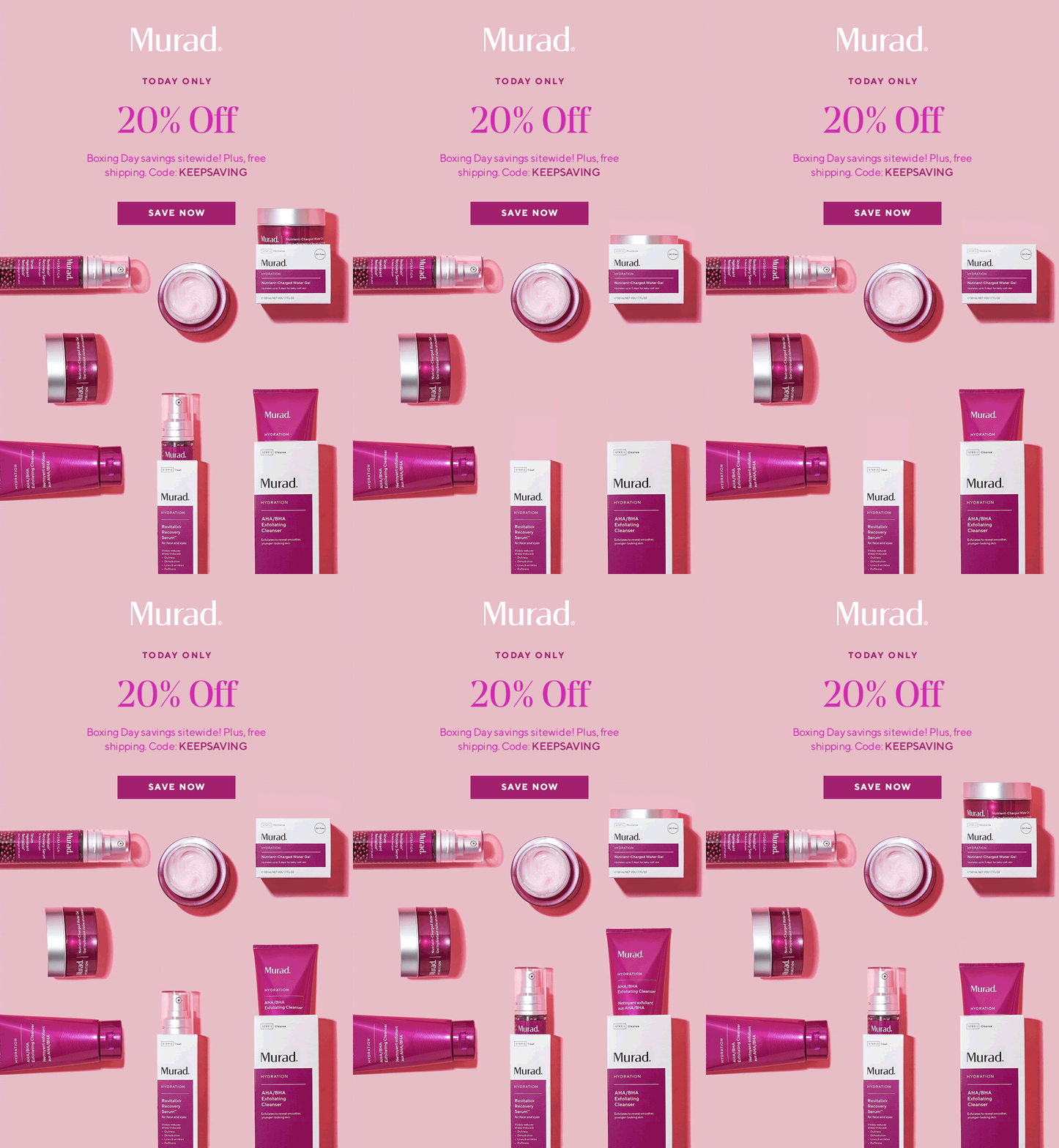
Incorporate product GIFs into your Boxing Day email marketing to highlight your products and increase your conversion rate.
Get creative with color
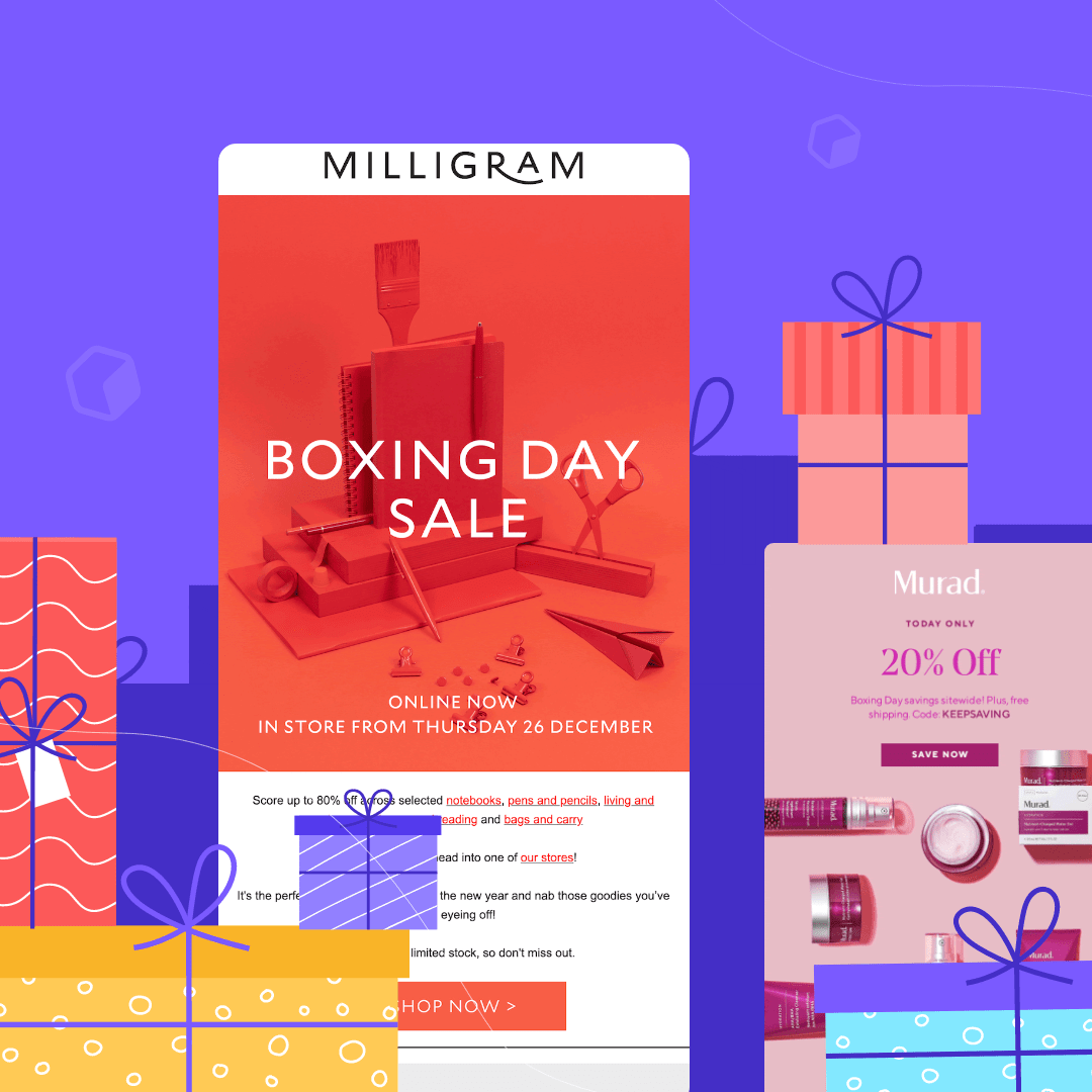
Draw on the power of color to help advertise your Boxing Day sales. Color psychology plays a big role in marketing. Red gets attention fast and orange brings an aspect of friendliness and fun, making this combo used by Milligram the perfect choice for a Boxing Day email. And while the majority of the email is composed of a single image, Milligram adds that same red-orange color elsewhere too — like the standout CTA button and the hyperlinks in the body copy.Subject line: Boxing Day sale now on!

Add a countdown timer
Countdown timers are an excellent way to push customers to take action for your Boxing Day sale. Not every company takes the trouble to add a countdown timer to its emails. So by doing so, you can stand out. (And, psst — adding countdown timers really isn’t that hard.) This Boxing Day message from Frank And Oak caught our eye: It provides a countdown timer so you know exactly how much time you have left to shop.Subject line: Ending soon: Boxing Day sale ?

Continue the holiday season
Think of your Boxing Day email marketing as a continuation of the holiday season. That’s what Bodum does here, telling customers not to worry if Santa forgot their wish list — the holiday season isn’t over yet! Using a similar “treat yourself” concept can go a long way in encouraging customers to make a purchase. Bodum also includes a few key products in this email with separate CTA’s for each one — an easy opportunity to retarget customers who have looked at your site but haven’t converted.Subject line: Bodum Boxing Day sale is on! Up to 70% off

Use a play on words
Boxing Day provides some fun opportunities for a play on words (and emojis, like Murad’s Boxing Day email subject line, above, that included two cardboard box emojis). Dr. Roebucks takes advantage by giving customers the code BOXITUP. When you give your customers a discount code, it’s important to choose something simple and easy to remember. BOXITUP is a great example of a fun discount code that’s more memorable than a string of unrelated numbers and letters. Incorporate a similar play on words into your Boxing Day email marketing this year.Subject line: BOXING DAY SALE ENDS TODAY

Wrap-up: Boxing Day Email Templates
Ready to get started on your Boxing Day email marketing? Use the BEE email editor to help! With BEE's user-friendly, drag-and-drop interface and its catalog of 500+ email templates, you don't have to be a professional graphic designer to create professional marketing emails. Sign up for a free account and start designing today!
Share this post with your friends! Pin it on Pinterest ?
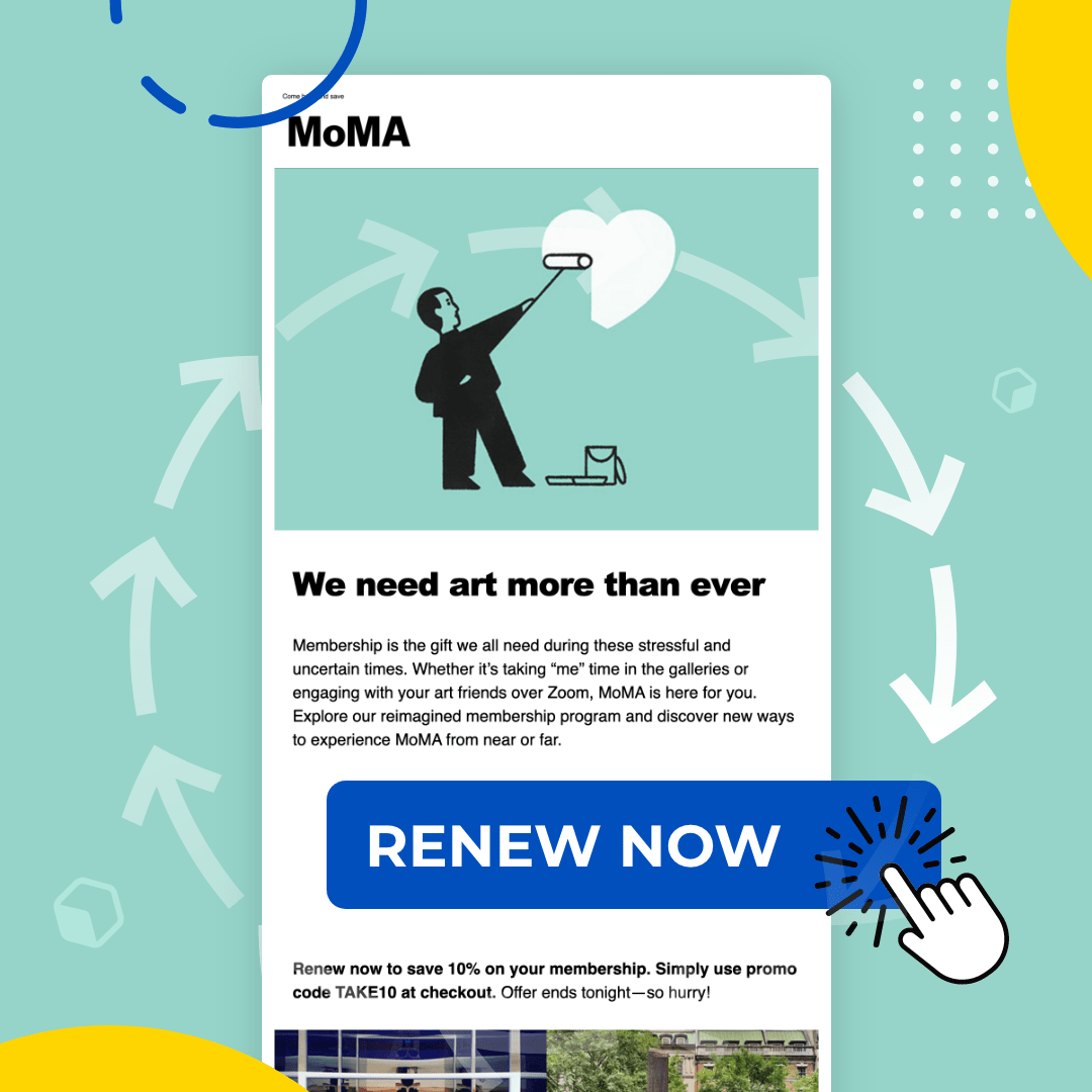
Effective Membership Renewal Letters: Guide & Samples
If you’re operating a membership program, renewals are essential when it comes to growing and maintaining your revenue. Even if your service is great, most members will need some encouragement or at least a reminder to renew. A membership renewal letter or email is instrumental in getting renewals. Keep reading for the top best practices, examples, and more.
What Is a Membership Renewal Letter?
A membership renewal letter is a letter or email you send to your current subscribers when their subscription term is ending. The goal is to prompt customers to renew their memberships and tell them how to renew.
Importance of a Membership Renewal Letter
A membership renewal letter is vital for any business with a membership-based model that doesn’t use automatic renewals. It can serve several purposes depending on how a customer feels about your service:
- Reminding happy customers to renew their membership
- Providing clear instructions on how to renew paired with a clear CTA button.
- Providing a reason to renew for customers who may be on the fence. For instance, a simple reminder of the benefits they receive works wonders.
Customers are likely to forget to renew, so a renewal letter could be what prevents you from losing recurring business.
Membership Renewal Letter Formats
Membership renewal letters take one of two formats: a physical letter that is mailed or sent via email. A physical letter is more formal and may be harder to overlook than an email in a member’s crowded inbox. However, email has a powerful advantage. Email allows members to take immediate action by simply clicking on the CTA button. The easier you make a task, the more likely people are to complete it.The great part is that you can do both! First, send an email. Then send an email a couple of weeks after as a reminder.
8 Strategies to Write a Compelling Membership Renewal Letter
Some customers will already know whether they want to renew when your letter lands in their inbox, but others will need some convincing. Follow these tips to make your membership renewal letter more effective and increase your renewal revenue.
#1 Use a personalized greeting and opening
People pay more attention to emails and letters that appear more relevant to them, so personalize your renewal letter to make it stand out. Simply including the member’s name will help, and you can include other personalized notes in your opening too, such as, “We’ve loved having you as a member for these past three years” or “We hope you’ve enjoyed your first year of membership!”
#2 Highlight member benefits and value
Assume that every member reading your letter is trying to decide if they’ll continue their subscription. You need to tell them why to renew. Include a clear, exciting list of the benefits and value they get from their membership (don’t assume they know it all because they’re already a member).
#3 Create a sense of urgency
Your customers have a lot on their to-do lists, so if there’s no reason to renew their membership promptly, they may put it aside for later and forget about it entirely. Give them a reason to complete that quick task now, like a discounted renewal offer that expires on a certain date or a special perk they’ll get if they renew before a particular date.
#4 Address potential objections
Think about reasons your customers might not renew and offer solutions for those issues. For example: “Want to size down your bill? Check out our basic subscription option instead” or “We use top-of-the-line security and privacy practices so your data will always be safe with us.”
#5 Express gratitude
You appreciate your customers for their business, so let them know! Thank them for being members and let them know what you plan to do to show your appreciation for their continued membership, like an upcoming member appreciation event or a special sale for members only.
#6 Use storytelling and emotional appeal
Your customers are human beings, so connect with them on a person-to-person level to remind them of how much they love their membership. You could include some highlights from their membership so far, for example, like snapshots of some of the products they’ve bought. Or, you could paint a picture of their continued membership, like a vision of their future success because of your program.
#7 Showcase success stories and testimonials
There’s a concept in marketing called social proof, AKA peer pressure: when customers see that other people have enjoyed your products, they trust those people and are more likely to buy in too. Testimonials or stories of customers who have benefited from your program can go a long way in a membership renewal letter.
#8 Choose the right timing
We all respond to questions or choices differently based on our frame of mind when we see them. You can’t set your membership renewal emails to land when customers are in a good mood, but there are other timing tricks you can use. For example, send it within 24 hours of them making a purchase or otherwise taking advantage of their membership.
Key Elements of a Membership Renewal Email
What should you include in your membership renewal email? The structure doesn’t have to be overly complex, but there are ways to make each element more compelling.
Subject line
Did you know 47% of email recipients decide whether to open an email based only on the subject line? Make sure your renewal emails get noticed and opened by using an enticing and accurate subject line. Try these examples for instance:
- Your membership benefits are ending! Renew here to keep them.
- Time to renew! Save 20% just by renewing the subscription you already love.
Email layout
Once a customer opens your email, the body or layout of your membership renewal email will determine where their eyes fall on the page. Make your layout simple and easy to skim, guiding readers toward the purpose of the email: the renewal link.
CTA design
In a membership renewal email, the CTA (call to action) is a button or form to complete the membership renewal. Because this is the ultimate goal of the email, you want it to stand out. Surround it with enough white space for it to stand out rather than putting it too close to the text, make it a bold, eye-catching color, and make it clear what the button does. Our CTA design tips are all about pulling in their reader’s eyes and getting them to click.
Sample Membership Renewal Letters
Need a bit of inspiration to create your compelling, revenue-boosting membership renewal letter? We’ve got it! Check out these membership renewal letter samples to get your creativity flowing.
Nonprofit Membership Renewal Sample
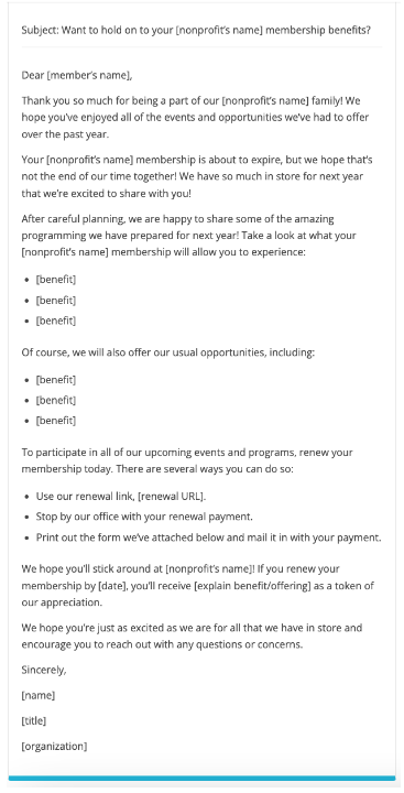
FundraisingLetters.org is dedicated to helping nonprofit organizations grow their funding, and memberships are a core part of that mission. The organization crafted this outstanding template that is clear and shows you how to emphasize the benefits of membership:
Storytelling Sample Letter
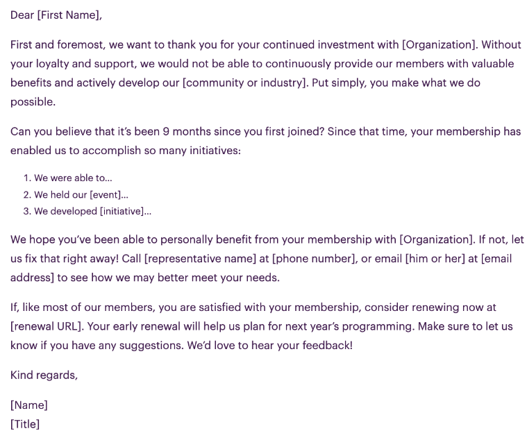
Remember our tip about taking a storytelling approach to remind members of what they’ve received from their membership so far? This excellent sample renewal letter from MemberClicks shows you how to harness that technique:
Membership Renewal Email Examples
Now that you have an idea of how a membership renewal letter should look on paper let’s talk about membership renewal emails. Emails tend to have shorter formats because you’re more focused on taking advantage of the interactive format and prompting customers to click on the CTA. Check out how these email templates work.
Simple and To-the-Point Renewal Email
If you want a simple design for your membership renewal email, we’ve got you covered. This email template is as clear as it gets: it has very little email copy and is primarily dedicated to the renewal button:
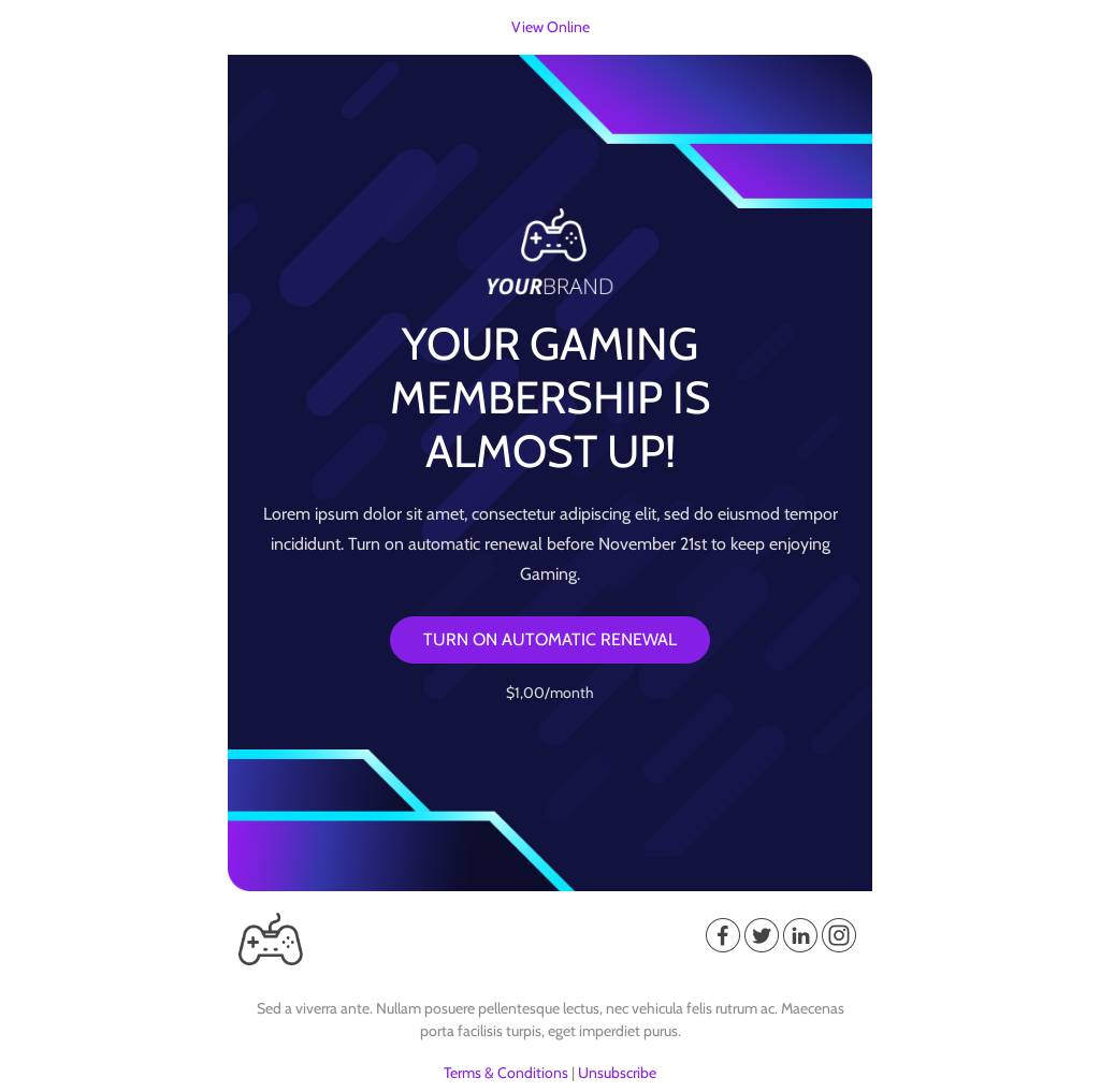
Liking this straightforward email? You can use this membership renewal email template today!
Value-Focused Membership Renewal Email Example
A simple email like the example above is great as a first renewal notice you’re sending to a customer. When a customer doesn’t respond to an email like that, though, it could mean they need some convincing to renew their membership. That’s when it could be better to use a longer renewal email template like this one, which puts more emphasis on showing the value of a subscription:
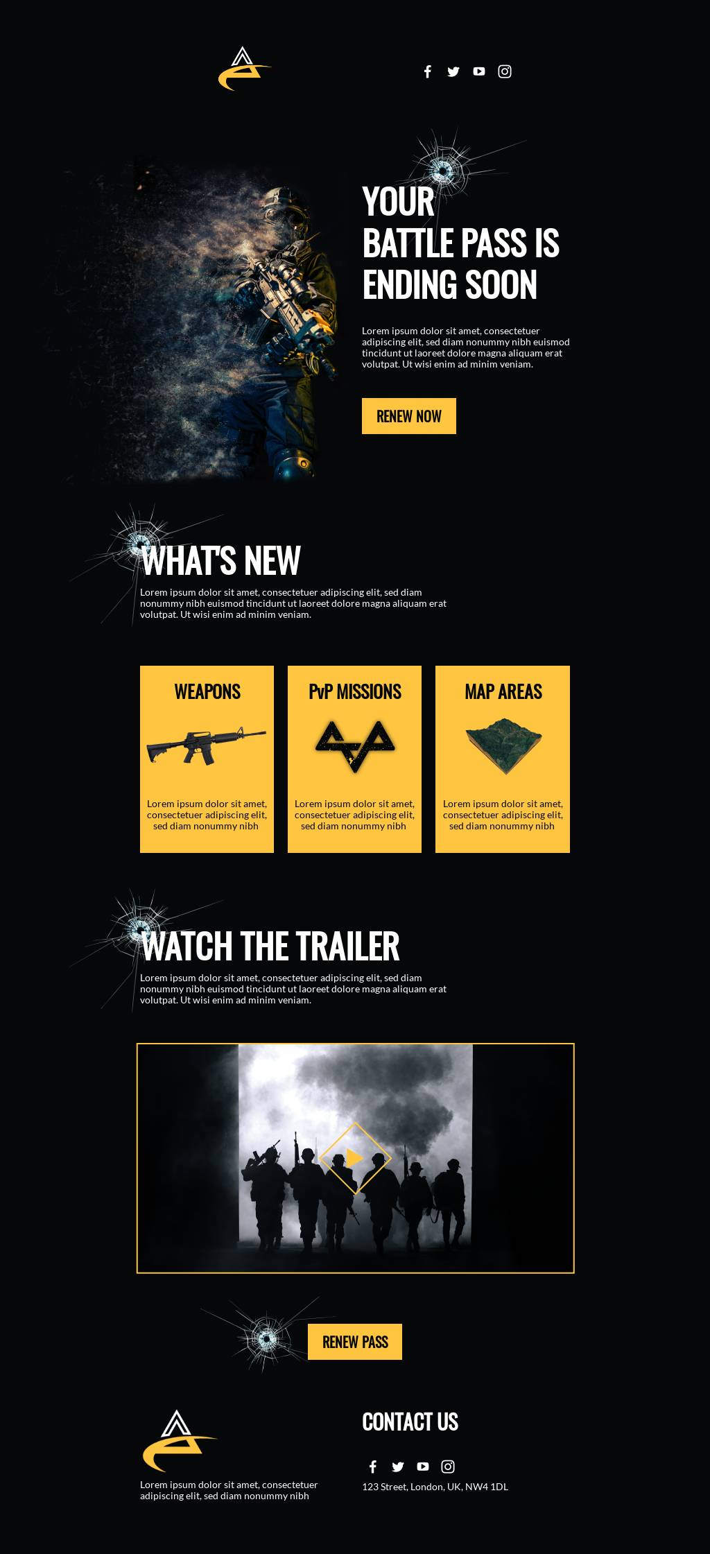
This template is one of Beefree’s membership renewal templates you can use and customize for your own program.
Get started with a membership renewal email template
Creating an effective membership renewal email doesn’t have to take days of labor. You can make your life easier (and take advantage of designs that have been created with best practices in mind) with Beefree’s expansive email template library and email editor. We aim to make it easier for you to enjoy the growth and opportunities that come from well-constructed email campaigns.Editor’s Note: This post was updated on July 2023 to ensure accuracy and comprehensiveness.SaveSaveSave
Best Black Friday Email Marketing Examples
There’s a lot of money to be made online on Black Friday - over $9 billion, in fact. Email marketing is one of the most lucrative ways to capture those sales. Are your emails good enough to rake in the conversions?If you’re not sure, we’re here to help. As your friendly email marketing experts, we’ve compiled some examples of the best strategies and approaches for Black Friday emails that your customers won’t be able to resist.Check out these examples and the key strategies they use to guide and inspire your Black Friday email marketing campaign.
How to Create a Successful Black Friday Email Campaign
There are many ways people shop on Black Friday. Some are impulse buyers - they just wake up on the day, scroll through their emails or newspaper inserts, and head toward whatever sales they find appealing. But then there are strategizers - those who, for days before the holiday, are compiling their lists of who to buy for this holiday season and gift ideas for each person, along with notes about which retailers have the best sales for those items. When Black Friday arrives, they already know where they’re shopping and what they’re buying, so they can snag all the good stuff before it’s out of stock.This is why Black Friday campaigns (rather than simply sending an email on the day of Black Friday to announce your sale) are so important. These campaigns actually help you with both types of shoppers. They make impulse buyers more aware of your sale so your brand is more likely to come to mind when they’re doing their shopping, and they give strategizers the information they need to plan to shop with you.Black Friday email campaigns can be broken into three categories:
- Pre-launch emails: to build hype and offer sneak peeks into your sale in advance
- Sale launch emails: to kick off the sale on the big day
- Post-launch emails: to keep up the momentum during the sale and continue encouraging more shoppers to join the fun
Each category in your Black Friday campaign serves a different purpose, and each has various techniques and types of emails you can use to make it effective. We’ll break down every category with top strategies you can use, and examples of each one implemented expertly.
Black Friday Pre-Launch Email Examples
The prelaunch before your Black Friday blowout sales should work to intrigue your customer base. You want to showcase products that will be on sale, while being transparent about the discount customers will receive on those products. Include these types of emails in your Black Friday pre-launch sequence:
- Teaser. Give customers a glimpse of the products you’re promoting for Black Friday.
- Early access. Let VIP customers in on the sales earlier than the rest.
- Save the date. Include a countdown and an exact hour of when certain products will go on sale.
Here are some examples from brands that we love. Check them out to get inspiration for your Black Friday email marketing strategy.
The teaser: Sonos
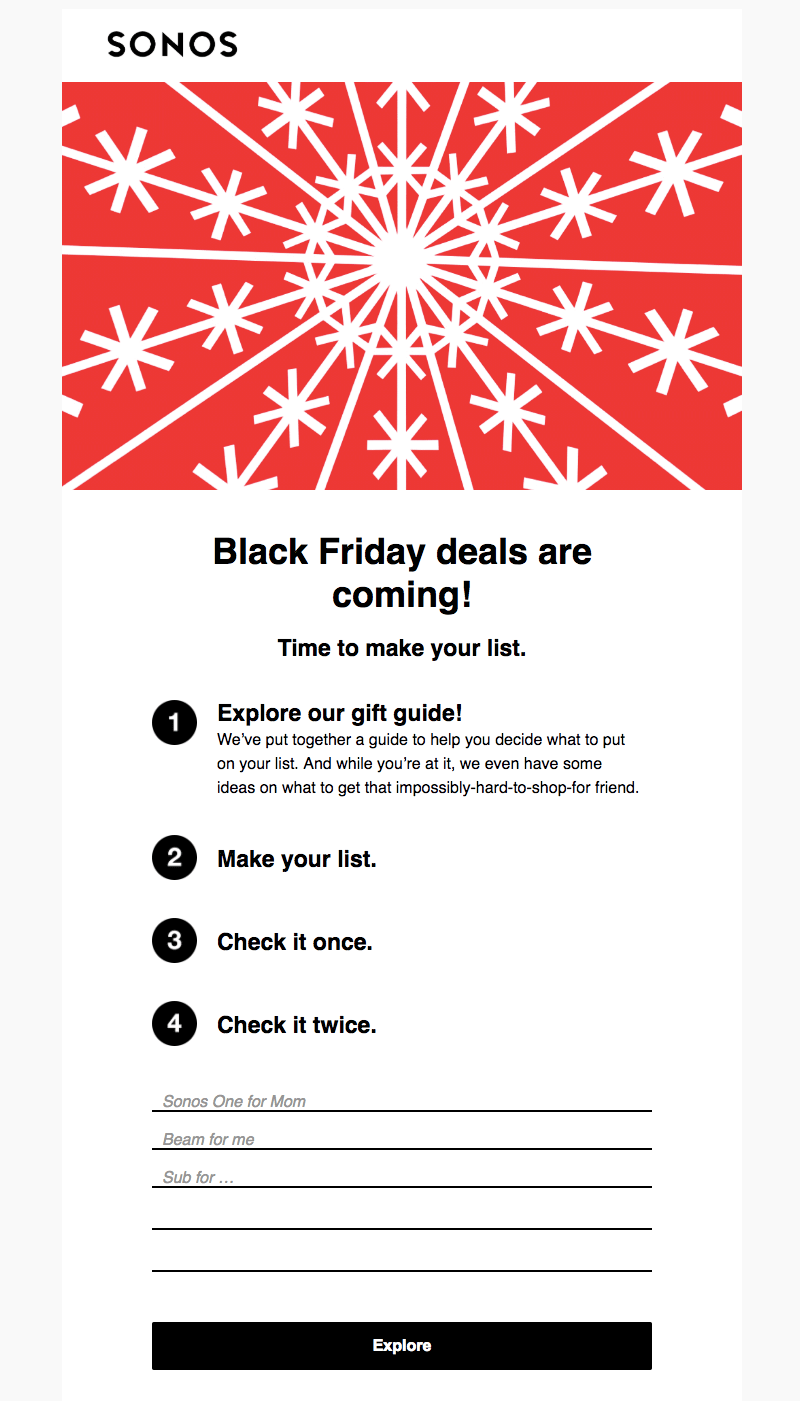
Sonos gives subscribers a glimpse of what deals are coming. They ask subscribers to make a list and explore their gift guide. The bold CTA button takes readers to a gift guide landing page to check out items they can prepare to buy on Black Friday.Subject line: "Get ready for Black Friday."
Early access: Joe’s Jeans
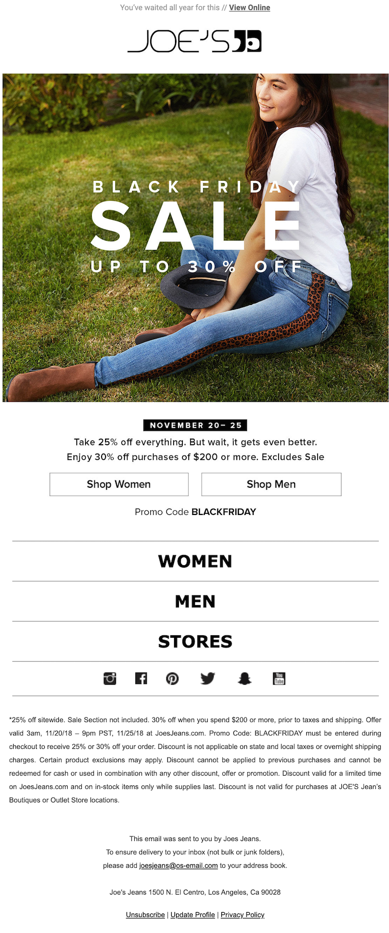
It’s best to begin sending emails about Black Friday well in advance — as early as a week prior. Start your sale early to stand out, or simply use the time to increase awareness and anticipation. Joe’s Jeans sent this email on the Tuesday before Black Friday. Since subscriber inboxes will be flooded closer to the weekend, starting early is a good way to get out ahead of the flood.Subject line: "Black Friday Begins! Up to 30% off."
Save the date: Frank & Oak
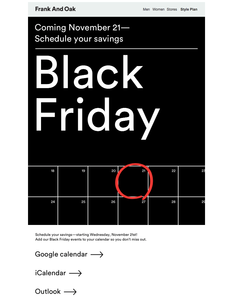
Whether you’re starting your sale earlier or sticking to a more traditional timeline, give readers a heads-up about what’s coming. It’s a way to drum up excitement and maybe get a better turnout for your promotion. Frank and Oak gives readers the option to schedule their savings with calendar shortcuts. Include a countdown timer in your next email so your subscribers will save the date.Subject line: "Mark your calendar for Black Friday."
Black Friday Sale Launch Email Examples
In your Black Friday emails that officially launch your sale, it’s crucial to display urgency and excitement. You want customers to pay attention to your Black Friday email above all other businesses, so what you have to offer must be enticing. Run through these types of emails for your Black Friday launch sequence:
- Announcement. The day is here! Give subscribers a rundown of what your biggest promotions are for Black Friday.
- Free gift. Offer a free gift when customers spend over a certain amount.
These brands approached their Black Friday sales with these strategies in mind. Try them out for your next campaign.
Announcement: Pact
Before you create your Black Friday sales emails, you need to decide two things: what you’re going to offer and the best method for announcing that method. The clothing company Pact mentioned several discounts in the subject line but focused on the best deal in the body of the email.Subject line: "Doorbusters: $25 hoodies. $5 socks. $15 leggings & more."

Free gift: MAC
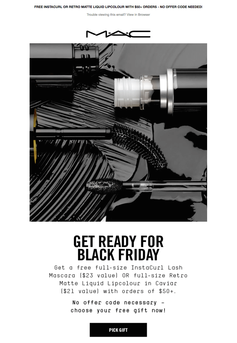
Mac promotes more spending on Black Friday by offering a full-size gift to customers if they hit a certain amount of money spent. This is a great way to encourage customers to buy more than one product and greatly increase your sales. Make sure to craft a fun CTA in your brand voice and showcase the free gift offer in a clear way.Subject line: "Last Day to Choose Your COMPLIMENTARY Full-Size Gift."
Black Friday Post-Launch Email Examples
The post-launch phase of your Black Friday email marketing campaign is the last chance to catch your audience's attention and bring in more sales. Create a sense of urgency for the existing sale or provide additional money off of products or exclusive offers that customers won’t be able to pass up. For those that haven’t jumped on your Black Friday deals yet, try these emails to give them that extra push:
- Limited availability. Express that certain deals for specific products are only available for a limited time.
- Last chance. Let subscribers know that time is running out and this is their only opportunity to snag those deals.
- Extended sale. Surprise subscribers with a sale extension.
Limited availability: Function of Beauty
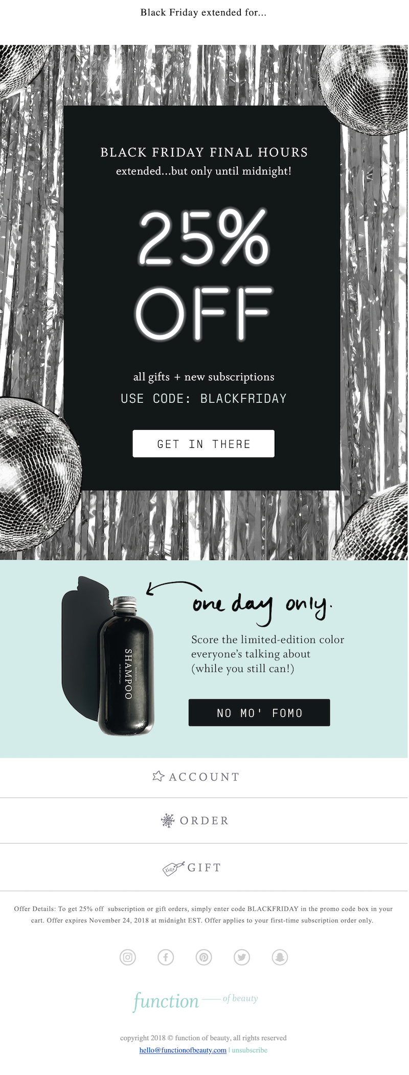
Inducing FOMO is a great way to get more subscribers to jump on your deals. Function of Beauty leveraged this strategy with creative CTA copy: NO MO’ FOMO. Their persuasive language explains that their deals are only available for a limited time and that other subscribers have already taken advantage of them. This encourages subscribers that haven’t purchased yet, to purchase.Subject line: "ONE MORE DAY! 25% off + the color everyone’s talk about."
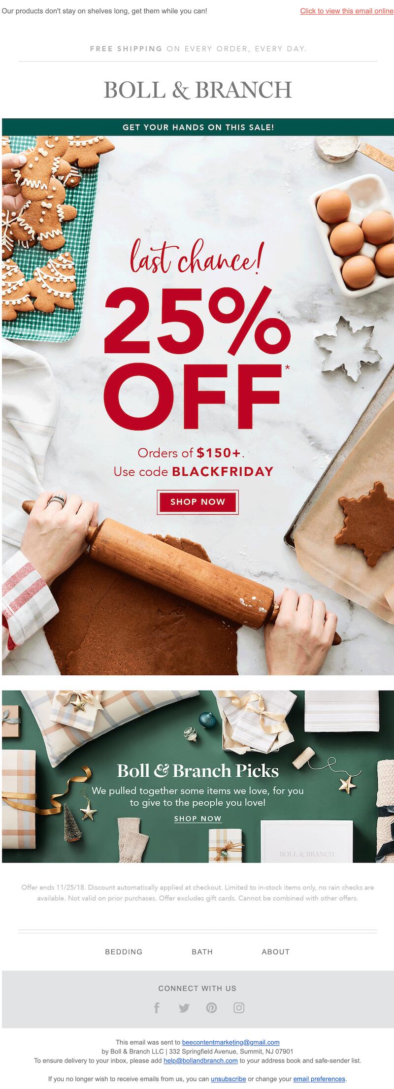
Last chance: Boll & Branch
Boll & Branch shares with customers that it’s their last chance to get in on the Black Friday sales. They’ve designed their emails around their main selling point (in this case, a 25%-off discount). This is free from clutter and distraction while also pinpointing the urgency and deadline of the deal.Subject line: "Last chance for Black Friday savings!"
Extended Sale
Is there anything worse than finding out about an amazing sale minutes after it ends? You can save your customers from that feeling and capture more sales by giving them a surprise sale extension. For example, perhaps your Black Friday sale was meant to end at 3 PM; when 3:00 hits, you send out an extended sale email announcing that you’re continuing your sale until 10 PM.
Leesa
Mattress company Leesa sent an email the day after Black Friday, letting customers know they had extended their deal — but that the offer was only available for so long, and their visible timer reinforced that message.Subject line: "Kelly, we’ve EXTENDED our Black Friday offer."

Black Friday Email Marketing Strategies and Examples
Now that you have a list of the types of Black Friday emails to include in your Black Friday campaign, how do you make those emails as effective as possible? After all, you have a lot of competition - according to Campaign Monitor, more emails are sent on Black Friday than on any other day of the year. Check out these strategies to catch your customers’ attention and boost your sales.
Starting planning early
The sooner you start your email strategy game plan, the better. This will give you more time to get creative so your email campaign will stand out amongst the swarm. Depending on how extensive you want your campaign to be, starting your planning in July, August, and even September is a safe bet to be ready for the hype.
Craft a strong subject line
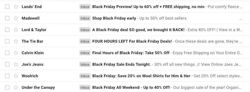
With emails flooding subscriber inboxes on Black Friday, it’s crucial to focus on standing out with attention-grabbing subject lines. A huge chunk of subscribers — about 47% — decide whether or not to open an email based on the subject line alone. Follow these tips to create a subject line that will stand out:
- Include a deal or coupon, a deadline, or other features of the sale.
- Keep it short - most mobile devices only display the first six or seven words of a subject line.
- Make sure to test beforehand to see what style of messaging initiates a response from subscribers.
- Don’t forget the preheader text that immediately follows your subject line. Like the subject line, the preheader serves as a screening tool, so make it enticing.
Keep your message simple
Black Friday is a once-a-year event that’s synonymous with particularly steep discounts and deals. Subscribers want to know your best offers for the day. So don’t dilute your promotion by sending a cluttered email. Logitech uses an attractive design to get across one message: Click to shop Black Friday deals. It’s easy to scan and pleasing to the eye. Show subscribers content that’s specific, relevant, and easy to understand.Subject line: "⏰ Rise and shine – Black Friday exclusives are selling quickly."

Include product images in your design
When people are scrolling through their emails, you want something that stops their thumbs and makes them take notice, and usually, it’s visuals that will do this. Including images of some of the most exciting items in your Black Friday sale will snag readers’ attention and generate interest in the products, whether or not these are items that were originally on their shopping lists. Just make sure to include variety. If you only include images of one or two types of products, customers will think those are the only types of products you’ll have on sale.Take a look at this email from Overstock, for example:
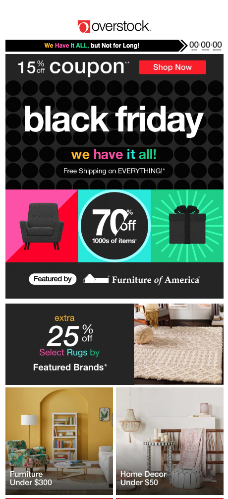
The product images are bright, colorful, and attractive, so it’s easy for customers to see them and think, “Could my home look like that if I picked up the products in this sale?”
Incorporate GIFs
With all the competing emails in your customers’ inboxes, you need to get creative if you want to stand out and be memorable. GIFs can do exactly that. They have all the visual appeal of eye-catching pictures, but they’re more engaging. New York & Company has done this well with a GIF of one of its top Black Friday sale items:
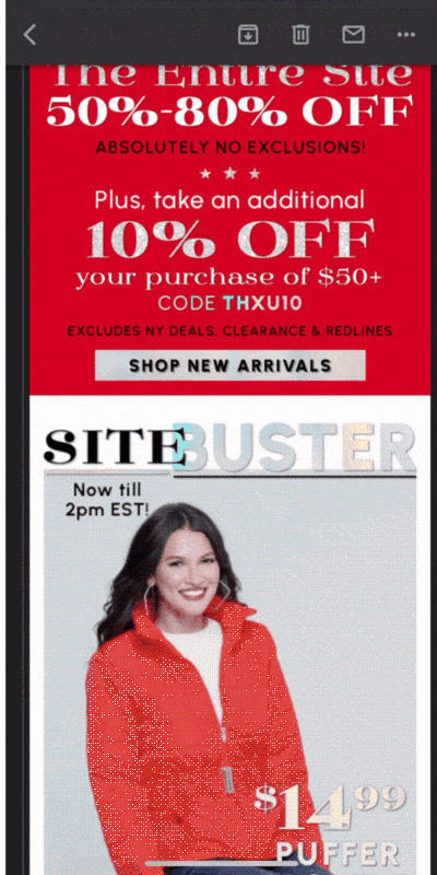
The movement in the ad for puffer jackets is attention-grabbing and shows the product in motion in an attractive way.
Don’t forget about building brand trust
Brand trust on Black Friday means your audience trusts you to deliver content that’s relevant and valuable. Offer a real deal — one that’s special and different from your other promotions throughout the year. Black Friday doesn’t necessarily need to be about offering 50% off your product. Stay true to your brand’s mission and values, and approach the holiday by thinking of what your audience would most appreciate seeing.For example, Toothbrush company Quip announced a “Brush black, give back” campaign for Black Friday, selling a special type of toothbrush and donating the proceeds to provide dental care for disadvantaged families.Subject line: "Introducing All-Black. Give back this Black Friday."

This example puts the brand’s modern and impactful mission at the forefront while also giving customers an opportunity to shop for the benefit of a good cause. It’s a refreshing break from the excessive commercialized email customers are seeing, and it improves the brand’s image.
Optimize for mobile
Plenty of online purchases will be made using mobile devices. Plan ahead with a mobile-first approach. Create concise content, clutter-free design (no complex headers and focused messages), tap-friendly navigation, and bulletproof buttons (with appropriate padding), and use images with great ALT text for a fully responsive experience.
Prepare your abandoned cart emails.
While there’s a large amount of online shopping going down, it’s crucial to note that this will increase the number of abandoned shopping carts among shoppers. They will be comparing prices and bouncing from site to site, trying to find the best deals. Have your creative abandoned cart emails at the ready, and include an extra discount to push them to purchase.
Design your Black Friday emails with Beefree
An optimized Black Friday email sequence is a game-changer for your business. Focus on crafting a strategy first, then use Beefreeto implement the best practices that you’ve gone over in this blog. There’s no coding required here when customizing Black Friday emails to match your brand identity.If you’re simply running out of time to create a whole sequence, choose from our Black Friday email template collection to customize. There are plenty of colorful, animated, and optimized emails to pick from. Don’t miss out on the holiday shopping hype — solidify your Black Friday email marketing strategy right now.Editor’s Note: This post was updated on August 2023 to ensure accuracy and comprehensiveness.
Share this post with your friends! Pin it on Pinterest ?
SaveSaveSave

10 Creative Ways to Use Color in Email
Consistently and creatively using color in email is one of the most important things you can do as an email designer or marketer. Our brains can process visual information 60,000 times faster than text, and color is a major factor in how we evaluate what we’re seeing. Up to 90% of product assessment is based solely on color. In one case study, a company saw a 20% increase in conversions just by switching a call-to-action button from green to red!
It’s clear that color has power. But how can we harness that power in email? Read on for 10 creative ways to use color in email, with design inspiration from brands doing it right.
1. COLOR YOUR ALT TEXTALT
text is the text that shows up when your email’s images don’t appear. This happens because your subscriber has image-viewing turned off or because the images are too large, making them slow to load. It’s an email design best practice to always use ALT text so that readers who don’t see images still get your message. Here’s how ALT text typically looks (on the left) and how the same email appears with images (on the right):
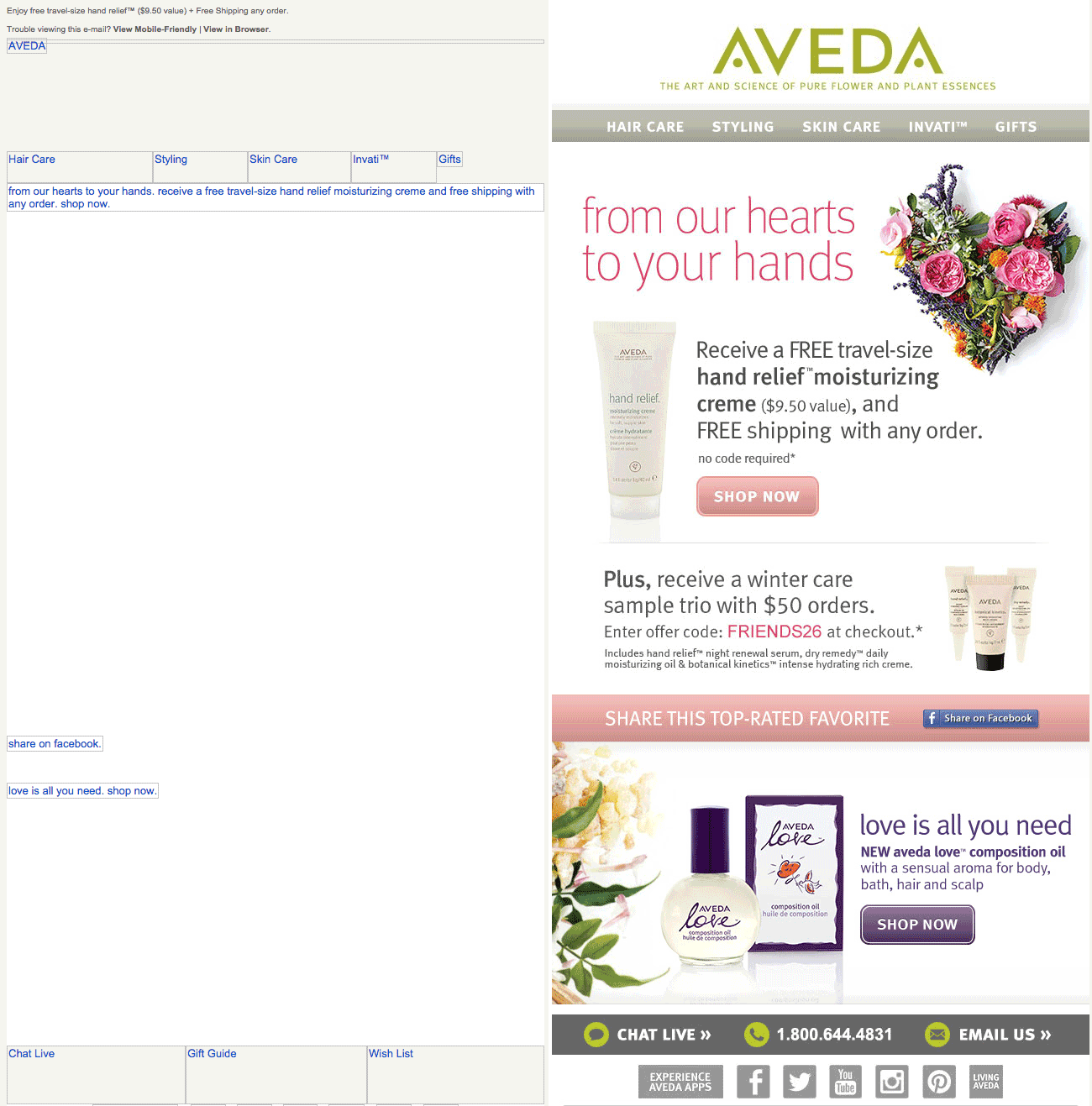
It’s clear to see why it’s not wise to send an email that’s entirely made up of images — it really won’t look good if the images aren’t there. But if you’re sending image-heavy email campaigns, you can style ALT text, too. Check out how much better the ALT text looks in this email (on the left) with background colors added (email with images loaded appears on the right).
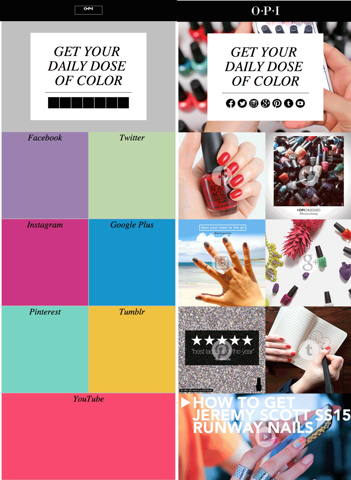
Color your ALT text to improve your email’s design, even without images.
2. ORGANIZE CONTENT WITH COLOR TABS
Small color tabs or labels can improve content organization, helping readers skim your email. We’ve seen quite a few brands consistently use this technique to add order to both text and image content. One of the great things about these small splashes of color in email is that they’re not images. Using an HTML background color means they’ll always show up.
In this email newsletter, Robinhood Snacks uses small green tabs of text to categorize each story. “Tappy” and “Aww” denote must-read and adorable content:

These colorful tabs are small and unobtrusive. But they still do a good job of segmenting the stories and giving readers a bit of extra information.
3. GO ALL IN ON A COLOR SCHEME
Complement the photos in your email by reflecting their colors in your headers and CTA buttons. This is a great technique for product emails. The approach unifies the aesthetic of the email and offers a cohesive, contemporary look. You can even match the exact HTML color from an image or graphic by using a quick web tool like HTML color codes. Here’s an example from Draper James:

The product that’s being showcased is a dress in vibrant tones of lilac, lavender, marigold and fuschia. The text below the image is written in the same colors as the dress, helping tie the email together.
4. ADD COLOR BLOCKS TO YOUR PHOTO COLLAGE
Mix up your email’s photo gallery by adding text blocks with flat HTML background colors. The approach breaks up images and adds a sense of cohesion to photos, like in this example from Michael’s.
Make sure the color blocks are plain text with background colors (not images) to improve your text-to-image ratio. And don’t forget to make it responsive!

5. DIVIDE CONTENT WITH COLOR
A lot of emails have a white background. Often, this makes the content feel a little lighter, cleaner and less cluttered. It also makes high-contrasting black text easier to read.
But all that white space leaves plenty of room to get playful with color in email when it comes to separating and organizing your content. We often see this approach when modules of an email have different background colors to visually separate them, like in this email from Melissa & Doug.

It’s clear where the first section of this email ends and the second one starts. The visual separation can help your readers navigate the content.
6. GET CLEVER WITH COLOR IN TEXT
There’s no rule that says the plain text in your email needs to be black. As long as it contrasts enough against your background color, it’s okay to leave the black font behind and play with color. Fusion uses an on-brand aqua-and-purple color scheme to liven up their listicle emails. It’s a nice break from the black font we often see, and it also serves to organize the email. The consistent use of aqua for headers and purple for sub-headers allows the reader to skim this email more easily.
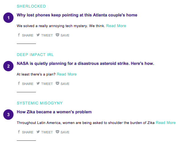
The New Yorker takes a more subtle approach when it comes to color in email by adding red text above each headline. The text categorizes each article and pops just enough to catch the eye.

7. CREATE CONTRASTING COLOR CTA BUTTONS
One of the most powerful ways to use color in email is in your call-to-action buttons. CTA buttons should visually pop out from the rest of your email — a reader scanning your message should be able to instantly identify where the CTA is. And color is a great way to do that! But it’s all about balance. Your button should also be on brand and simply styled.
Most brands choose a color that’s within their brand color palette and matches the aesthetic of the particular email. Often, the button echoes the header design in color. Here’s how Cratejoy uses the same blue color of its logo for many of its CTA buttons:

It’s so easy to spot, and it’s bulletproof — a must!
Another way to use color to make a CTA button stand out is to make the module that contains it a distinct color, like in this example from Can’t Clutch This.

If you’re scrolling through this email, two of the CTA sections immediately stand out because of the pale pink background color compared to the mostly white email.
8. USE A COLOR OTHER THAN BLUE FOR LINKS
Readers don’t need the classic bright blue text to know text is linked. Get playful with color in email. Capitalize on branding your email by using an on-brand color for links. Here’s another Robinhood Snacks email that adds a few green keywords here and there to easily call out links to readers.

Similarly, the Mic Check newsletter uses their brand turquoise color in both headers and for links. Against the otherwise all black-and-white email, the links easily stand out.
In this newsletter, Tech Crunch does the same thing. Against the otherwise all black-and-white email, the links easily stand out.

9. USE BACKGROUND COLOR FOR HEADERS, FOOTERS, AND ADS
HTML colors are a great tool for content organization in email: They render across all inboxes (unlike images), they take up less than one line of code and they’re easy to implement. By assigning different background colors to different modules of your email, you organize content and provide a seamless reading experience for subscribers. Using an HTML background color as your header is an excellent alternative to using an image (which may not render). Here, the New Yorker uses a tan background color to distinguish a paid post from the rest of the email.

10. GO COLORLESS
One final tip on how to use color? Don’t use it, especially if it’s a regular part of your email design aesthetic. Instead, try an all black-and-white email. Without color to help you call attention to links and CTAs and to help you organize content, you might be forced to simplify, streamline and improve your design in ways you wouldn’t otherwise think. Here’s a B&W email from Converse that we love:
WRAP-UP: GET CREATIVE WITH COLOR
Get creative with color in email by using the BEE email editor. Our drag-and-drop editor is the perfect way to play with background colors, headers, CTA buttons and more, cycling through a rainbow of options before you hit send. Use the BEE editor for free today to create beautiful emails for your subscribers!
Small Business Saturday Email Ideas to Make Your Local Business Stand Out
Small businesses, are you ready to market yourself on Small Business Saturday? This is an important holiday for local businesses, so seize the opportunity to help yours stand out. Check out these Small Business Saturday email marketing ideas to help inspire your campaign.
Small Business Saturday is an important holiday for local businesses. Seize the opportunity to help yours stand out.
What is Small Business Saturday?
Small Business Saturday takes place on the last Saturday in November. This annual holiday is a chance to shop small, helping small businesses get the recognition and revenue they deserve. (Curious whether your business counts as a small business? Check out this size standards tool created by the U.S. Small Business Administration.)Coming right on the heels of the feeding frenzy that is Black Friday, Small Business Saturday is a welcome change. This holiday was created by American Express to celebrate the small businesses in your local community. It’s been around for the past decade and counting and produces extra revenue from holiday shoppers: In 2019, Small Business Saturday generated $19.6 billion in reported spending. There's an incentive for consumers to participate: American Express offers them cash back on purchases made at small businesses on the Saturday after Thanksgiving.As a small business yourself, this is a day that you can’t overlook. This holiday is growing in visibility each year. And investing in some Small Business Saturday marketing is definitely in your best interests.Set yourself apart by creating a strong email campaign. Email marketing is a great choice for small businesses that want to make a big impact. Free marketing tools like the BEE email editor can help you design beautiful emails with no coding knowledge — helping your email ROI increase. Let’s take a look at a few Small Business Saturday email ideas.
Small Business Saturday email ideas
Don’t get lost in the shuffle between Black Friday and Cyber Monday — remind your customers that you have a lot of great deals and products heading their way!
Segment your audience
Segment your audience by geographic region to make sure people get the email that’s most relevant to them. If you’re a local business, this still applies: Segment people according to their specific zip code. This Tie Bar message uses clever copy to encourage readers to seek out their local Tie Bar store.Subject line: It’s Small Business Saturday! Grab your free socks.

Offer a special discount
Small Business Saturday might be the perfect time to launch a new product, or create a special bundle of products that are on sale. That’s what Catbird did here, advertising a group of products that went on sale for Small Business Saturday. Think about which of your products you could bundle together to sell at a reduced cost. Then consider what would be the most effective way to advertise this promo in your Small Business Saturday email.Subject line: We made something small, shiny & new ?

Take advantage of neighborhood networking
Small Business Saturday is all about supporting the small businesses around you. So don’t be afraid to do just that! Try partnering with another local small business and creating a joint sale. A coffee shop and a bakery could team up, offering lattes and cupcakes at a reduced price for both. Larger brands can also get in on the fun. Brooklinen used its platform to encourage customers to #shopsmall.Subject line: Shop small with us
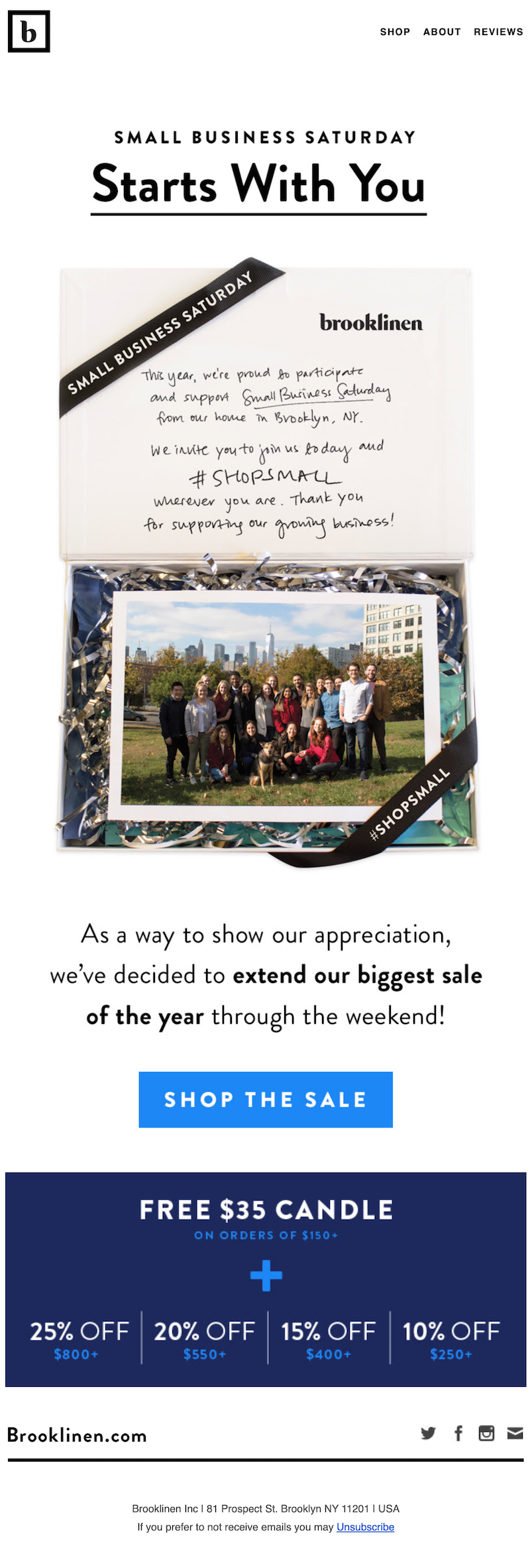
Give your customers context
While most people are probably familiar with the concept of Small Business Saturday, it never hurts to dive a little deeper. Use your Small Business Saturday email to further explain the idea behind this day. Otherwild describes just why Small Business Saturday is so important and how it helps community-focused small businesses keep their doors open.Subject line: Support small businesses

Include catchy Small Business Saturday email subject lines
Judging from our inbox, most businesses marking the day mention Small Business Saturday in their subject lines. Others play off of the phrase “shop small.” We also recommend including your specific deal or promotion in the subject line; after all, that’s what people are looking for during the holidays. Their minds are still in discount mode the day after Black Friday. So adding numbers and percentages in the subject line could help increase your open rate.

Add a countdown timer to increase hype
Countdown timers have a lot of benefits. These dynamic, real-time elements are a great way to jazz up your email and create a sense of urgency. And adding a countdown timer to an email isn’t as difficult as you might think. While not a Small Business Saturday email specifically, this Lands’ End email has a great countdown timer that grabs your attention right off the bat.Subject line: Countdown’s on: 50% off 1 ends tonight

Wrap-up: Celebrate Small Business Saturday in style
Use the BEE email editor to bring your Small Business Saturday marketing ideas to life! BEE is a great tool for small local businesses. The editor is 100% free to use, with a template catalog full of 500+ professionally designed email templates available, including a set of Small Business Saturday email templates. Use BEE’s email editor to create your Small Business Saturday emails this year!
Share this post with your friends! Pin it on Pinterest ?
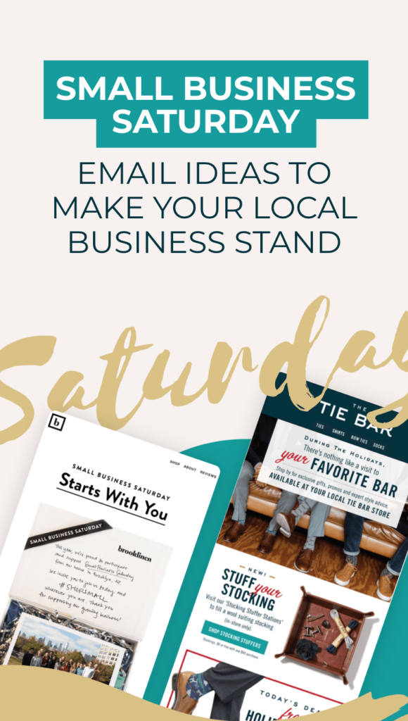

Stay informed on all email trends
From the latest creative design strategies that inspire your next campaign to industry best practices and tech advancements, our newsletter is the go-to for all things creation.
