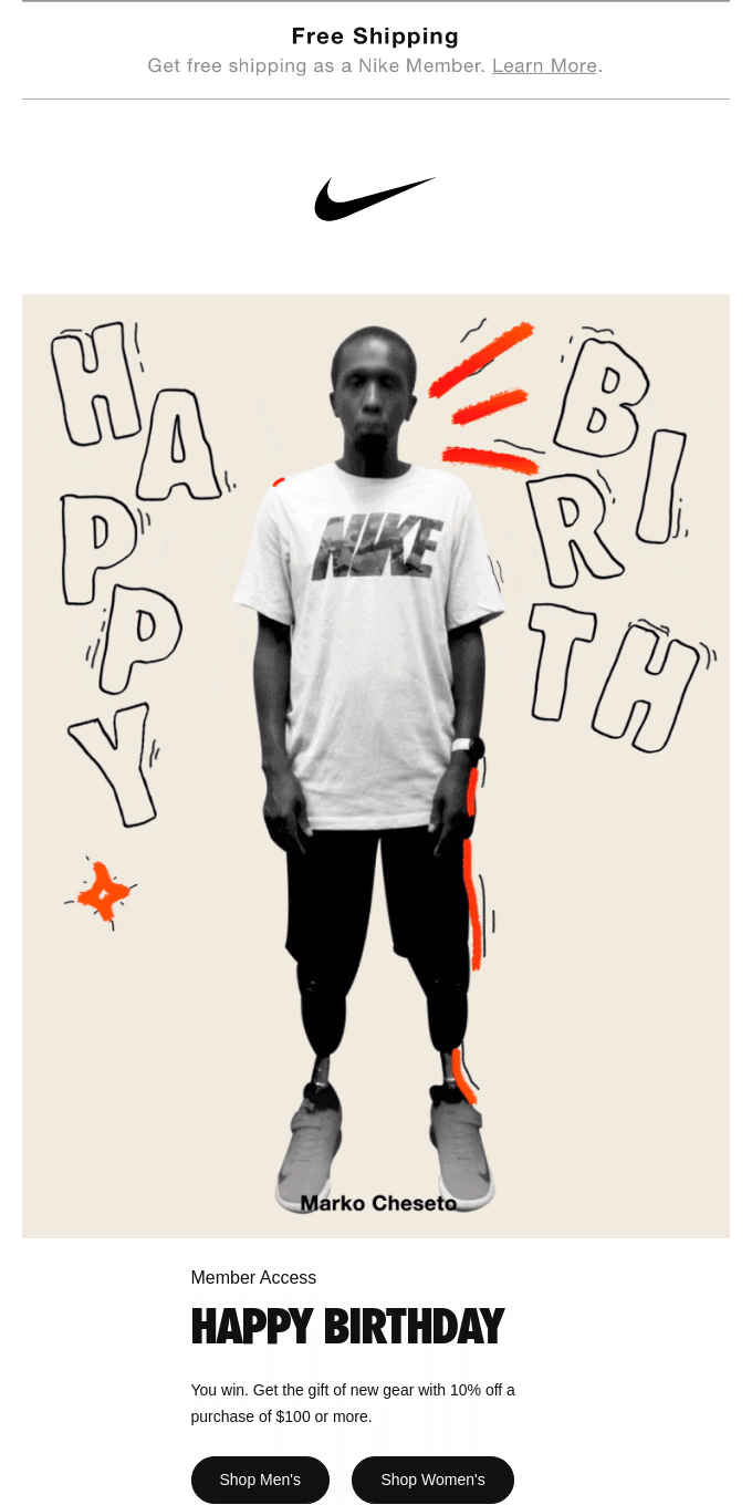
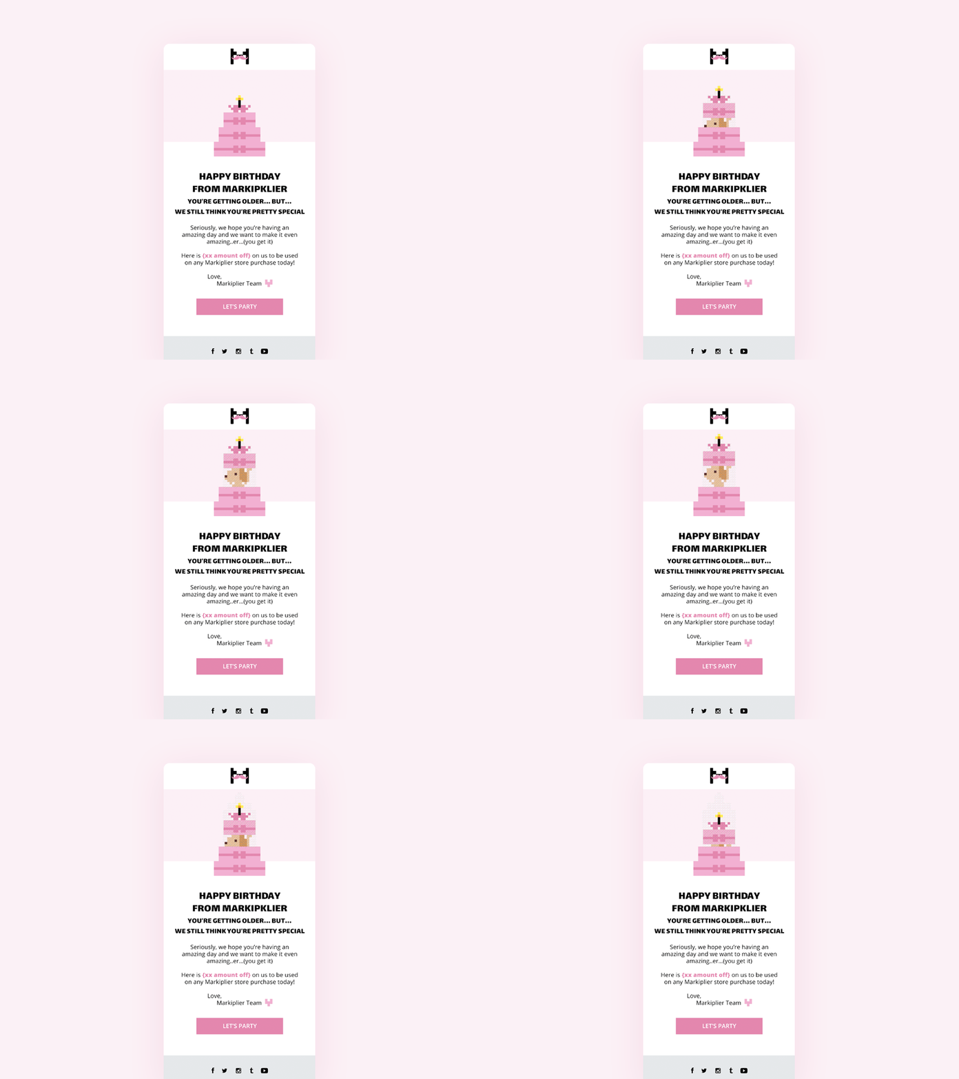
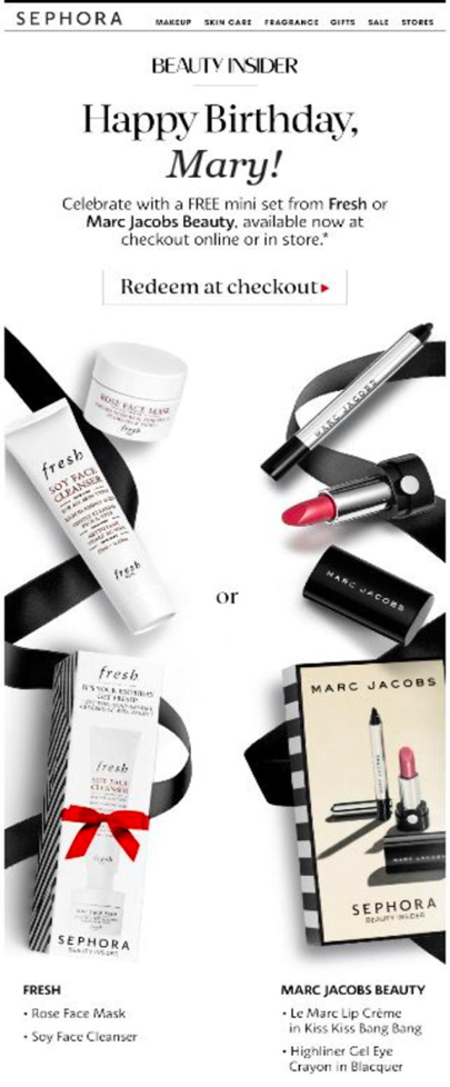
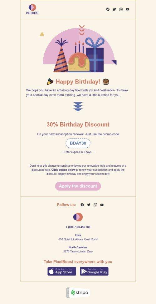
Evolution of Mobile-First Design
The term "mobile-first design" is one you may have heard before, but perhaps you've never put it to practice. To understand what mobile-first means, it's important to understand how web and email design has evolved over time.Previously, desktop computers were the most commonly used device to view websites and emails. Today, mobile phones are ubiquitous and part of our lives.We use mobile phones for most of our everyday tasks. From waking up tolistening to our favorite podcasts, managing our project, chatting on Slack with our colleagues, and, yes, checking emailsThe shift in how users view content forces marketers and designers to approach email creation with a slightly different mindset – using a "mobile-first" design method.
What is Mobile-First Design?
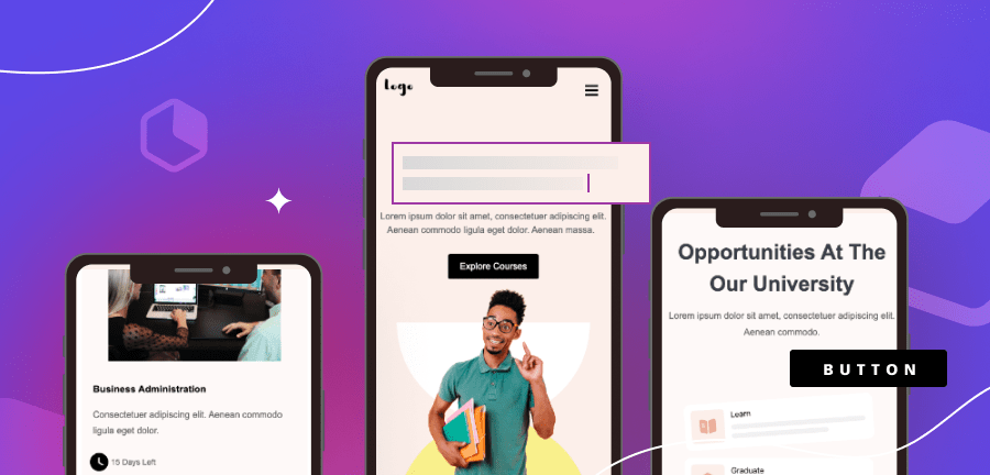
The mobile-first design method encourages us to build emails and websites considering the smallest device first. This means that as your design process continues, additional functionality and content is added for larger screens, such as desktops.A Bluecore report shows that "59% of Millennials and 67% of Generation Z use their smartphones as their primary email source." Given that a vast majority of your subscribers are most likely part of these generations, it is safe to assume that ignoring mobile-first design could result in low email engagement.It is easy to see that mobile-first is essential. However, it does come with its challenges that could become barriers to your success. These barriers include spam filters, ineffective subject lines, long graphic load times, or accessibility concerns.To get a better understanding of these challenges and best practices to tackle them, continue reading.
Why Should We Optimize Emails for Mobile Responsiveness?
Reports by Litmus show that "roughly half of all email opens occur on mobile devices." In fact, SaleCycle shows that "42.3% of people delete emails on their devices when they're not optimized for mobile."Unfortunately, a majority of marketers have yet to embrace mobile email design. A 2020 study by SuperOffice found that "nearly one in five email campaigns were not optimized for mobile viewing."By ignoring mobile design, even your best emails could be providing your reader with a poor email experience, and you could be missing out on the benefits it can provide, such as:
- Increased conversion rates
- Higher open and click-thru rates
- Fewer opt-outs
- Better email delivery rates
Mobile Email Design Stats to Make You Go Hmmmm….
Here are some moreinteresting mobile email stats that might make you consider upping your mobile email game.
- "Almost every report on email open rates concludes that mobile is responsible for at least 50% of all opens" (Campaign Monitor)
- "70% of users will delete poorly formatted emails in under three seconds." (Campaign Monitor)
- "Mobile transactions accounted for 71% of sales on Black Friday and Cyber Monday in 2021." (Shopify)
- "Smartphone users spend five to six hours daily on their phones, not including work-related use." (Statista)
See also: Top Email Design Trends for 2022
Creating Mobile Responsive Emails: 8 Best Practices
As we've outlined, you have much to gain from investing time in learning about responsive email design for mobile. According to MailChimp"launching a mobile responsive email design can increase unique mobile clicks by 15%".So, let's unwrap some essential best practices for creating responsive emails that convert and make you more confident in mobile email.
1. Best Email Subject Lines
The best email subject lines are the ones that intrigue you, offer you a deal, or require you to take action. While desktop allows up to 60 characters to reel your reader in, mobile-only has the capacity for 30-35 characters.
The Stats on Subject Lines:
- "Subject lines influence 33% of email recipients to open the email." (OptinMonster)
- "Subject lines can cause 69% of people to mark the email as spam." (OptinMonster)
- "Using an emoji in a subject line can increase open rates by 56%." (Experian)
- "Subject lines that use personalization increase open rates by 50%." (Marketing Dive)
- "Including a sense of urgency can increase open rates by 22%." (OptinMonster)
When you have so much riding on such a small amount of real estate, you may feel pressured to deliver brilliance each time.An effective subject line is one of the most important and it might seem like a difficult and daunting task. Lucky for you, we're here to help. Here are some tips to make writing a short and effective subject line:Ways to improve your subject line performance Right Away
- Personalize it
- Avoid salesy-phrases like "apply now," "cash bonus," and "earn money"
- Include a keyword for SEO Optimization.
- Add some emojis for an extra dose of personality
- Make it timely and specific
- Add a sense of urgency
- Keep it relevant to your copy
Don't Forget About Preheaders
The preheader is the text line displayed under the subject line in your email. You can use this additional real estate to get someone to open your email. We'll talk more about A/B testing and how you can test the effectiveness of your subject line and preheaders.
2. Best Practices for Designing Emails for Mobile
In a mobile-first email design world, design starts with the mobile user's needs and then the desktop user's needs. Approaching design with this mindset will ensure you're delivering the best experiences to most of your audience who choose to use mobile for email.A good mobile-first email design will include:
- A single-column layout
- Simple copy
- Standard fonts
- Limited, on-brand color
Single-column Layouts
A responsive email designed with a single-column layout will be well-received by users on any device. It is by far the most accessible format to navigate from a smartphone.The single-column email makes it easier to focus on the messaging, presenting information in a precise order using a hierarchy. The content will scale and fit nicely regardless of the device used to view it.
Copy
Continuing with our subject line guidance above, keep copy simple. It can be challenging for someone to read a large amount of text on a small screen, like that of a mobile device.Keep the experience enjoyable by landing your message quickly before users scroll past it. Here are some tips for how to write short, goal-oriented sales copy:
- Have one goal in mind, and try not to do too much more than that with one email message.
- Keep a consistent brand voice throughout the email.
- Use subject line and preheader text to add to the email's content.
- Use active words that engage.
- Get specific – don't use too many fluff words that take up space.
- Have someone else read it to make sure your message is clear.
See also: 4 Steps for Writing Better Emails and Collaborating Efficiently
Fonts
Have you ever tried to read a tiny font on a smartphone? Be sure to choose readable fonts – at least 22-point headlines and 14-point body text.We also recommend choosing a standard font and limiting the fonts used to no more than two. Defining this will keep your email legible and looking professional and on-brand.
Colors
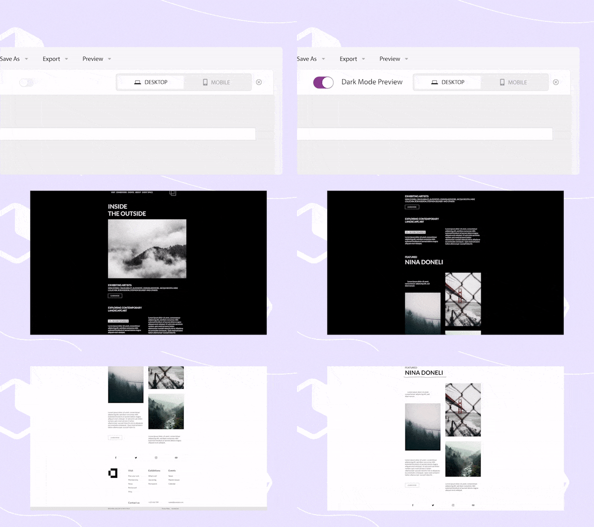
We love color and think it can add a lot of fun to design. However, mobile email is not necessarily the right place for a crazy amount of color. Too much design in an email can be distracting from the message, so try to choose one primary color and one or two secondary colors for each email.It would be best if you also considered accessibility concerns when choosing the color for the email. For many mobile users, Dark Mode is a default setting. Not only does it enhance accessibility and reduces eye strain on those with light sensitivity, but also:
- Preserves battery life on devices by reducing screen brightness and using less energy.
- Offers a slick and cool dark interface that many prefer.
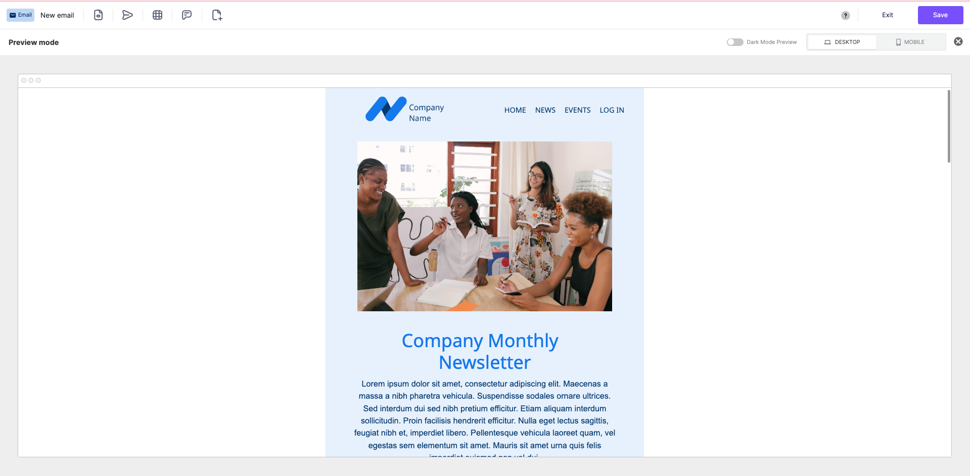
Read this article for Dark Mode best practices. When using BEE Pro, you can easily toggle on and off the Dark Mode feature to helpsimulate how your messages will be displayed when dark mode is enabled.
3. Optimize Images for Mobile Use
Images are a great way to create visual interest and engage your audience in the content of your email. However, images could also hurt your email's performance if not done correctly.See also: How to Optimize Images for Responsive Mobile EmailsSome common mistakes made when it comes to images include:
- Images too large to load
- Images not formatted for accessibility
- Poor image quality
- The image is not responsive
- The image is in the wrong format
To give your readers the best user experience, it's best to use responsive email images in your email design. Using responsive images is one way to keep your design mobile-first and provide a positive experience for mobile users.
High-Quality Images
It is best to export high-quality mobile and web images with a resolution of 72 DPI (dots per inch). While this might sound small, this is not one of those instances where more is better. A 72 DPI guarantees a high-quality image on web and mobile and prevents blurriness.It's also important to consider the image's color values. CMYK (cyan, magenta, yellow and black) color values are meant for print and won't display well on a digital screen. Instead, we recommend images in RGB (red, green, blue) because they work well for high-quality digital images.
Image Size
File sizes impact the total time it will take for email content to render once it's opened fully. In addition, on a mobile device, internet connections could contribute to long load times. Avoid these concerns by optimizing your image sizes for mobile-first email design.For the highest quality image, we recommend adjusting your content area width to around 600px. Images will adapt according to the device used to open the email, so this is the safest route to ensure a high-quality display. Be sure to compress your images for faster loading times.
Image Format
There are many different image file formats, each with pros and cons.
- PNG: These images maintain their quality when compressed and can export transparently.
- JPEG: These images are suitable for colorful photos but don't allow transparency and may lose quality with compression.
- SVG: These images are in a vector format, allowing easy resizing without losing quality.
Image Accessibility
Always consider if you should include accessibility components to assist visually impaired individuals. For example, here are two ways to make your images more accessible:
- Alt Text: Includes an image description that allows screen readers to describe the image to someone who cannot see it.
- Color Contrast: It may be hard for some to distinguish between colors. Reading colorful text on top of a bright background can be especially hard. Consult this guide by Color Oracle for tips on designing for people with visual impairments.
Keep Diversity and Inclusiveness Top of Mind
As you choose images for your mobile email design, be sure to consider your audience's diverse perspectives. Consider their genders, races, abilities, cultures, ages, and more.If your audience is diverse in these areas, then your emails should also represent this diversity. When you select images, consider if the people in your pictures represent different races, genders, abilities, etc. Here is an articleto help you write more diverse and inclusive emails.
4. Tips for CTA Design
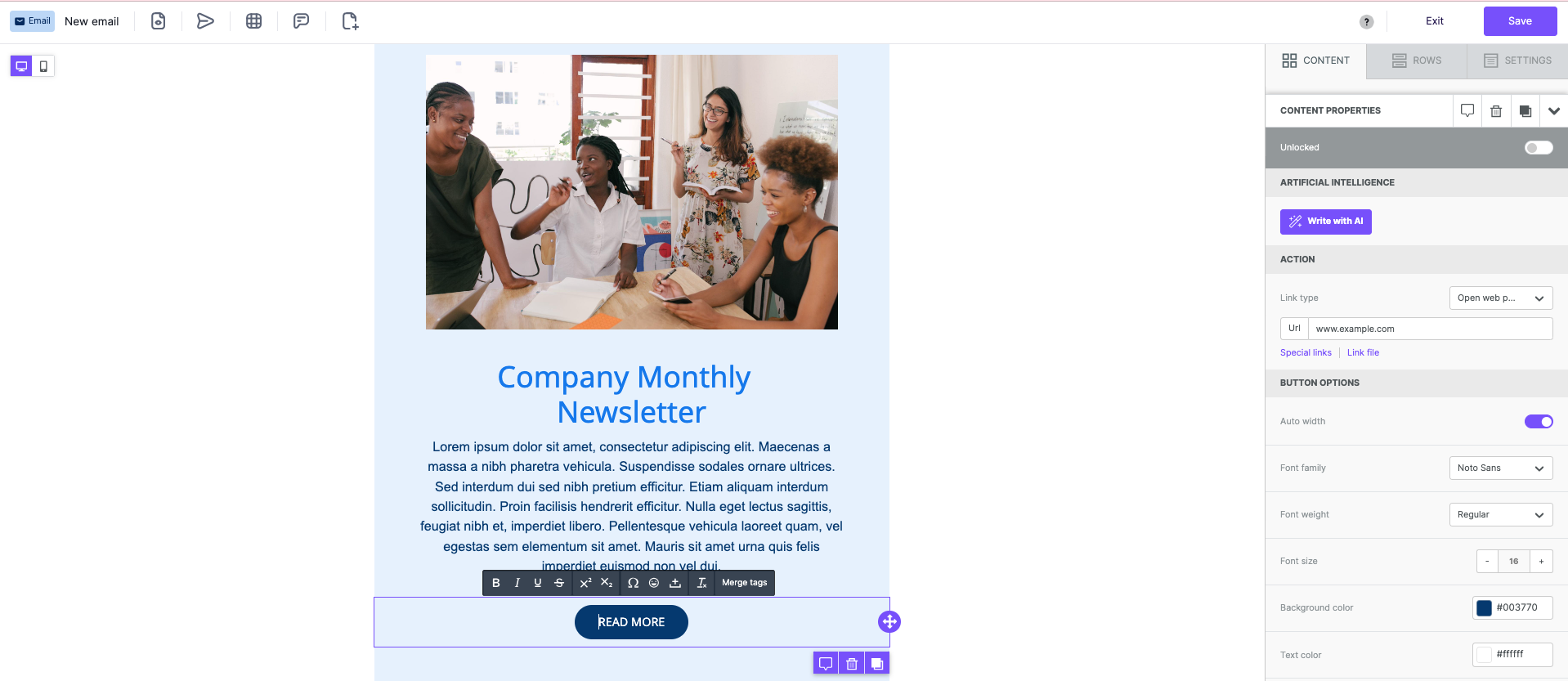
A call-to-action (CTA) can be a link or a button. When designing your mobile responsive email, it is best to use large, colorful buttons for the CTAs. According to Constant Contact, "buttons are 25% more likely to be clicked than a link alone."Sometimes, a thin link can be challenging to find and click on a smartphone. Provide a big, colorful button to get the most attention from your readers. A suggested size is a minimum of 44px x 44px.After you consider how to design your button, next, think about what it says. The purpose of a CTA is to encourage your reader to do something. Here is a list of common CTAs:
- Sign Up
- Subscribe
- Try for Free
- Get Started
- Learn More
- Join Us
- Register
These CTAs are generic, and some may cause hesitancy because the reader doesn't know what they'll get beyond the button. What does "Learn More" mean?Marketing emails often use engaging CTAs that are more explicit about what the reader can expect. A few examples of more descriptive CTAs include:
- Download the eBook
- Sign Up for Weekly Newsletters
- Book a Free Demo
- Register for Free Webinar
In your email, it is best to drive attention toward a single action to take. Including multiple CTAs with different activities may cause confusion and, therefore, inaction on the reader's part. Similar to the guidelines for writing the best email copy, keep your CTAs focused on the one goal of your email and don't distract from that goal.Ensure accessibility of your CTAs by using HTML code to define your button instead of inserting an image. Within the code, you can include alt tags to identify the CTA text for a screen reader.
5. Best Use of Space
When designing the layout for your mobile-friendly email design, remember to make it user-friendly as well. It can be challenging to interact with elements on a mobile device if they are too close together. By leaving a good amount of white space around design elements and CTAs, you can help drive a more positive user experience.Often, simple emails can get the message across more easily. Utilizing white space allows a reader to focus more carefully on the action that you want them to take. A good email will contain your logo, simple copy, plain colors, and a clear call to action.How you choose to layout your email will have an impact on the user experience. A modular structure, similar to the layout options provided in BEE Pro responsive email templates, will ensure that your email layout is mobile responsive and presents information in an orderly way.Keep your email layout simple by including these three basic simple and skimmable design elements:
- Header
- Body copy
- CTA
Keeping the content simple and a clean layout will make for a very user-friendly mobile email experience.
6. Best Use of Scroll
According to Campaign Monitor , the average person receives 100-120 emails daily, not including spam. That's a lot of emails! If you take time to read and scroll through every email, that will consume a large portion of your day.That is why many people scan their emails for essential details and only typically give an email 10-15 seconds of their time.For this reason alone, it is important that your email's key message is immediately seen with only a short glance. Don't beat around the bush, or you'll miss out on a potential conversion opportunity.Most readers do not follow a typical left-to-right reading pattern when scanning emails. Instead, their eyes will fly over the copy and images, typically in an "F" pattern.If you have subscribers, they may only be looking at headlines and CTAs.Here are some content tips by Campaign Monitor tokeep your email skimmable
- Subject lines: For mobile audiences, the best subject lines will be 28 to 39 characters.
- Preheaders: Most email platforms allow 40 to 100 characters.
- Email copy: Ideal length is 50 to 125 words.
- CTAs: Keep it short and sweet at two to five words.
Keeping your email copy concise will keep your message clear and get your point across more quickly.However, keep in mind that CTA placement is still extremely important, even if you have a short email. Don't bury your CTA at the bottom of the email – there's a high probability they won't even get there to see it.Instead, drive a higher level of engagement when you place a CTA before the first scroll. This may mean including a button in your header image or immediately below it. Then, if your email is on the longer side, including a few more buttons later will give them ample opportunity to convert.
7. Is A/B Testing Emails Necessary?
A strong email marketing strategy will include testing to see if the improvement is achievable. Who wants to settle for the status quo? That said, there are a few different ways to optimize your emails with testing to increase results.HubSpot reports that "Q.A., A/B, and spam testing can lead to a higher ROI of up to 28%". So, where should you start?
Q.A. Testing
Use the test-send functionality available through your email provider to review emails, as they will appear to recipients before deploying them to your entire list. Doing this allows you to test appearance across multiple devices and email clients. Be sure to click on all hyperlinks within the test email to ensure they are linked correctly, and also review any personalization for proper setup.A good Q.A. testing process may also include a review by another person. With remote work at its highest levels, you may need a tool that will provide a suitable platform for collaboration.Ways you can speed up email development and team collaboration include:
- Reusable content blocks - These ready-made templates allow everyone in your organization to build emails in an organized and repeatable way. BEE Pro utilizes a reusable content block strategy to help users create focused and on-brand emails every time.
- Style guidelines - Empower all team members to take charge of creating mobile emails when you provide them with a brand style guide. Policies can include color palettes, fonts, text, title sizes, etc., and help keep communications consistent across the organization.
- User roles and permissions - Allow team members to provide feedback and collaborate faster when you all have access to the email design platform. With BEE Pro, team members can be assigned as designated reviewers and provide timely feedback to speed up email design and launch.
A/B Testing
A/B testing can help you improve the performance of your emails by allowing you to learn what performs better – A or B. This article by 99Firms states that "approximately 59% of companies will perform A/B tests on their marketing emails."
What should you A/B Test?
- Subject lines
- Call-to-action phrases
- Button colors, size, and placement
- Salutation
- Bullet points
- Video or no video
- Personalization
- Sending day of the week
- Sending time of day
In addition to these items, A/B tests are also helpful in understanding UX design and conversion rate optimization. A study by Forrester Research showed that "better UX design could result in up to 400% increases in conversion rates."
Spam Testing & Email Deliverability
You can use a third-party testing app to check your email for red flag errors that may send your email to a spam folder. Nearly 16% of all emails go missing or get caught by a spam filter. Common triggers that could cause your email to identify as spam include:
- Long, wordy emails
- Lots of exclamation points
- ALL CAPS
- Too much salesy language
- I.P. address reputation
- Domain reputation
In addition to these items, some design choices could help keep your emails from the spam folder.
What is the CAN-SPAM Act?
The CAN-SPAM Act enacted in 2003, states that all marketing emails are required to have an unsubscribe option visible on every email. A simple mistake such as forgetting the unsubscribe link could lead you to be found in violation of CAN-SPAM and receive fines or penalties.Other requirements for staying in compliance include:
- Don't send emails to people who have previously opted out
- You must remove someone from your list within ten business days of opting out
- Each email must have the physical address of the sender on it
- Subject lines can't be deceptive or misleading
If you make it hard for a recipient to unsubscribe from an email, they could flag you as spam, and your email service provider could stop sending your campaigns. Unwanted emails can really bug some people.
8. Accessibility Guidelines for Emails
According to the CDC, 26% of adults in the United States have some kind of disability, making Accessibility design, not a choice but a necessity.The Americans with Disabilities Act (ADA) was implemented in the U.S. to ensure businesses considered how they were delivering products, services, and communications to all Americans. While some outlined guidance is specific, the law doesn't provide much detail around ADA email compliance standards. This makes our job even more critical in monitoring ourselves and ensuring we communicate in an accessible way.Email accessibility is about making sure allyour email recipients can access your message.Here are some best practice guidelines to ensure your mobile-friendly email designs are accessible:
- Create descriptive subject lines
- Don't rely solely on color to emphasize – use underlines with hyperlinks
- Use responsive design
- Structure content with headers
- Include alt text with images and graphics
- Ensure legible font size and high color contrast ratios
- Include white space
- Include an HTML language attribute
- Left-align text
- Include captions in videos
The most beneficial changes email marketers can make to email accessibility is to keep content short, subject lines descriptive, and links and buttons easy to see.
Mobile-Friendly vs. Responsive Email Design
When you're preparing to begin optimization of an existing email built for desktop, you should consider if you want to build your emails mobile-friendly or with a responsive email design. Before you can make that decision, let's compare the two options.
Email Width
When you design an email as mobile-friendly, you essentially design the email to fit a mobile device. Typically, a mobile-friendly email will be constructed as a fixed width to the width of a mobile device.Responsive emails, however, are slightly different. First, their construction allows them to conform to the width of whatever device views the email. So, the email will be viewable at full width, whether viewed with a smartphone, tablet, or desktop.
Font Sizes
A mobile-friendly email will only display fonts at the size they were coded, for instance, 14-point body text. However, a responsive email will optimize the font size automatically in proportion to the original to display it legibly on the chosen device.
Layouts
We mentioned earlier that single-column layouts are ideal for mobile-friendly emails. While this is true, designing a multi-column email specifically for mobile is still possible.A responsive email, however, will adjust a multi-column email for a desktop to a single-column display for a mobile device. As part of this adjustment, elements can hide if the programmer chooses to help keep the email at a reasonable length.
How BEE Pro Helps Optimize Email for Mobile
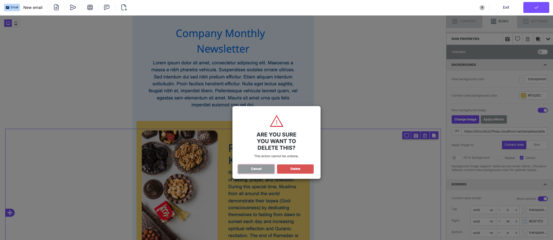
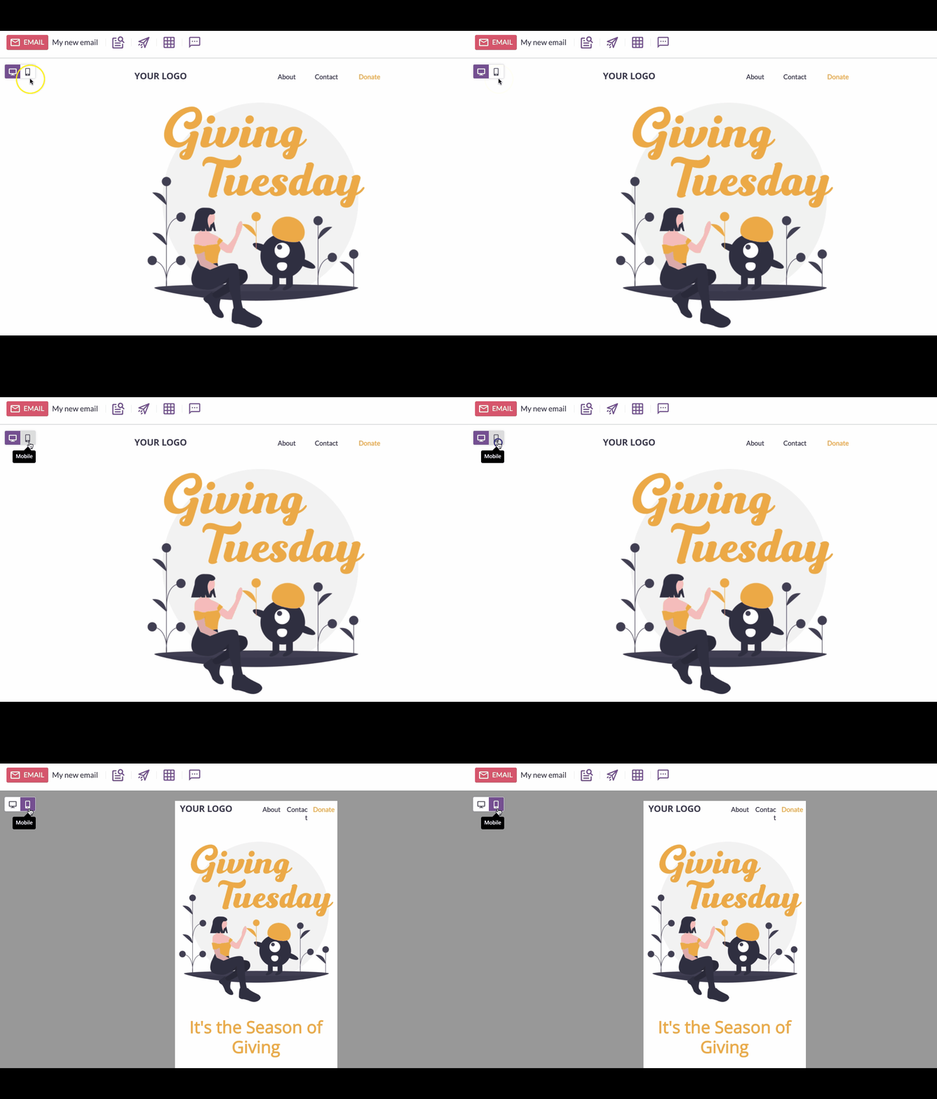
Mobile design mode, available in both BEE Pro plans, helps email marketers optimize email for mobile devices. Functionality in the platform allows users to hide elements to save mobile users space and control how pieces will stack on the smaller device screens.With mobile design mode, users will save time toggling between desktop and mobile designs without needing to enter a preview mode. Also, if you want to change your mobile design, you can do this independently of the desktop design version. We think this is a more efficient and intuitive way to create mobile responsive designs in less time.
Optimize your Mobile Email Design with BEE Pro
With BEE Pro mobile design mode, the system will optimize your email for the best display on a mobile device. This includes adjustments to:
- Alignment - When desktop designs have a multi-column layout, sometimes the alignment can look odd on mobile. Instead of hiding the contents, the mobile design mode will center-align it to look better.
- Text size - Set different text sizes for paragraph, list, title, button, menu, icon, and form for mobile display.
- Padding - Set different padding values for mobile and desktop.
https://www.youtube.com/watch?v=Vki0LNdPtJM
Mobile-friendly Email Responsse Template
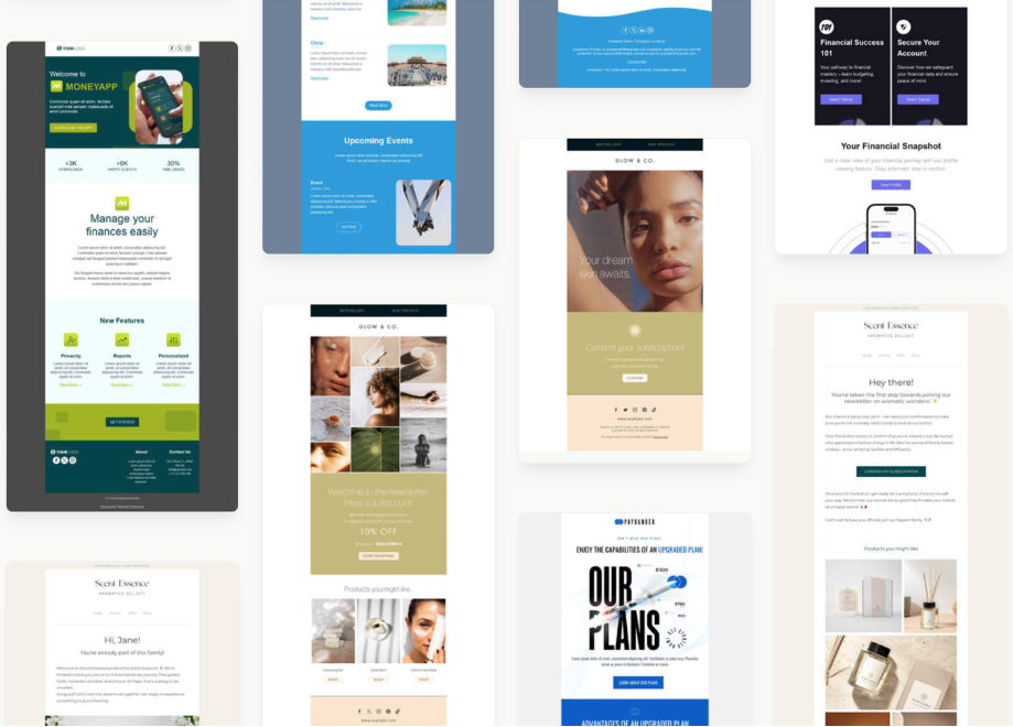
BEE Pro provides over 1,500 mobile responsiveemail templates. All of our templates are designed to provide you with peace of mind and ensure that all content is arranged to display optimally on mobile devices. Here are some tips for finding the right email template for you:
- Usage: How will you use the email? Is it for an announcement or a sale? There are many usage category options.
- Industry: Get closer to the look you want by filtering down to the industry level. A wide variety of sectors are offered, including automotive, health and wellness, and fashion.
- Automated: Will your email be sent in an automated message format? There are several great template options available to get your brainstorming. Consider abandoned cart, confirmation, thank you, and password reset emails.
- Seasonal: Grow customer relationships with timely seasonal email messages. We have various seasonal options, including Chinese New Year, Fashion Week, and the Super Bowl.
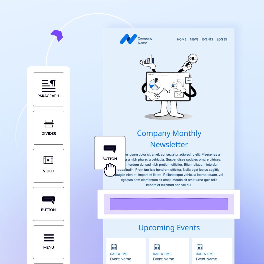
After you've selected your template to use, easily drag-and-drop content into the email or landing page. Switch from Desktop to Mobile mode to ensure design and content looks good on any device.
How Mobile Email Design Implemented with BEE Pro
The Director of Communications for the College of Natural Sciences and Mathematics at the University of Denver became a BEE Pro advocate after speeding up his design process to get work done faster.Since a large portion of his audience where busy college students with mobile devices, he needed a tool that allowed him to optimize emails for mobile. Our intuitive builder provided him with the flexible layouts he needed, along with key features like mobile optimization, for him to be successful at his job.With BEE Pro, the director could quickly complete email designs with easy-to-implement content blocks and use mobile optimization to design on-brand emails. It worked well with his email-sending platform and made his email marketing experience much smoother. In addition, quick preview tests allowed his boss to review emails quickly and stay organized for a more seamless workflow experience.You can read more about the University of Denver's BEE Pro story.
What Comes Next?
Now that you've become a pro at mobile responsive email design, check out our tips on creating landing pages that convert. You can use BEE Pro to effortlessly create responsive landing pages from scratch or use one of our templates.BEE Pro helps anyone design emails and landing pages with our easy-to-use, drag-and-drop, no-code editor. Get access to over 1,500+ email and landing page templatesprofessionally made by 30+ Designers. We are always launching new designs, so there's always something new to discover!Take your email and landing page design to the next level by subscribing to BEE Pro. Happy designing!


