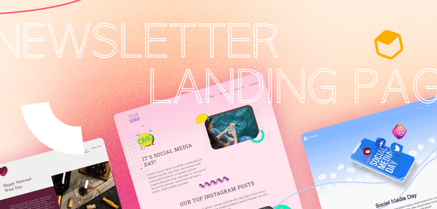
One of the best places to get to know a customer and build their relationship with your brand is from within their inboxes. Did you know email marketing has an astounding ROI of $36 for every $1 spent? But here’s the catch: for email marketing to work, you have to attract customers to your mailing list. How do you do that? With an outstanding newsletter landing page. Settle in, and we’ll tell you how to make one that takes your potential to new heights.
What is a Newsletter Landing Page?
Simply put, a newsletter landing page is a landing page on your site where visitors can sign up for your mailing list. Visitors typically reach this page by clicking on one of your ads or an invitation elsewhere to join your mailing list. This landing page has two jobs: to encourage them to sign up and to make it easy and convenient for them to do so. It usually consists of information about why to sign up for the newsletter (like special offers, exclusive content, and so on) and a straightforward sign-up form.Your landing page is your chance to establish trust with your audience. You’re asking for a commitment to your newsletter by proving what you have to offer is educational and interesting or guides them toward a solution to their most pressing challenges. You’re also promising not to misuse their email or send them spam.Some landing pages are more convincing than others. In this article, we’ll explain what makes an effective newsletter landing page and how to create one of your own.
Why Is a Newsletter Landing Page Important?
A newsletter landing page is important because it’s the final push that convinces visitors to sign up for your newsletter, and that’s a big deal. Your newsletter has outstanding potential to grow your relationship with customers, build brand loyalty, prompt sales, grow your brand awareness, and more. And the only way you get the opportunity to do these things is by encouraging customers to sign up for your mailing list via your newsletter landing page.
6 Newsletter Landing Page Tips for Building Pages That Convert (with examples)
Creating the best email newsletter landing page allows you to get closer to your readers over time. This is one of your first impressions, which is why your design quality is an essential investment. Put these pro tips and newsletter landing page templates to use to design an excellent landing page that sends your newsletter sign-ups through the roof.
1. Simplify Your Design and Page Elements
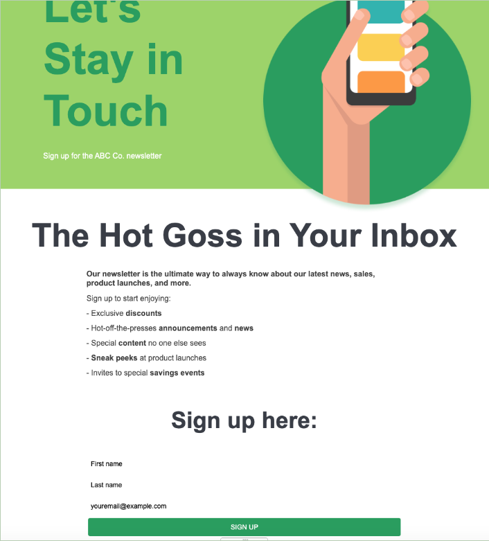
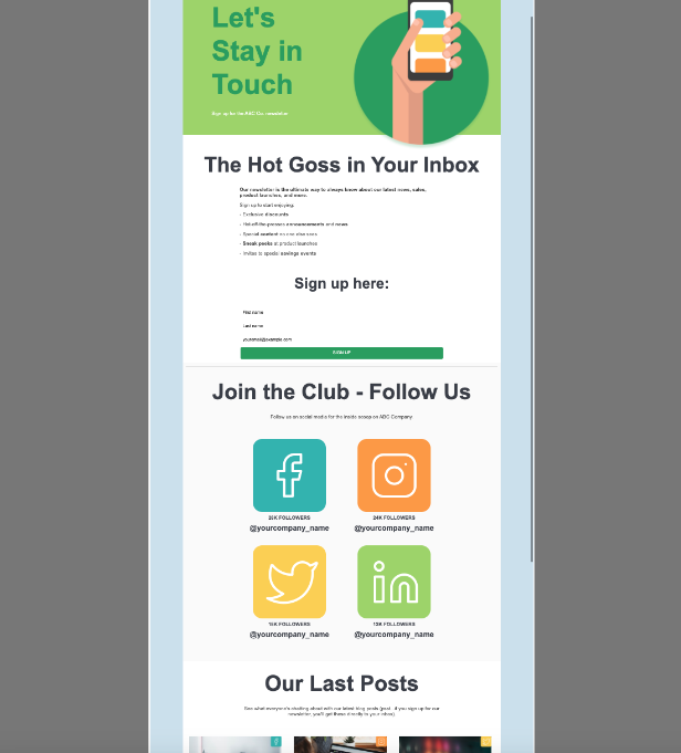
A successful newsletter landing page to get right to the point. The reader should be able to find the CTA easily so they can subscribe before losing interest. A newsletter landing page is not the place to add loads of detail. Data has shown that landing pages that overwhelm their customers with more than one offer get 266% fewer leads than pages with single offers. Only include the essentials - a few bullet points about what to expect from the newsletter and a simple sign-up form (all you really need is the subscriber’s email address and perhaps their name, so skip unnecessary fields like age, location, gender, and so on).This example does precisely that - uses white space and clear, minimalistic designs to draw in the reader’s eye without overwhelming them.
2. Pull in Readers With a Powerful Headline
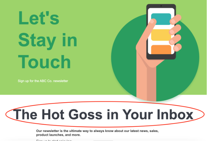
An attention-grabbing, engaging header serves as the “bait” that reels in readers and gets them interested in finding out more about your newsletter. First, determine what you want to convey. What is the purpose behind your newsletter landing page? What will you provide your audience with once they subscribe? Do you want to offer updates on your products or educational resources? Your header should clearly but concisely tell readers why they should read on.The headline is your first impression. The font, size, and location of this headline will help readers know what the entirety of the page is about. It’s where you captivate customers or lose them immediately, so your choices here are important.In this case, “The Hot Goss in Your Inbox” is unique, fun, and casual, albeit a bit corny, but in an endearing way. It makes readers feel like they’re joining a club by getting all the latest announcements and news in their inboxes. The headline is also formatted in a powerful way - clear, bold font with plenty of white space so it catches the reader’s eye.
3. Write Skimmable Copy
The descriptions and copy that follow your headline need to give the what and why in a way that quickly sparks the reader’s curiosity. What are you offering your customers? Why should they care and continue to care?While these questions might have your thoughts flooding with ideas, remember this copy can’t be overwhelming to the subscriber. Find the sweet spot where it’s skimmable yet captivating. Include bolded words, numbers, bullet points, and easy-to-read info. Your newsletter landing page copy should:
- Set expectations for the customer’s subscription
- Provide a compelling explanation of your offer’s value
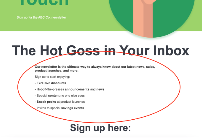
You know the value of what your newsletter will offer readers, so be upfront about your benefits and what a commitment or sign-up entails. Provide concise copy that specifies that value and the actionable steps they need to take to subscribe.In this example, the content under the headline is simple, clear, and to the point. It’s also structured as a bulleted list, which makes it easy to skim at a glance. The bolded words add to the ability to see the value in your newsletter at a glance and compel readers to sign up.
4. Provide Authentic Social Proof
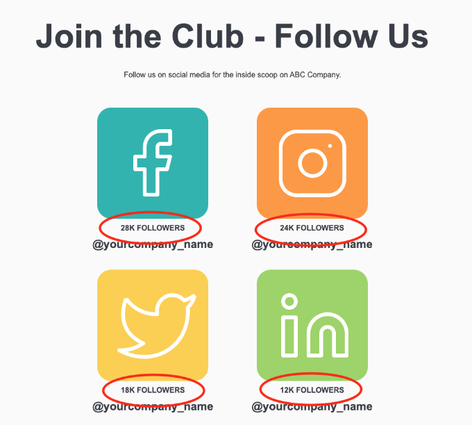
In case you’re not familiar with the phrase, “social proof” refers to showing customers that your product is popular so they may think, “If so many other people like this, maybe I would like it too.” Okay, it’s basically peer pressure, but it lends credibility to your product - in this case, your newsletter.You could include phrases like “Join our 3,000+ other subscribers” or “Find out why over 3,000 people have subscribed…and why new subscribers join every day!” You could also include slightly more subtle cues that your brand or your newsletter is well-liked.This example, while inviting readers to follow the company on social media, adds some social proof to the mix by providing a follower count for each social page the business is active on, as well as their top photos and videos from some of those pages. The views, likes, comments, and numbers provide proof that people trust you. Back up what you are promoting with factual progress through socials to increase conversions.
5. Use Valuable Imagery
Imagery that increases the emotional tie between you and your readers is key to high-converting newsletter landing pages. In truth, the human brain processes imagery 60,000 times faster than text. This means that your images can send a message and pique interest far more quickly than your copy can.Place your business logo, stock images, profile/bio pics, or other graphics to attract readers and inspire them to care about your newsletter. Portray value and ignite that emotion by using real pictures, which will allow readers to trust you and further feel for your purpose.In our sample newsletter landing page, the imagery throughout the page is on-brand with our hypothetical company’s image. It’s casual and fun, using bold colors to reel in readers’ attention and make them interested to read on.
6. Add a Clear CTA Button and Simplify Sign-Up
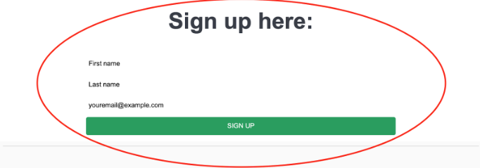
It’s time for the main event on your newsletter landing page: the sign-up. This is what it’s all about, so you want to make that sign-up form or button visually prominent and, dare we say, alluring.Anyone should be able to find this button easily on your newsletter landing page. Make it a visible, medium-sized font that is placed in a clear area on the page, and make sure the color of the button is not too bright or dim. Neutral CTAs will grab their attention if other details are accurate.Make sure the information you are requesting from the customer is simple:
- Enable autofill – Customers appreciate when fields populate automatically when possible. It saves time and fast-tracks the subscription process.
- Use only a name and email input – Limiting the number of field fills will get you more clicks because it’s quick and simple, respecting your readers’ time.
- If you must ask for more than a name and email, use multiple-choice questions – Typing out 3-4 fields takes more effort than clicking a choice bubble. Posing questions to get the answers you need also serves as a great tool for newsletters.
Again, here we see a clear CTA that’s easy to find. We are asked to simply fill out our name and email. The quick sign-up and bright colors allow customers to see and fully understand what is being asked of them and why. This makes for a quick and easy decision-making process.Read: Top Tips for Best Call to Action Button Design
Get Started With a Newsletter Landing Page Templates
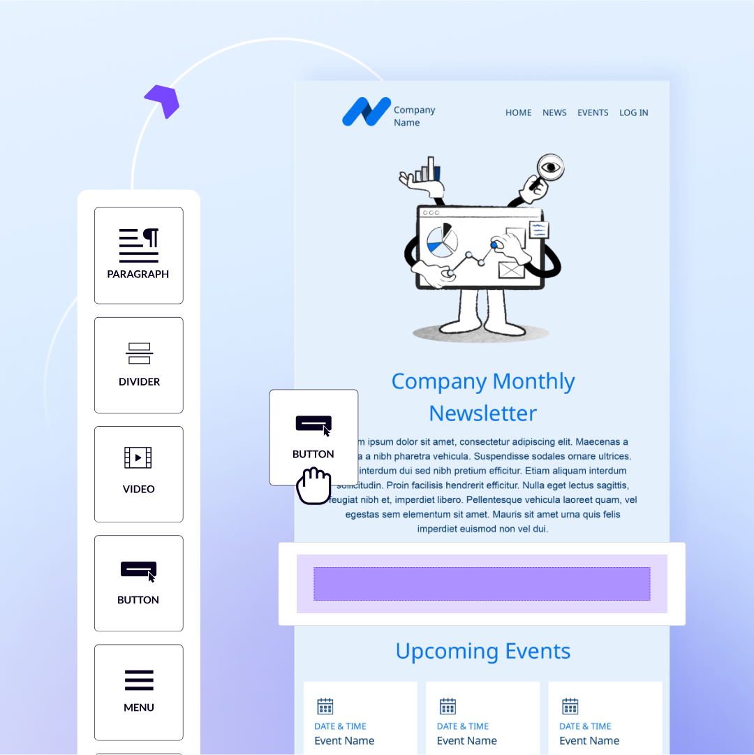
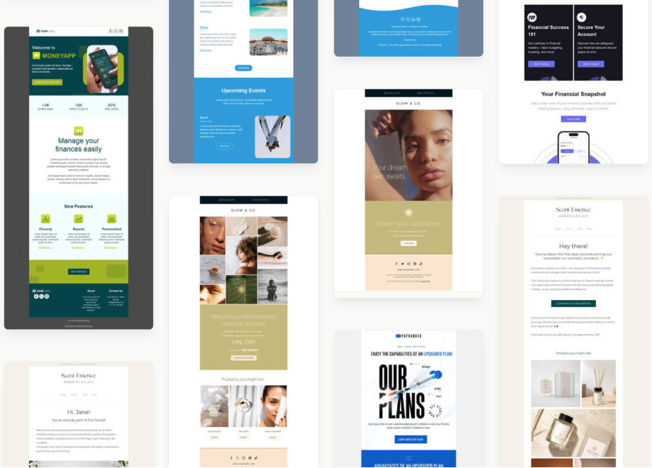
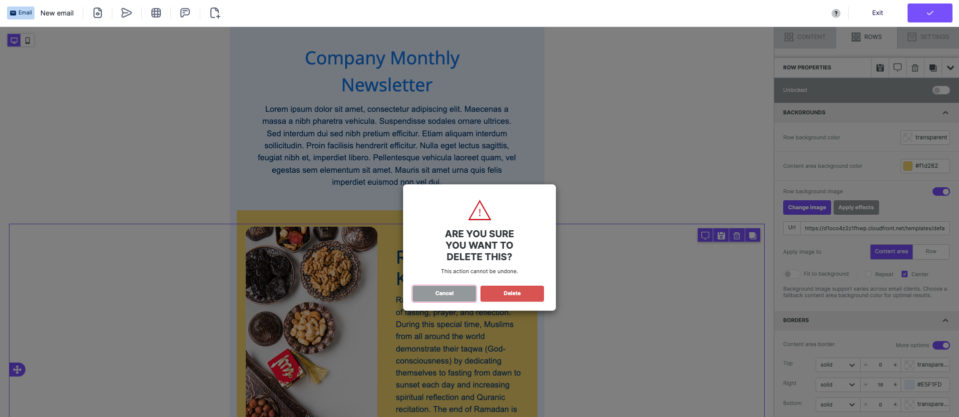
Now that you know which key elements make up a powerful newsletter landing page, you are ready to begin the design process. Not sure where to begin? We’ve got you! Our library of newsletter landing page templates guides you through using these best practices to design effective, conversion-driving landing pages, or you can start fresh and create your own. Beefree allows you to create your newsletter landing page in both a guided and customized way. To see for yourself, sign up for a free Beefree account today and start exploring our templates and options in seconds.Editor’s Note: This post was updated on May 2023 to ensure accuracy and comprehensiveness.


