
Solutions
Tutorial: Create an email signature in BEE
In a recentDesign Inspiration post, we looked at how brands use email signatures to make a statement about their brand identity, build a connection with readers, and leave a lasting impression. An email signature isn'tjust for person-to-person business messages; creative signoffs areused in marketing emails to add a personal touch. In today's workshop, we'll show you how to create awesomeemail signatures in the BEE editor. Keep reading to learnhow!
Recap: Qualities of a great email signature
Check out our video recap:
These are the design best practices we'llkeep in mind as we create our email signature:
- Short. Just a few lines of text.
- Simple. A single font and a single accent color.
- Visual. With a headshot, signature, or logo.
- Organized. Hierarchy and structure matter.
- Linked. One or two calls-to-action.
- Personal. In our brand voice.
- Mobile-friendly. Responsive and simple; not a single image.
Version 1: Basic signature with plain text
Including an email signature is a statement in and of itself. Plenty of messages don't have them. But including a signature tells readers the email was sent by a real person and not by a robot. It makes the message a little more personal, and it says something about your brand (you're personal, friendly, thoughtful).So you can keep your email signature simple. Just having one already has a lot. Some examples of simple email signatures we spotted look like this:
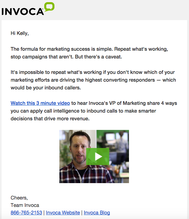
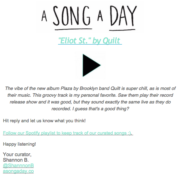
Making a simple signature like this is easy in BEE. Let's open the editor and choose any templatewe'd like to get started.For either of these signatures, we can select a single-column container from our Structure menu...
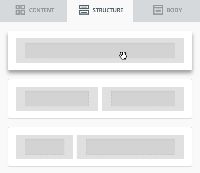
...then drag in a Text box from the Content menu:

Now let's type in a nice signoff in our brand voice. We saw that Dropbox signs their emails "Happy Dropboxing!" and Mailcharts says, "Happy emailing." Above, Invoca signs off with a "Cheers." Instead of closing with “Thank you” or “Sincerely” or “Best,”we can use this opportunity to create a tailored signoff. Today, I'm going to go with this:

I like the font Georgia, so I'm going to choose it from our list of email-safe fonts, and increased the font size to 18px so it's easy to read.

Now, let's add some basic, linked details. Sticking to our "keep it simple" best practice, we'lladd two links: one to our Twitter account and one to the blog. A great opportunity to have fun with color and further brand the signature is to use a brand color for links. To change the color of links in our email, we'll go to the Body menu.
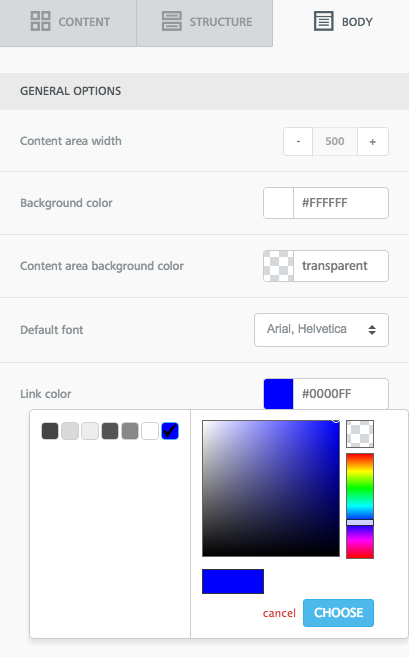
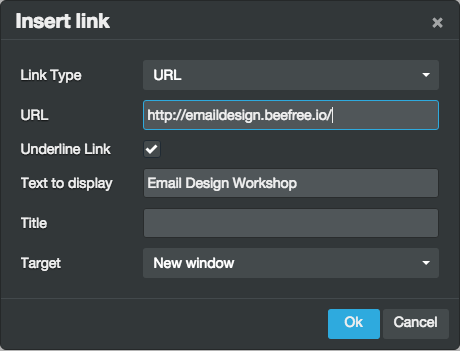
I'm selecting apale blue accent color we use onthe blog. When you add links, you can select if you want your linked text to be underlined or not in the pop-up menu.
Here's my signature:

On the blog, we talk a lot about the importance of calls-to-action in email. Your email needs to drive readers to a CTA button, and that CTA should be well-worded and well-designed. Anytime you link content, that's a CTA, too. One way to make linked content in a signature more compelling is by making it an active statement, and keeping it to just one link. Here's something to try:

It's more compelling than just adding a simple link, isn't it? Try it out and test the results with your subscribers.
Version 2: Add social buttons
We can keep our stellar simple design from Version 1, but instead of links, we can switch to icons, especially if we want to drive people to social media. I'll delete oursignoff one-liner and add a two-column structure beneath my name:

In the smaller column on the left, I'll add social media buttons from the Content menu. On the right, I'll have plain text.

Now, I'll edit my social media buttons. In this case, Iwant to includePinterest, since the Email Design Workshop recently started curating some awesome design boards on the site, and I want to drive readers there.
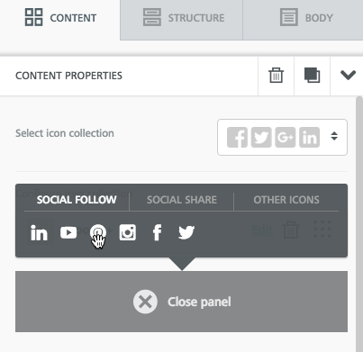
Then I'll add a line of text on the right.

To balance out the signature and create a stronger sense of organization and hierarchy, I'm going to drag in a divider line between the signoff and the Pinterest CTA. And voila!
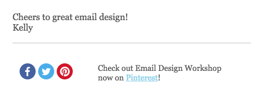
To read more about customizing your social media buttons, check out our post on icon design here.
Verion 3: Include a headshot
It’s refreshing to see the person who’s sending an email—the personal touch might make readersmore likely to engage—so we really like these photographic signoffs from Hubspot and Apartment Therapy:
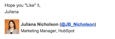
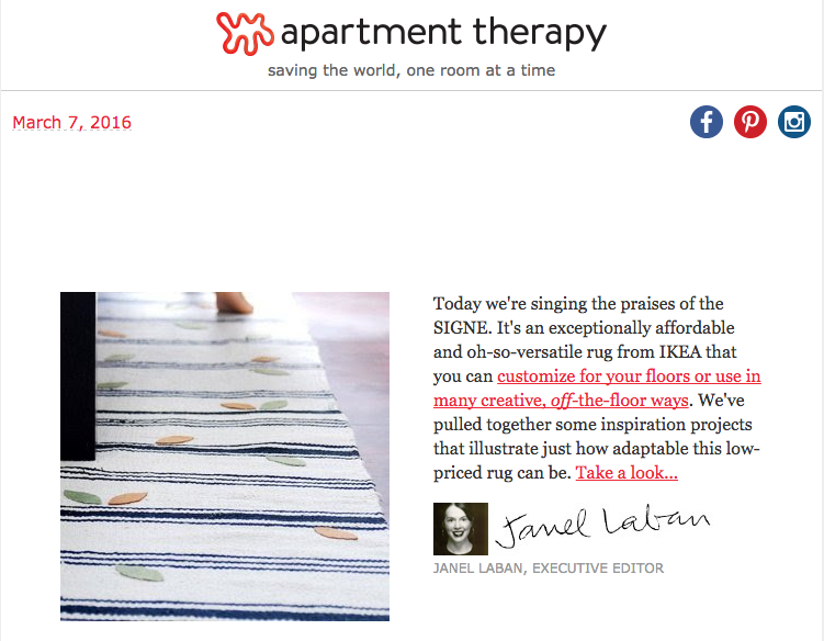
To create something similar in the BEE editor, we'll again start withthat two-column structure, but this time, we'll add an image placeholder on the left instead of one for social buttons.

Now it's as easy as dropping in my photo and updating the text, and we have a simple, personal signoff.
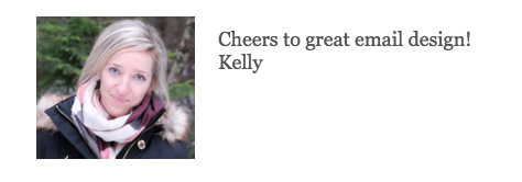
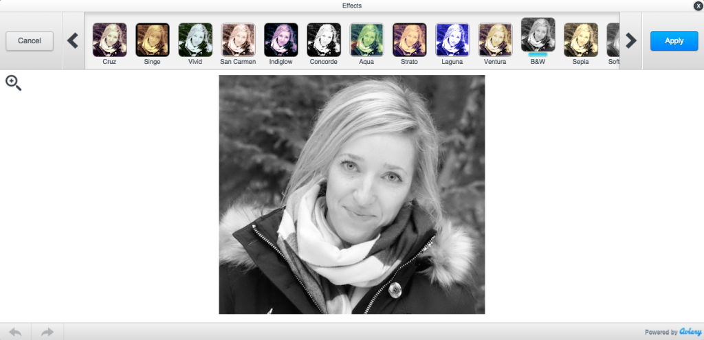
The BEE editor also has a built-in image editor from Aviary. You can crop, color-correct, add filters to an image, and more. Just select your image and press "Edit image" in the menu on the right. I'm going to use it to quickly update the photo to B&W.
To go with the new black and white theme, I can also add two social media buttons in the gray color scheme to round out the signature.
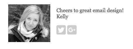
Or I can add a pop of color with a simple CTA:
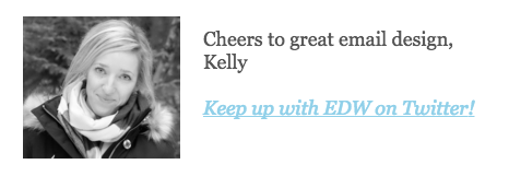
There are plenty of possibilities! Have fun with your options and tools on BEE.
Version 4: Add a digital signature
Adding a hand-written signature to email is a greatway to add a personal touch to your email signature. To do it, scan your signature or create one in a program like Photoshop, then add it to your email as an image.To recreate Janel Laban's signature from Apartment Therapy, we'd start with this structure in BEE:
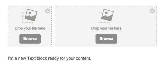
Then we can add in a headshot and signature image, and customize the text underneath for a title.
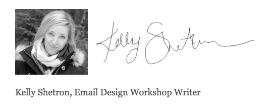
And thanks to BEE's built-in responsive design, the signature is optimized for mobile devices, too.
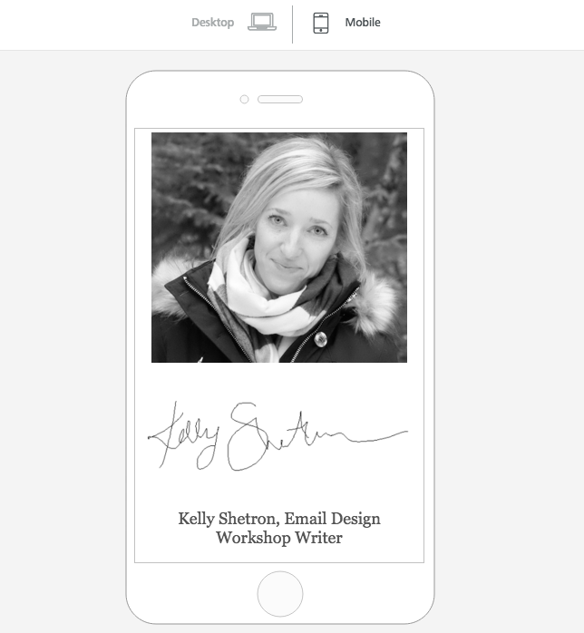
Creating an email signature is fun! Test out colors, CTAs, and images with yours, and let us know how they turn out!

Quick Video: How to use HTML colors alongside images in email
Don't only use images in your email design! Chances are some of your subscribers will have image rendering related issues in their inbox. Watch this quick video on how using HTML colors alongside images can solve many of these image rendering issues in your email marketing. To learn more, check out workshop tutorial: How to use HTML colors along images in email…and try this out in the BEE email editor: http://beefree.io/

Tutorial: How to use HTML colors along images in email
Email marketers and designers know sending an email composedonly of imagesis a gamble. Tailoring your image-only design to be just-so in Photoshop, then dropping it into an email template is tempting, but it can also increase your spam score, and it means your message won't be viewable to subscribers with image-viewing turned off. The best way to get around this is to break up imageswith plain text and HTML design that will render no matter what. And you can do this without sacrificing the look of your email.We recently looked at three clever ways brands are using HTML background colors in email. In one example,Moo, the website that helps you design and print business cards, incorporatesthe purple color from aproduct image intothe background of a plain-text module in their email. This color blocking technique unifies the email's composition, reinforcing a single visual focus.Itlooks likeit's asingle image even though it isn't.
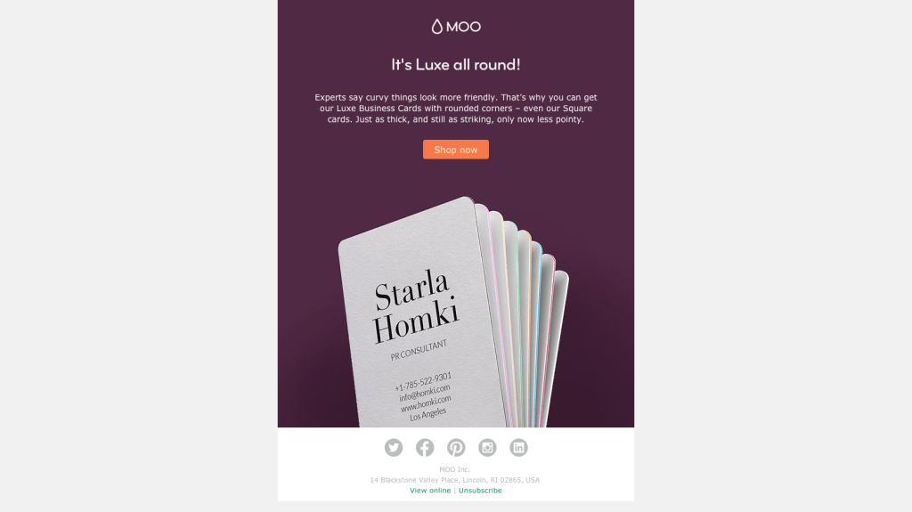
Tutorial: How to use HTML colors with images in email
Today, we'll recreate this email in the BEE editor to show you how usingHTML colors with images canimprove your email designwithout sacrificing looks.Here's our video recap:
Step 1: Set up the single-column structure
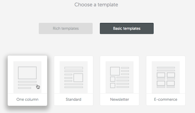
In BEE, we'll start designing in abasic one-column template.
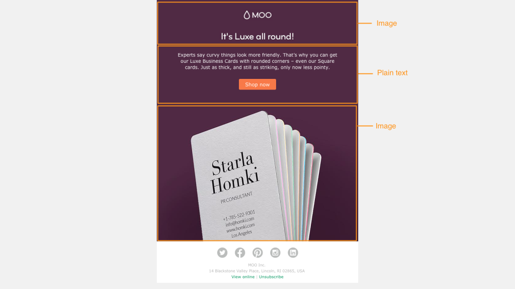
The email has four modules: one at the top for the header, one for the plain text and CTA button, one for the main body image, and one for the footer. From our Structure menu on the right, we'll create this structure by dragging in four single-column modules.
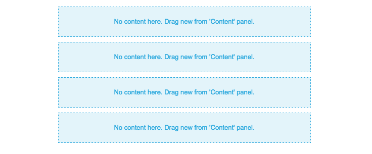
Step 2: Arrange content blocks
Section 1: The first module will contain two images: the Moo header andthe sub-header in the Moo brand font ("It's Luxe all around!"). So we'll drag in two image containers from the Content menu.
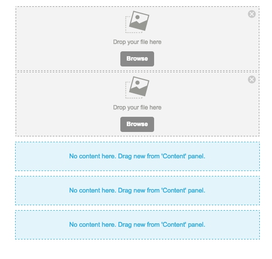
Section 2: The following module contains text and the "Shop now" button. Text and button containers are pulled in.
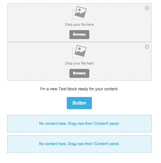
Section 3: This middle section will contain the central business card image.
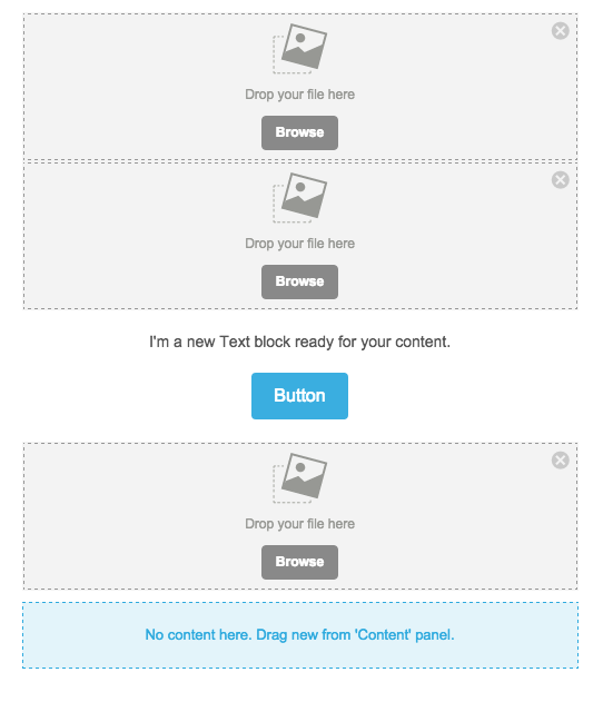
Section 4: The footer includes social media buttons, followed by text. We're all set!
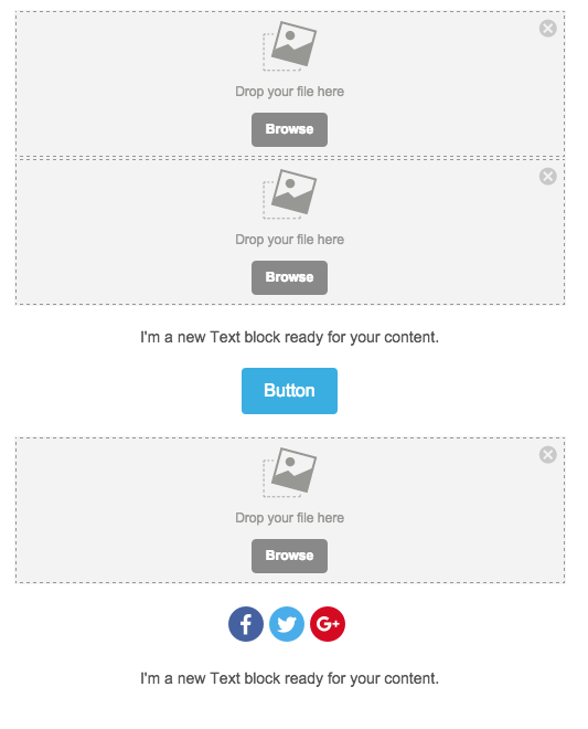
Step 3: Add content and customize
Add images: With our image placeholders are set, we can drag and drop images from the original Moo file into the email.
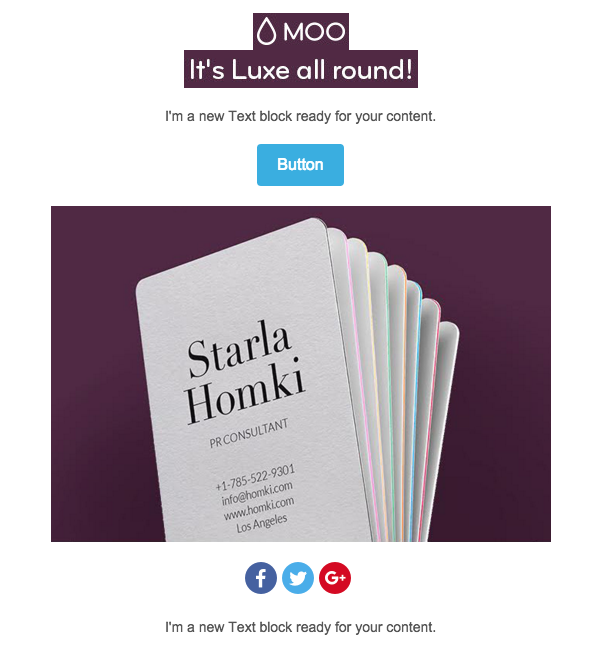
Customize text: We'll update the content in the body of the email and in the footer.
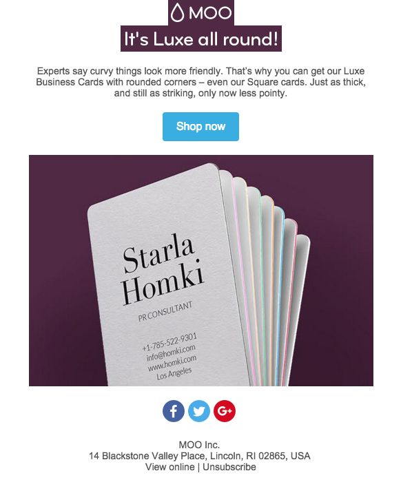
Then, we can format the text. To match Moo, we'll choose Verdana size 16.

The footer font is smaller; we'll choose 12px. To make the link color greenforUnsubscribe and View Online, we'll navigate to the Body menu and choose green for all links in our email.
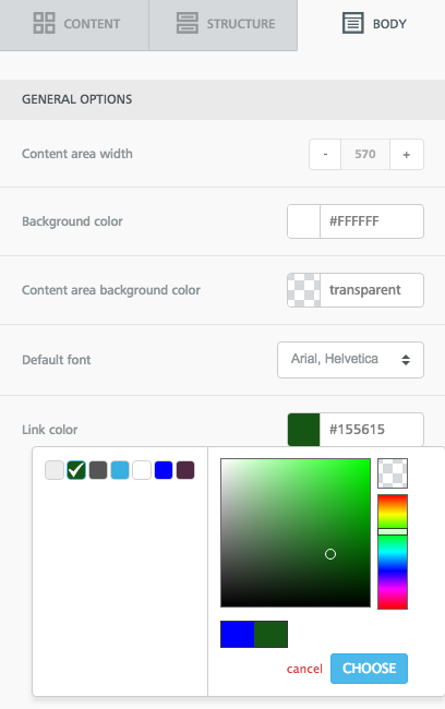
Then, when we link those lines of text, they become green!

Format buttons: Lastly, we'll update the CTA button and social media buttons.The CTA button needs just two simple changes: we'll make it orange in the Background color menu, and then we can also condense the height a bit by selecting a tighter option in the Line height menu. Read more about all the ways you can customize buttons in BEE in our post How to design bulletproof CTA buttons in email.

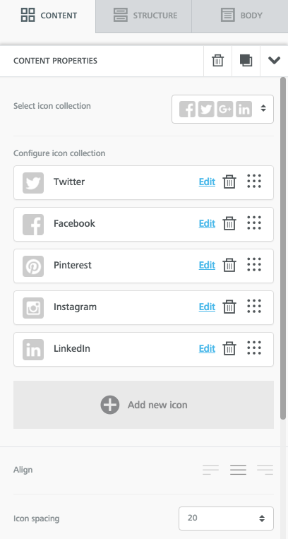
We'll also choose the same social buttons as Moo, and drag-and-drop them in the icon collection menu to reorder. Read more about how to customize your social media buttons in our post How to customize social media buttons in email with BEE.
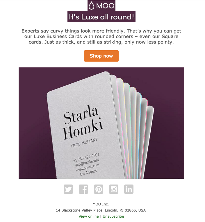
The message is shaping up!
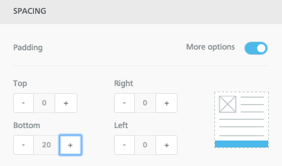
Adjust padding:The header images are clearly a bit condensed, so we need to create space between them. We can do this by selecting one or both images and increasing the padding above or below each one. Just made sure to move the More options slider to the right to make adjustments on particular sides of any type of content.
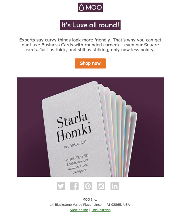
Our spacing now looks closer to Moo's.
Step 4: Select HTML background colors
Now it's time for the fun part! We need to update the background color behind the header and the plain text module to match seamlessly with the product photo beneath. To get the HTML code for the color we need, we went tohtml-color-codes.info, uploaded our image, and got the proper code.
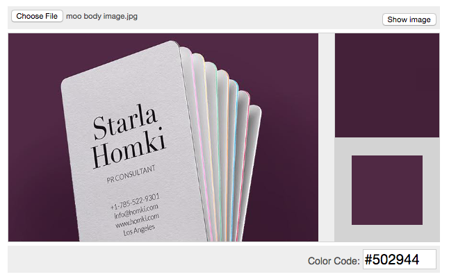
Then, we can copy #502944 and drop it right into BEE. The easiest way to do this in one fell swoop is to go to the Body menu and paste the code into the Content area background color field.
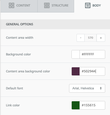
We can also select a light gray for the background color, same as the original email.Just like that, our email background matches the central image exactly. Pretty cool, isn't it?
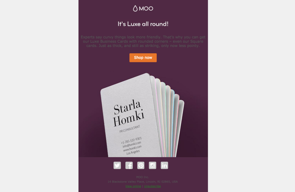
Just a few final updates: we'll change the text color to white, and update the footer background color to white, too.Here we are!
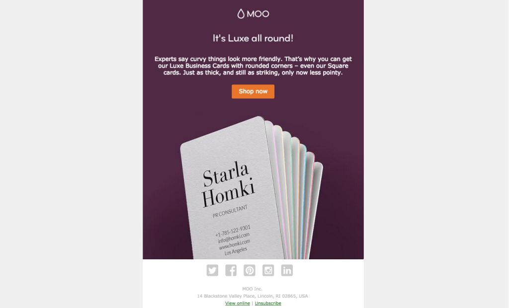
Put together, the matched modules makethe email appear to bea single, solid image. It's a simple way toimprove ourimage-to-text ratio with abold and bright email thatwon’t get caught in spam filters. Check out other ways to use HTML colors in email in our design inspiration post, and, if you're really feeling creative, see how to combine HTML colors with images to build unique content dividers. In the BEE editor, it's a cinch!
Tutorial: How to make a responsive photo collage in email
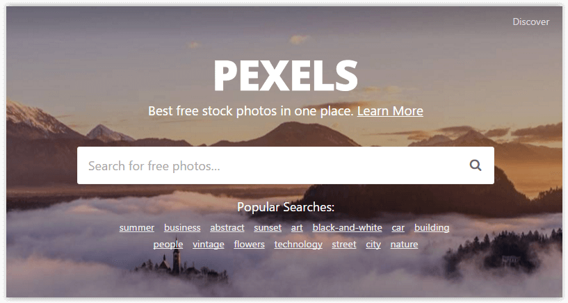
Photo collages (also called photo galleries) are a great way to add visual muscle to your email campaigns.Readers increasingly scanemails on mobile devices while they're on the go. Withonly a few seconds to capture subscribers' attention, photography is a great way to make an impact (especially if you're in thefood or fashion industries, where product pictures can make or break a campaign).A photo collage in email is the perfect way to display stunning images and tell a compelling visual story while avoiding the pitfalls of a single-image email. With great stock photos now easier to get than ever, even free of charge (we particularly likePexels), you're in the driver's seat.
Today we'll show you how to build a beautiful, responsive photo collage in email so you can design a message that looks awesome and converts.
Inspiration for our photo collage in email
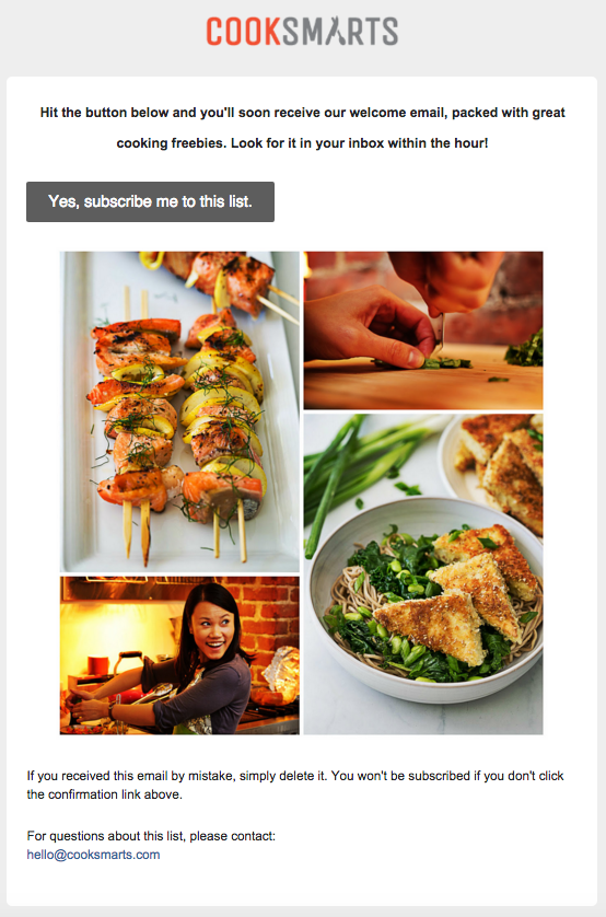
Many subscription confirmation emails look the same, but recently we took a look at how some brands are breaking the mold by giving subscribers a warm welcome and standing out from the crowd (on that, seeDesign a standout subscription confirmation email).One of them came fromCook Smarts, a company that emailscooking lessonsand recipes. After signing up for their mailing list, we received this confirmation email. The original, high-quality images made our mouths water. Thephoto collageserves as a delicious preview for the meal plans to come. Whata great way to get readers to tap"Yes, subscribe me to this list"!
But when we checked out the email on iPhone, we noticed it wasn't responsive.
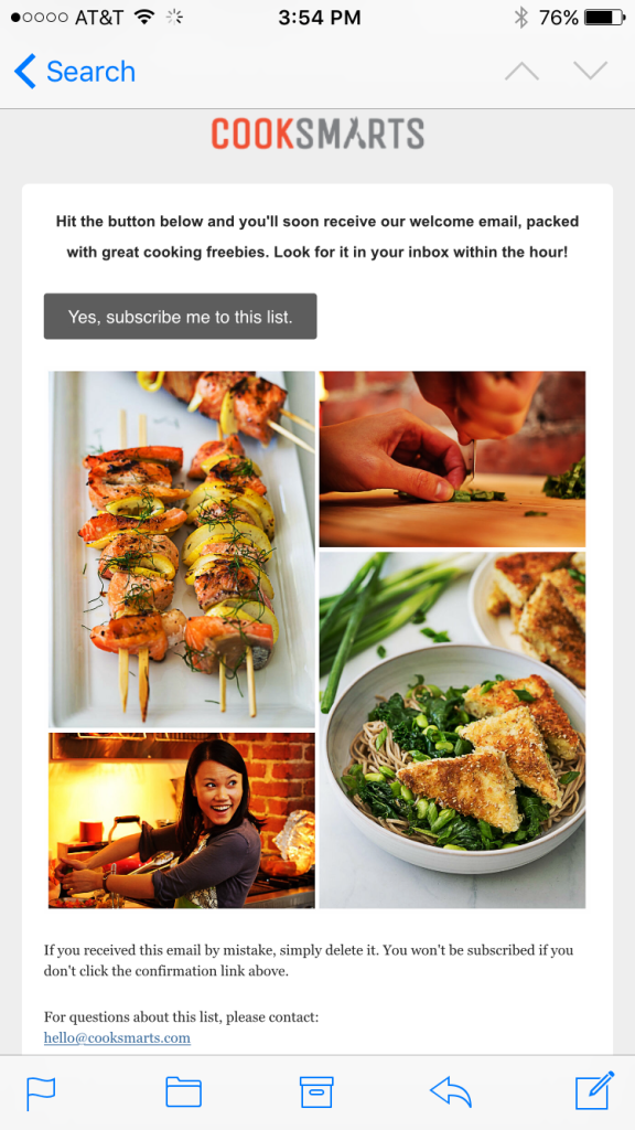
The text doesn't get any larger (it's actually a bit hard to read), and the photo collage is all one image, so it scales down significantly to fit the screen's width. Sometimes, not having a responsive collage isokay—you might want the images in your collage to remain in place, even on a small device. It depends onthe amount of detail you want to maintain and if losing that detail due to scaling is okay for the purposes of your message. If you make a collage that's a single image, you'll have to do it in Photoshop or a similar program, but you can make a totally responsive photo collage entirely in our drag-and-drop BEE email editor, without needing to pre-format. Here's our quick video recap of today's workshop:
Tutorial: How to build a responsive photo collage
We recreated the basic structure of the Cook Smart email in the BEE editor to get started. Starting with a basic single-column layout, we brought in the logo as an image for the header, formatted the email background color to gray and the content background to white, and copy-and-pasted the text into the email. We also formatted our bulletproof CTA button. (For tips on how to make these formatting changes, check out our post on modular design and HTML colors in email).
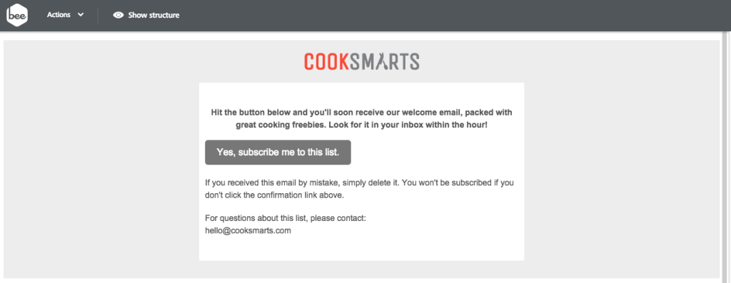
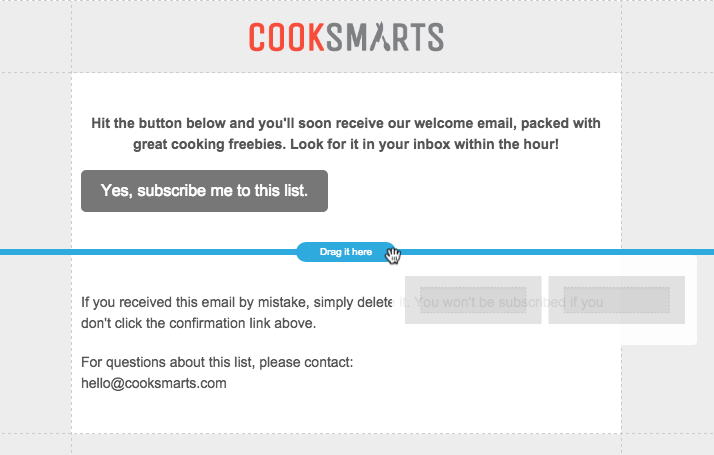
Setting up the photo collage structure
What we need to do next is set up the structure of the photo collage. While so far our email is a single-column layout, we'll need to add a two-column structure to arrange our photos. From the Structure menu, we'll drag one in.
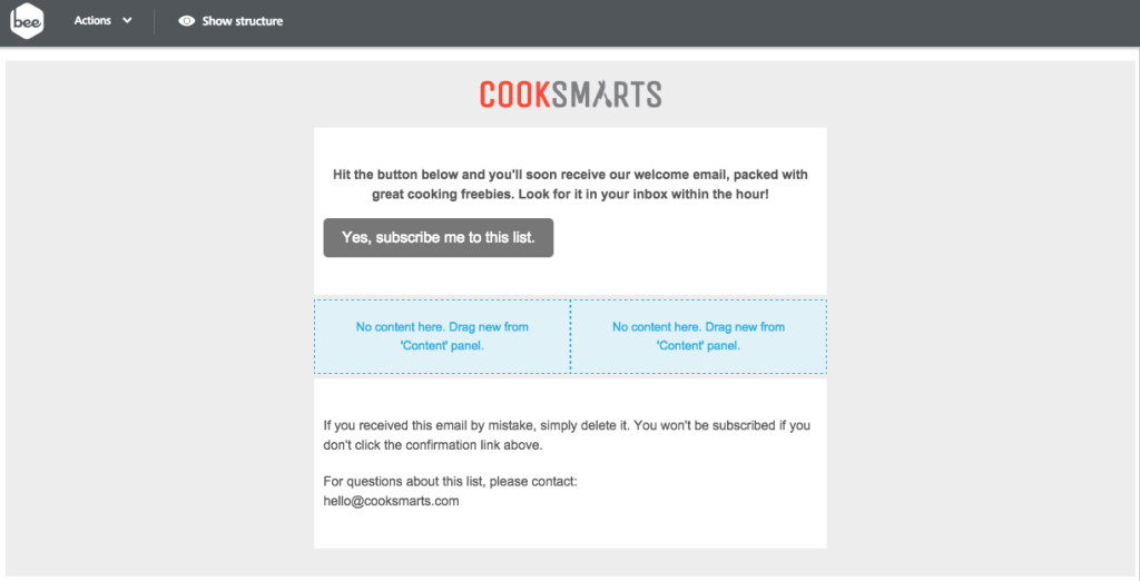
Now we have a placeholder for our content.
From the Content menu, we can drag and drop in four image placeholders, two in each column.One...
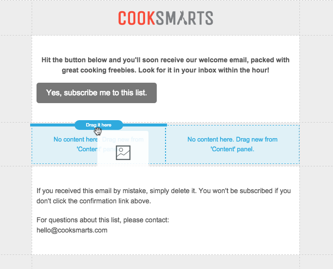
Two...
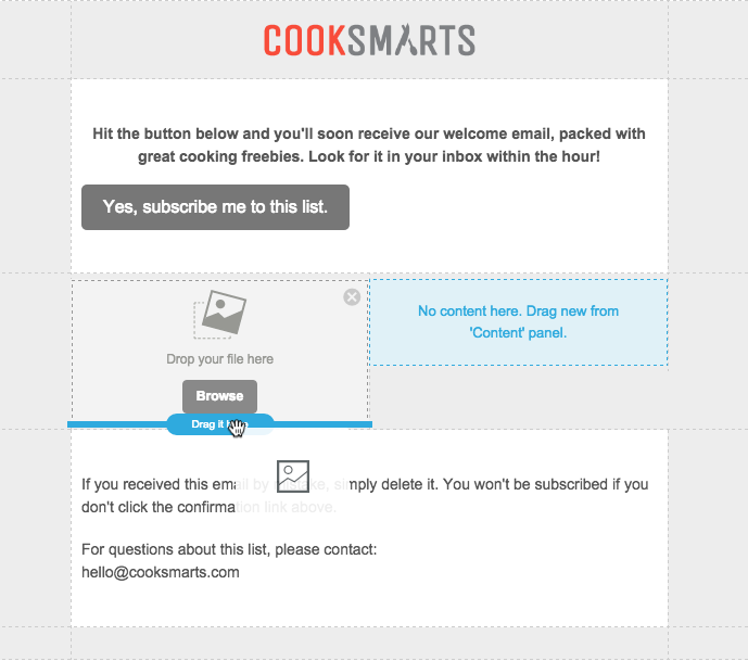
Three...
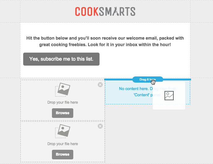
Four...
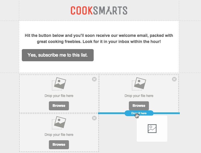
Ready to rock and roll!
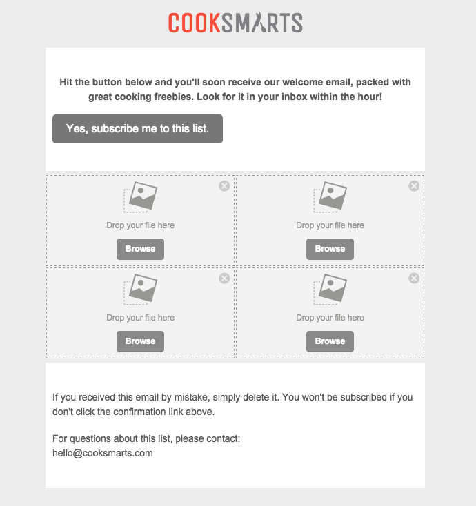
Adding photos to the collage
We took Cook Smarts' single image collage and saved each portion individually so we have four separate images to work with. Now we'll drag them in one at a time into our placeholders.
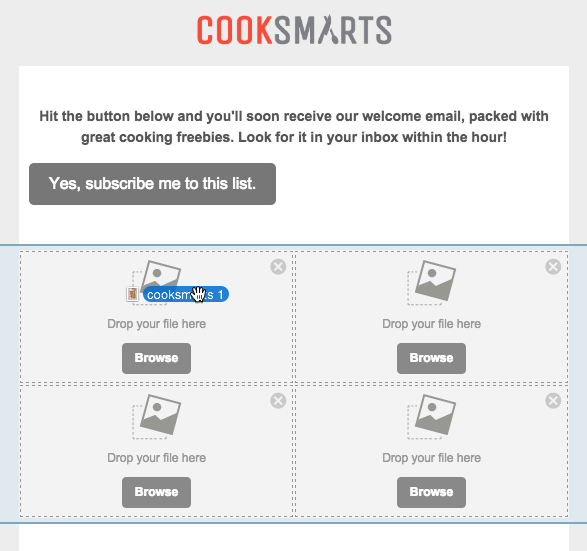
The content placeholders automatically adjust in size to fit the heightof each image, making it super easy to maintain the look and feel of the Cook Smart collage.
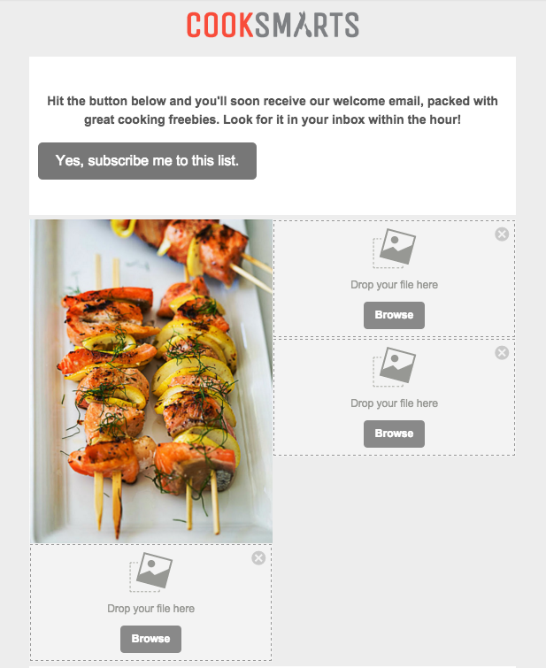
We can continue to add the images on at a time, dropping each one into place, until all four are in place.
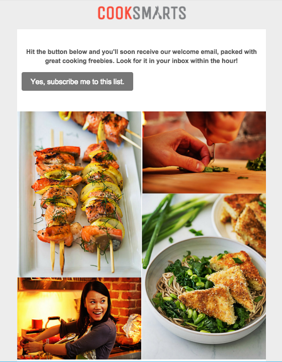
Fine-tuning with padding adjustments
The photo collage looks great, but we can more closely mirror the layout of Cook Smart's collage by adjusting the white space between the images andalong the outside borders on the right and left. We can adjust padding on any piece on content in BEE by clicking on it and navigating to the Content menu that appears on the right.To add white space on either side of our collage, we'll click the content row (the blank space to the right or left of our collage), so we can adjust both sides at once. Here's how:Turn on the "More options" slider under Padding.

In Column 1, we'll want to adjust the padding on the left only. By increasing the padding to 30px, we create a nice strip of white space on the left of our collage, similar to the original Cook Smart one.
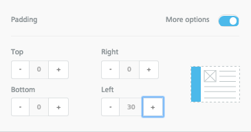
In Column 2, we will bump up the Right padding to 30px as well. Now there's white space on either side of our collage.
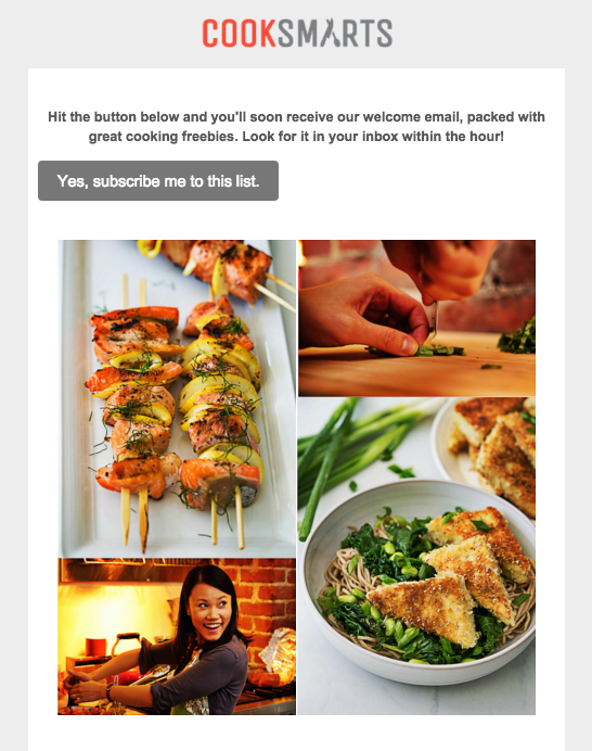
Looking good! Finally, we can make a similar adjustment for each image, so that there is a thin white border around the photos. Click on each photo, turn on "More options" for Padding, and fine-tune away! Here's our collage after we finished:
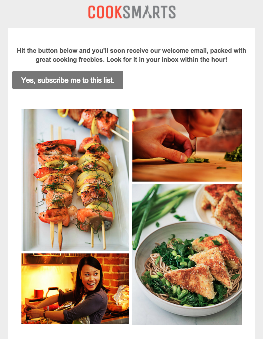
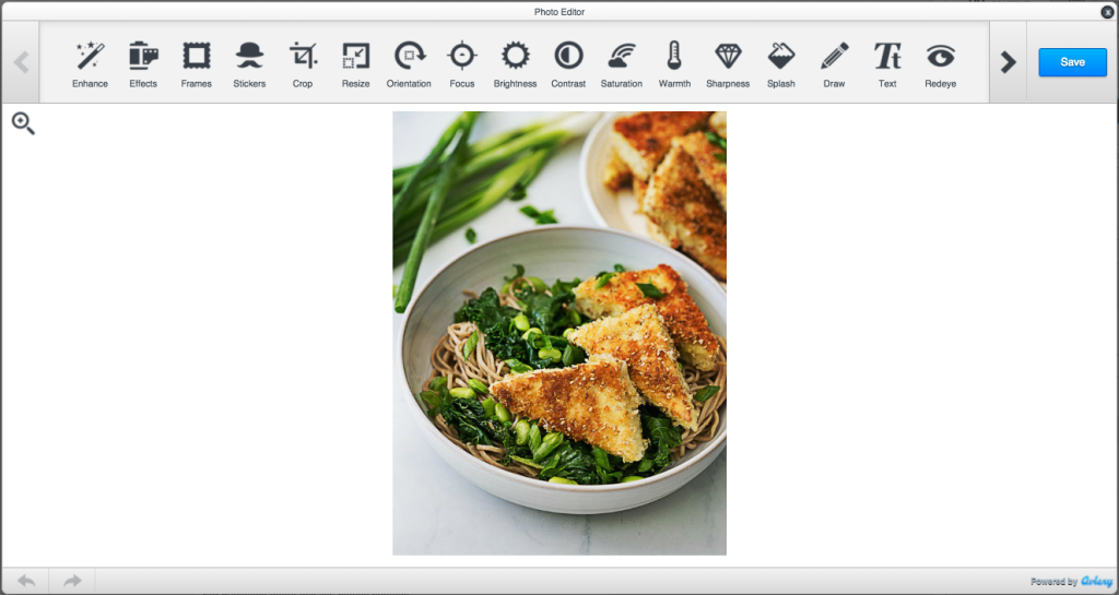
Ta da! The photos from Cook Smart are stunning and already look great, but the BEE editor also has a built-in image editor, from Aviary, that you can access to crop, orient, resize, and edit your images in countless ways. To access Aviary, just select an image, navigate to the menu on the right, and click "Edit image."

Aviary will load, and you can edit away!
Previewing our new email
To get a glimpse of how our new responsive photo collage will look on mobile devices, we can preview it in BEE. Select "Preview" from the Actions menu in the upper left corner.

And here's our mobile preview:
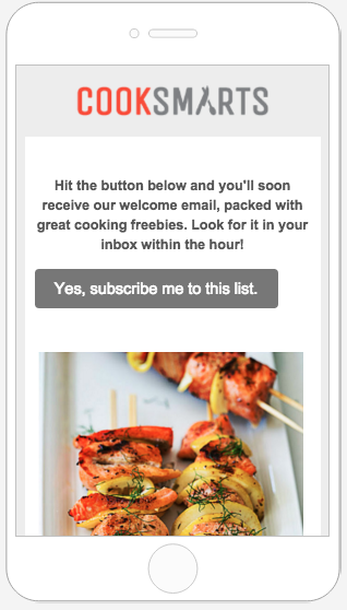
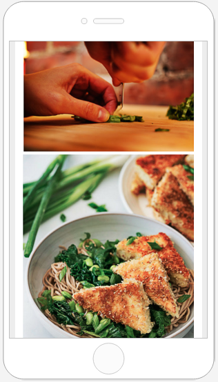
I love how we can see these beautiful images at full-resolution and takeadvantage of the full width of the smaller screen. The text is much easier to read, too. The email looks great, is fully responsive, and was easy to build! Give the BEE editor a try and tell us aboutyour creative collages in the comments.

Quick Video: How to customize social media icons in email
Did you know you can customize social media icons in your email message? Yes! Watch how to customize them in this quick video tutorial. For more info, check out our workshop tutorial: How to customize your social media icons in email...and try it out in the BEE email editor! http://beefree.io/

Tutorial: How to customize your social media icons in email with BEE
Earlier in this week's Design Inspiration post, we looked at how different brands use social media buttons in email: where they put them, how the color/shape/size is customized, and what purpose they serve (to share or follow).
Today's workshop
Today, we'll show you how to customize social media buttons in Beefreeso next time you're designing anemail campaign, you can give a little extra thought to those very important little buttons.Follow along as we show you:
- How and where to place social media buttons in your email
- How to add or remove different buttons
- How to customize the look of the buttons
- How to fine-tune with alignment, spacing, and padding
1. Position your social media icons
Most brands place social media follow icons at the header or footer of anemailwhere readersinstinctively lookforstandard info found in menus, like contacts and social media links. Design-wise, and from a message-comprehension point of view,it makes sense to placesocial media buttons at the opening or close of your email where they aren't interrupting the flow of your central message. An email's primary call-to-action is generally not about getting readers over to social sites; it's about getting them to make a purchase, sign up for an event, or take some kind of action. So it makes sense that social media buttons are positioned in a way to not steal the show.Let's review how toadd social media buttons to your email's header, similar to this email from Martha Stewart Everyday Food.
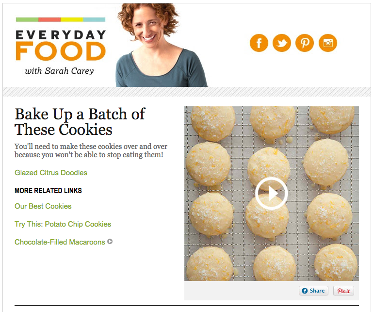
We'll need a two-column structure that accommodates a header image on the left and social buttons on the right, so we'll set up our header structure with this block:

Then, from the Content menu, we'll pull in an image placeholder in the left side of the structure,and social media icons on the right.To add social media buttons to any email in Beefree, simply go to the Content menu and drag and drop theSocial content block into your email's structure, as we see below:
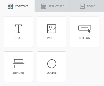
Here's our email header, ready to be customized:
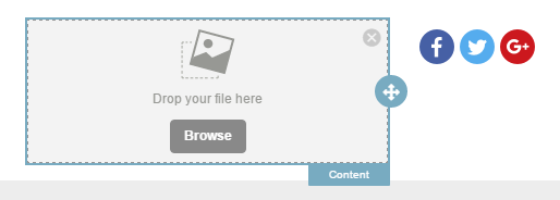
We'll pull in our header image (in this case, we took a screen shot from the Everyday Food email).

And now we can focus on customizingourbuttons!
2. Add and remove social media icons
Now that the social media buttons are positioned in our email, we can click on them to activate our Content Properties menu to make changes.
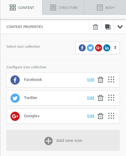
To mimic the Everyday Food email, we'll need four icons: Facebook, Twitter, Pinterest, and Instagram. From our Content Properties menu, we can configure our icon collection. Click the trashcan icon on the Google+ icon bar to delete it. Then, select"Add new icon" tobrowse for the ones we need.
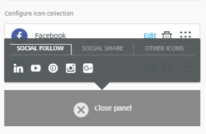
From the Social Follow menu, we select the Pinterest and Instagram icons. Beefree also provides built-in buttons for LinkedIn and YouTube, and, from the "Other icons" menu, an option to link or email content. To rearrange the order of the buttons, just drag them into your preferred position in the same menu on the right.Here's our new header with the social media buttons we need.

Remember to link each one to the appropriate account. Simply click "Edit" for each icon and add the appropriate URL.
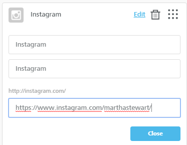
Each social button also has two editable fields--with default "Instagram" text, for example, in the image above. These are thetitle text HTML tag andthe ALT text HTML tag, respectively. Unlike BEE's bulletproof HTML buttons, social media buttons are images, so it's wise to fill out these fields.
3. Customizing your social media icons is easy!
Now that we have the buttons we need, we can format them in one easy step. Beefree offers four built-in icon collections to choose from. The Select icon collection option is the first formatting choice in the Content Properties menu. From it, we can choose betweentwo monochrome collections (all gray or all blue) and two multicolor collections, one with square icons and one with circular.
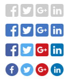
To keep the look of our header clean, we'll choose the gray scale.

If your brand has custom social media buttons, like these brand-colored orange ones for Everyday Food, you could bypass using the built-in social media icons from Beefree and drag in your own icons as images, linking the once they are in place.
4. Fine-tuning: how to apply alignment, spacing, and padding
Now we can fine-tune the exact position of our buttons--and the space around and between them--so we're happy with the layout and balance of our header. To match Everyday Food's header, the icons need to come down and to the left, so they're centered within their structure.Back in the Content Properties menu, beneath the collection customization options, we have three more properties to configure: Align, Iconspacing, and Padding.
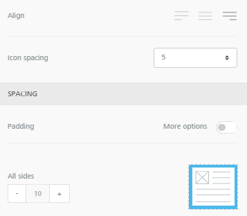
First, we'll change the alignment so the icons are center-adjusted (selecting the middleoption). This moves our icons over, so we go from this....

...to this:

Next, we can increase the spacing between the icons themselves with the Icon spacing option.It's set to a default of 5px between each, which looks good, but if we wanted to, we could increase to 10, 15, or 20:


Lastly, we can adjust the padding around the buttons. By turning on the More options switch, wecan increase padding specifically on the top, bringing the buttons downward.They're going in the right direction, but I'd still like them to come down a bit, even after adjusting the top padding to its 30px max:

To get more white space over top, we can further adjust the padding, not just on the buttons, but on the content container holding our buttons. Here's how: Select the row of content containing our entire header. The menu will change to view Row properties and Column properties.
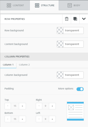
Since our social media buttons sit in the second column of our two-column header (remember that 2-column row structure we selected at the very beginning?), we can select Column 2 under Column Properties and continue to increase the top padding! Now it's just right. What do you think?

Adding and editing social media icons takes just seconds in the Beefree. Once you format the look of your buttons, you can also drag and drop them to the header or footer and test which position works best for your company and audience. Give it a try! And let us know how you do in the comments.

Quick Video: How to create a unique content divider in the BEE editor
Watch how to design a unique content divider in your email message that stands out from your basic horizontal dividers. Follow along and give it a try with our BEE email editor: http://beefree.io/To learn more, check out our workshop: How to create unique content dividers in email

How to create unique content dividers in email
The layout ofanemailis every bit as important as the message it contains. When your email is well organized with an effective layout, you can better communicate your message.This week's Design Inspiration email from BarkBox isa great example of how a modular, or grid-based, design improves readability withclearly defined sections. Have a look:
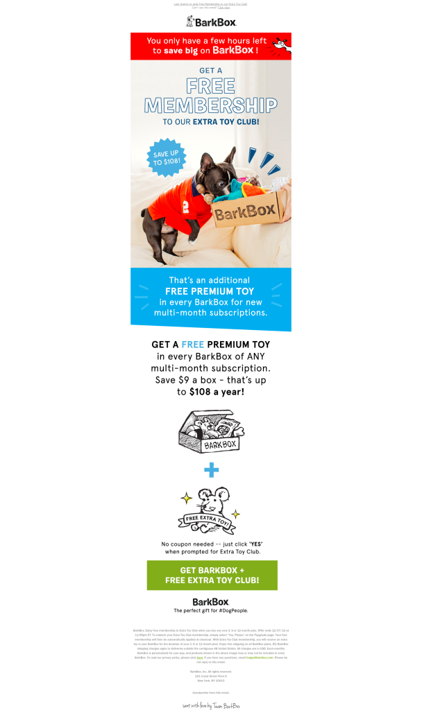
High-contrasting background colorsdistinguish each module, giving a clear order tothe information and allowing the viewer's eye to take in one message at a time. It's agreat way to create division of content and help readers quickly understand how thecontent is organized.Any email withenough information to requirescrolling likely usessome form of content dividers.Dividers section offcontent within an email, typicallywith a horizontal lineor with white spacethat visually groups and separates content without distraction. Here's an example offull-bleed black and gray dividers typical in emails:
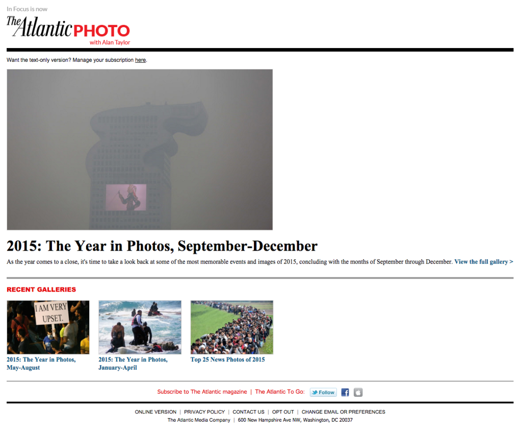
While most email editors allow you to adjust the color, width, and padding around dividers, the look can still get tiresome.In thecase of BarkBox's email, however,an asymmetrical content block in the central module caught our attention:
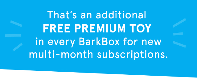
It's an eye-catching variation compared to standard horizontal divider lines we're used to seeing. The off-beatshapecreates a sense of playfulness that's in sync with the BarkBox brand, and it's a simple tactic you can use whendividing the content blocks in your next email. In today's workshop, we'll show you how.
Today's workshop
Let's create ablue content block like BarkBox's that can be used as a module in any email. Watch our video tutorial and all the steps below.
Getting started
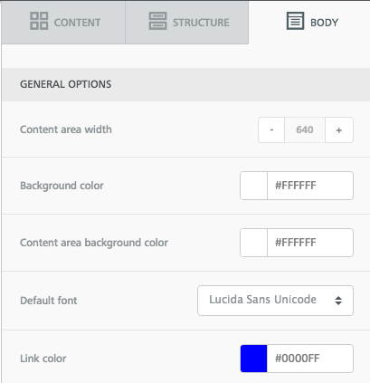
We'll open up the BEE editor to get started—it's free, online, and requires no registration. Try it out or follow along with us in your usual email editor.Starting with a basic one-column email template, we'll set up the overall look and feel of our emailby adjusting the General Optionsin the Body menu on the right. BarkBox's email is 640 pixels wide with a white background. Lucida Sans Unicode is the email-safe font most similar to the branded BarkBox font used in their email.
Setting the HTML background color
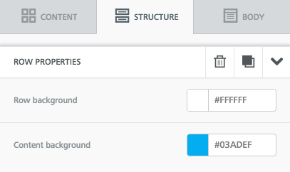
The BarkBox email is comprised of all images, which isn't a design best practice (read about the pitfalls of image-only emails here), so instead of uploading images in BEE, we'll use HTML to create the vibrant blue background of this module. We'll simply select the row structure, then adjust the content background in the Structure menu. The row background can remain white.
Our module looks like this so far:

Text formatting
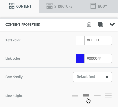
We'll update the text, then format it by center-aligning it, adding line breaks, and making "FREE PREMIUM TOY" phrase bold. Then we'll use the Content Properties menu on the right to make the font color white and increase the line height so there's more breathability between the rows of text.
Our module now looks like this:

Creating the asymmetrical content structure
Now for the fun part. To change the shape of the content block, we'll simple add a triangular image beneath it. We took a screen shot of the shape in BarkBox's email:

Beneath our text block, we'll drag and drop an image placeholder.
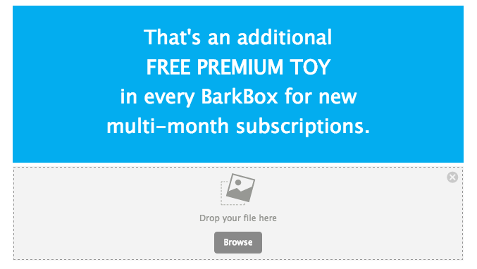
Then, we'll pull in our triangle image.
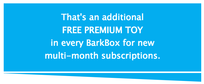
If you ever need to detect theHTML color usedan image, you can use a website like this oneto get the exact code. That's how our triangle image and text block match perfectly.Now, we can adjust the padding to eliminate the white space between these structures and make them appear to be one seamless section of our email. We'll click on the row with our image and navigate to the Padding section of the Structure menu that appears on the right. The default top and bottom padding is 5px. We can simply reduce the top padding to 0...
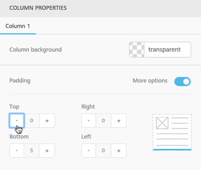
... and instantly the content blocks come together!
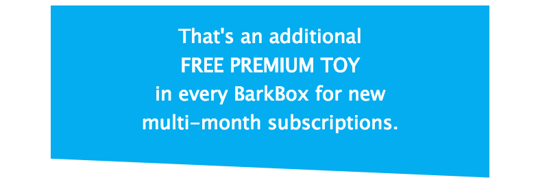
It's that simple!Any shape can be added above or below a content structure to seamlessly adjust the look of its shape, making your module design unique. And since every email designed in BEE is fully responsive, your content dividers will always look great on mobile. Here's ours:
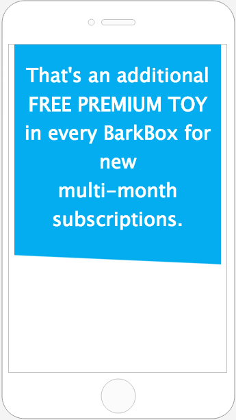
Let us know if you give this a try, and how it turns out!
How to format fundraising emails to increase donations
In our Design Inspiration post this weekon design tips for end-of-year fundraising campaigns,we identified six key ways to increase donations through email: tell a story, make your first headline count, create structure with a modular layout, use typography and good design to make a statement, strategically place your calls-to-action, and get personal. As we wrap up 2015, fundraising is going to be a huge focus for many organizations, and the need to stand out is greater than ever.
Today's workshop
Our workshop this week will lead you through the steps to follow to create your own successful fundraising emails, guaranteed to increase donations to your organization.One email we included in the post, from Memorial Sloan Kettering Cancer Center, had an interesting layout that caught our eye:
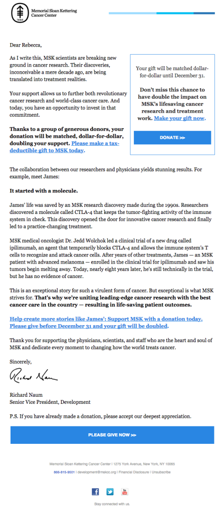
The email is simple: it's a letter from the senior vice president of development that tells a story, gets personal, and speaks directly and candidly to potential funders. Though it'sa long, text-heavy email, smart text formatting maximizes readability andcreates a sense of organization:
- The text is black on a white background
- Paragraphs are kept short
- Bold font makes key takeaways stand out
- Linked text is obvious in blue and because long strings of text are linked (vs just linking one word)
There aren't any elaborate design elements, but the email is focused andcommunicates a clear message that leads to a clear call-to-action. That wide, blue "Give now" CTA is well-placed, as research has shown that placing a CTA button below the fold canincrease clicks by 304%.That's because it's critical to let readers know why they should take action—with great copy and visuals—before actuallyinviting them to act.But Memorial Sloan Kettering can't count on each subscriberto read or even skim the entire thing. It's essential to communicate the key message quickly at the top of an email, so that even with a cursory glance, readers can get the gist.MSKcovers their bases by leaving their key CTA button at the close of the email but by also includinga succinct summary version of their email in acallout box in the upper right corner.With this cleverlayout design, MSK simultaneously keeps its main message above the fold withaCTA button, whilea second CTA closes the message for those with the time and interest to read the full email. It’s a great tactic for reaching as many readers as possible.
Let's get started!
The text formatting in the body of the MSK fundraising email is straightforward, but how do you create a callout box in a single-column email that isn't the full width of the email,formatting it so it has a border and a CTA button, and make sure that the entire email is responsive and looks great on mobile devices? That complex layout design is exactly what we'll cover in today's workshop. We'll use the BEE editor—it's free, online, and requires no registration, so feel free to give it a try and follow along with us.
Getting the structure right
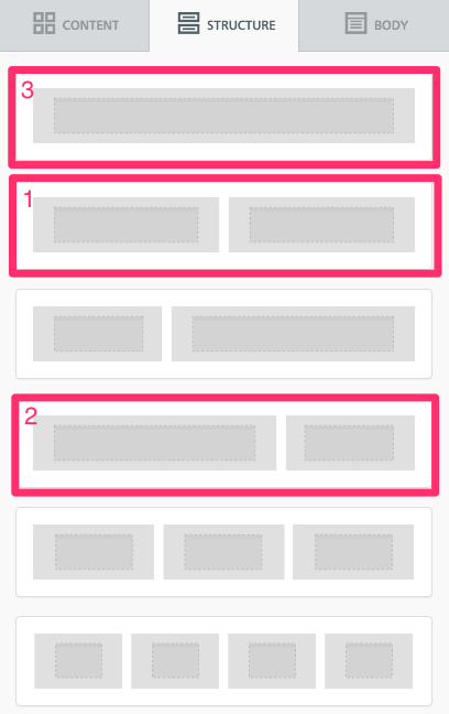
First, let's break down the anatomy of the email,orthe structure of the modules that make up the message.
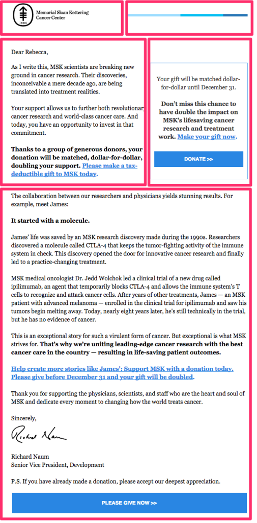
The email has three rows: the first one is split into two equal-width columns, each one containing an image that makes up the header. The second row also has two columns, but the left column is wider than the right. And the final row is one column, containing most of the body of the email.To get started, we'll recreate this structure in BEE, stacking these three containersatop one another from the Structure menu. This is the most important part of setting up our email—including the callout box—for success.
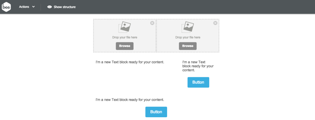
So our email layout looks like this:

Already, we have our complex layout set to go! The BEE editor allows us to customizecontent arrangementat a granular level, so positioning that special callout box isa piece of cake. Keep reading for instructions on how to bring it to life.
Arranging the content
Now that thestructure of our email is in place, we can drag in the appropriate content blocks.The header will have two images side-by-side, one for the MSK logo and one for the horizontal blue line.The second section will havetext on the left for the body copy, as well as text and a button on the right where we'll build our callout box.The third section will be text, followed by the final CTA at the bottom.Here's how it looks:
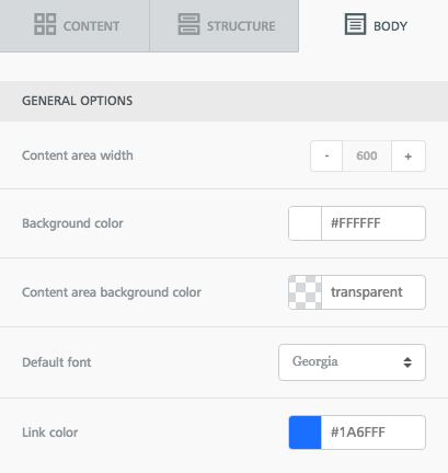
Before we drop in the actual content, let's go to the Body menu and set up our content properties. We'll want to increase the width of the email to 600px to match Memorial Sloan Kettering's. The font used is Georgia, and the link color is a boldblue.
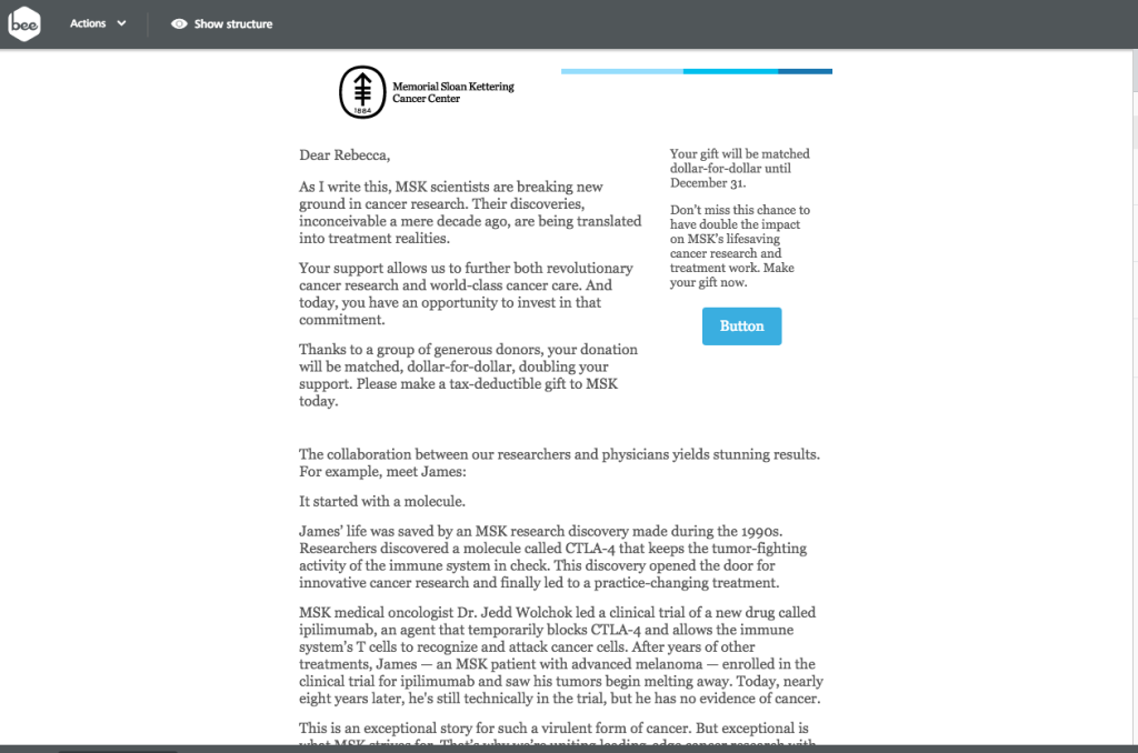
Now let's drop in the actual content. We saved the images from MSK's email, so we can easily drag those in for the header. Then we'll simply copy and paste the rest of the text.Here's the email with all content in place, before makingany formatting changes or adjustments.
Formatting the header
There are some obvious changes needed to be made to the header so that it better matches MSK's.Here's ours:

And here's MSK's:

Starting on the left, if we select the MSK logo, we can left-align it in the Content Properties menu on the right.

Then we need to bring the blue line down so that it's center-aligned with the logo.The easiest way to do this is to adjust the top padding on the image, increasing the white space between the line and the container's upper border. To do this, we'll select the line image, then navigate to the Spacing section of the Content Properties menu. We'll make sure we can see More Options, then increase the top padding to 20.
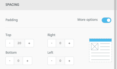
Now we're in business!

Formatting the callout box
The text in the callout box is Georgia size 14, with the second paragraph bolded, and the last sentence linked. All the content is centered. We'll mimic all of that in BEE with text editing menu that appearswhen we select text:
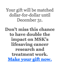
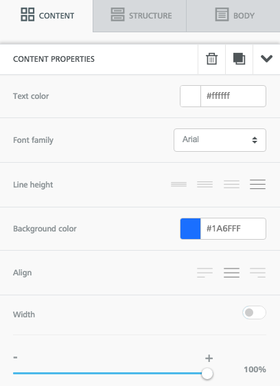
Next, we'll format the button so that it's the full width of the callout box (adjusting the width to 100% in the Content Properties menu) and so it's the same blue color as the links (we'll copy and paste that HTML color code from the color we chose in the Body menu). We'll also use Arial for itsfont. For step-by-step instructions on all the ways to format CTA buttons in BEE, check out our postHow to design bulletproof CTA buttons in email.
Now our button looks more like Memorial Sloan Kettering's:
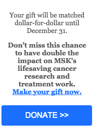
Lastly, and most importantly, we need to set this callout section apart from the email with a blue border. If we click the row that holds the first part of the body text on the left and the callout box on the right, we're shown a Column Properties menu that allows us to customize individually each column. This is an exciting feature of BEE. Each column we create can have its own custom background color, border color and width, and padding.
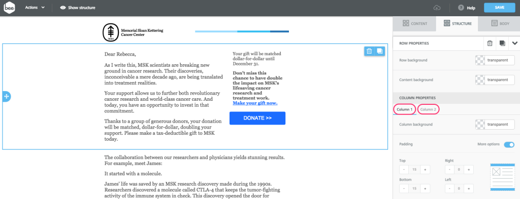
In this case, we'll format Column 2 so that it looks like MSK's callout box. Select the Column 2, and scroll down to the Border menu. Increase the border from 0 to 1. Then paste in the same blue color code to change the border from transparent to the color we want. Check it out!
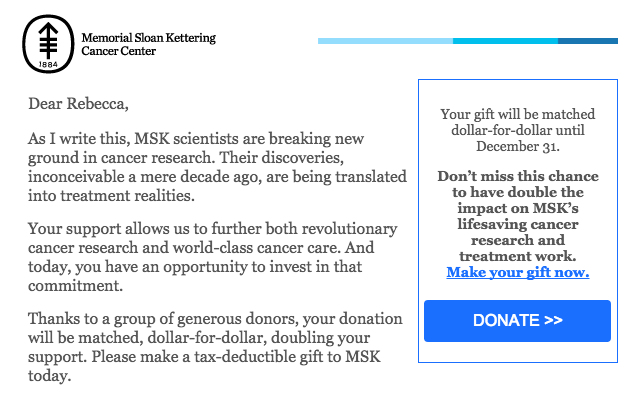
Just like that, we have our callout box! When you make your own, you could also try adjusting the background color and border width and color. Let us know how it goes!
Final adjustments
To complete our email, there are a few final tweaks to make:
- Add bold emphasis and links to appropriate sentences in the body text
- Adjust the padding between content structures so all the pieces of the email are spaced equally
- Format the final CTA button to be the full width of the email and the same blue color
- Preview the email to see how it looks on mobile
In preview mode, we can check out our responsive design in action. It's really coolto see how the header design and callout box respond beautifully to the smaller screen size:
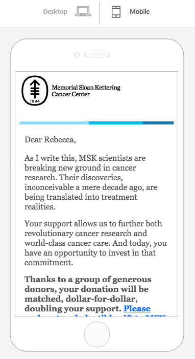
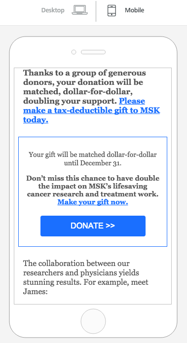
It's clear Memorial Sloan Kettering put some time and thought into this email design to optimize readers' experience and, hopefully, bring in donations.Fortunately, in an email editor like BEE, it's simple to put together complex layoutsthat look great on all screen sizes and accommodate the reading preferences of your subscribers. Try the BEE email editor and maximize the impact of fundraising emailsthis season, and let us know how it goes!
Video: Go Behind the Scenes to Learn About BEE’s History and Features
Want to learn more about the history and mission of BEE, the drag-and-drop email editor brought to you by MailUp? Now’s your chance to go behind the scenes at BEE and meet Massimo Arrigoni, from the MailUp product team. As you may know, MailUp, the Italy-based email company, launched beefree.io in the fall of 2014 to give ANYONE (that includes you!) access to a completely free email editor that makes it simple to create well-designed, responsive emails. Then in the spring of 2015, MailUp announced an embeddable version of BEE, enabling developers to include the BEE editor in their own application.Watch as Massimo shares more about this history, along with some of the many benefits of using BEE. You’ll get a peek into the enhanced features available in BEE’s latest version and learn why MailUp decided to develop an embeddable version of the editor.From changing background colors at the row level to having more control over padding, BEE offers email designers an easy, free tool to create well-designed, fully-responsive emails. And now developers can provide the same email functionality to users of their applications by embedding BEE Plugin.Learn about some of the ways you can use BEE today -- watch now!
Ready to design your own responsive emails in a snap? Try out BEE now >>

Stay informed on all email trends
From the latest creative design strategies that inspire your next campaign to industry best practices and tech advancements, our newsletter is the go-to for all things creation.

